Discount Popup Example: 5 Real Use Cases And Helpful Best Practices For Better Conversions

I hope you enjoy this blog post. If you want Hello Bar to grow your leads, click here.
Author:
Mansi
Published
December 1, 2025
Table of Contents
A good discount popup example can show you how simple ideas still move the needle when you present them the right way. Most people shop with some hesitation. They browse, compare, and think. A discount popup has one job: give them a reason to stop thinking and take that next step.
This isn’t about being loud or pushy. It’s about being clear, helpful, and timed well. If you’re running an ecommerce business or you’re trying to monetize your newsletter list, a discount popup example can guide you toward simple changes that get more people to subscribe or buy.
I’m walking you through five detailed examples, all based on real campaigns from ecommerce brands, but rewritten and re-ordered. Each discount popup example shows a different strategy, different goal, and a best practice you can apply right away.
Nothing here is extra. Everything stays true to the ideas in the reference blog but written in a more direct, human voice.
Let’s get into it.
1. The Minimum Purchase Discount Popup
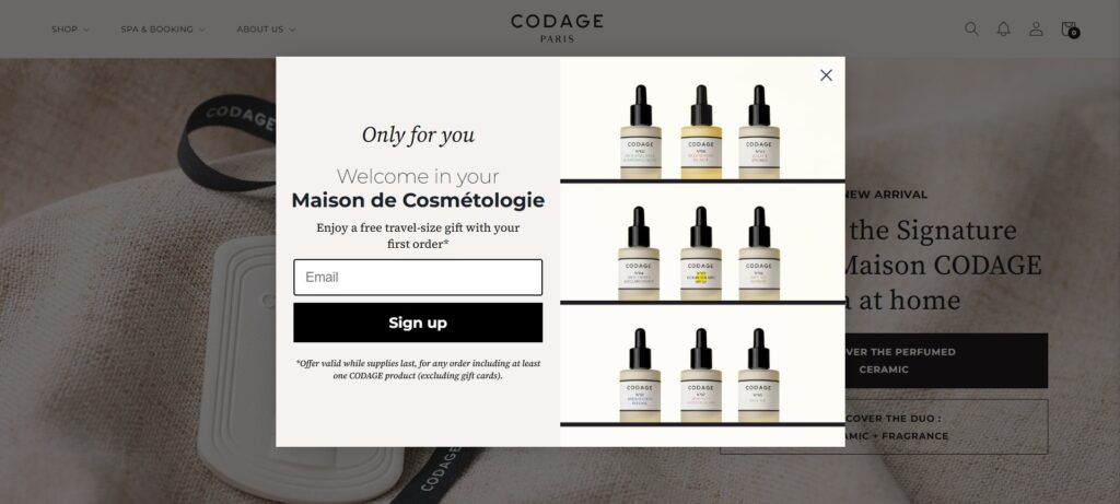
You’ve probably seen a discount popup example where a brand offers a free item once your cart hits a certain value. CODAGE Paris used this idea in a clean, simple way. The popup offered a travel kit at no cost, as long as the visitor bought items worth over a set amount.
Why this worked:
- The offer was clear instantly.
- The free product made sense because it included items that introduce people to more products.
- The button took shoppers straight to the product, which removed unnecessary steps.
A minimum-purchase discount popup example works because it pushes average order value in a natural way. You’re not forcing people to buy more. You’re giving them a reason to go a little further.
Best practice:
Run a minimum-purchase offer when the free item is something people can finish and want again later. It helps both short-term sales and long-term repeat buying behavior.
2. A Discount Popup Example That Uses Segmentation Questions
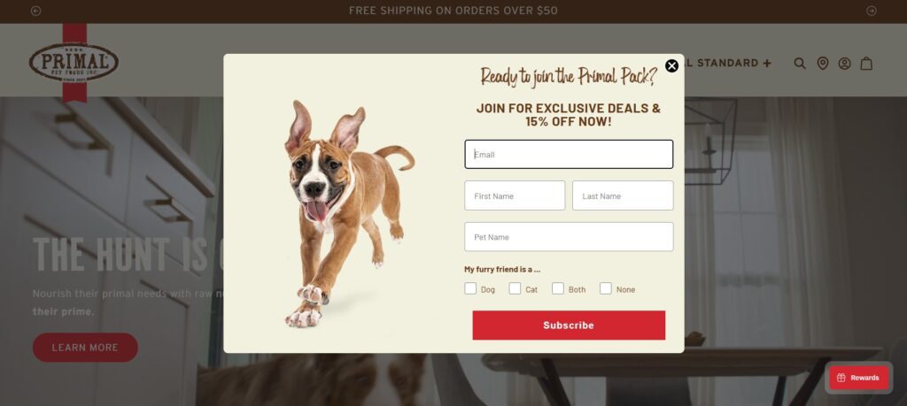
Collecting emails is good. Collecting emails with context is better. One strong discount popup example came from a pet food brand that added two short questions to the popup: what animal the visitor owns and what their main preference is.
This wasn’t a long form. It was just two fast clicks. The image in the popup featured pets, so people felt like the content was made for them.
Why this worked:
- It gathered details that the marketing team could use later.
- The questions didn’t slow anyone down.
- Visitors still got their discount immediately.
A segmentation-based discount popup example is helpful when you want to personalize follow-up emails without guessing. The more specific the future messages feel, the higher your open and click rates.
Best practice:
Use this format only when the answers actually matter. Don’t ask a question just to ask it. If the response won’t shape your future communication, keep the popup simple.
3. The Email Subscription Discount Popup Example
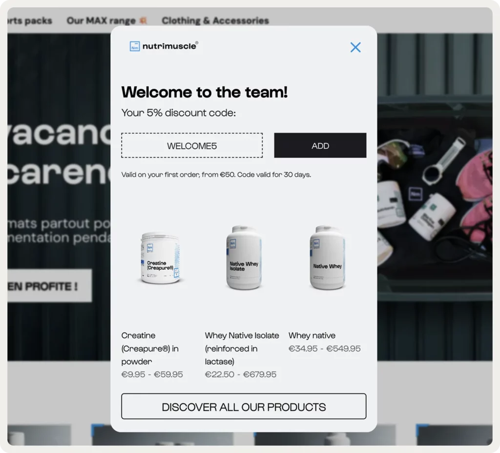
A classic discount popup example still works well: offer a percentage off in exchange for an email signup. Nutrimuscle ran a version of this built around a small discount on the first order. They also framed it as more than a coupon. Visitors would get training guides, nutrition tips, and early access to drops.
Why this worked:
- The headline made the benefit obvious.
- Product images matched what the visitor was already browsing.
- Extra content made the offer feel useful, not cheap.
A discount popup example like this is effective when your product has moderate pricing. A percentage discount feels meaningful without hurting margins.
Best practice:
If you can include something non-monetary — like early access or exclusive content — the popup attracts subscribers who might stick around longer. It shifts the value from “cheap deal” to “worth being part of.
4. A Gamified Discount Popup Example: Spin-The-Wheel
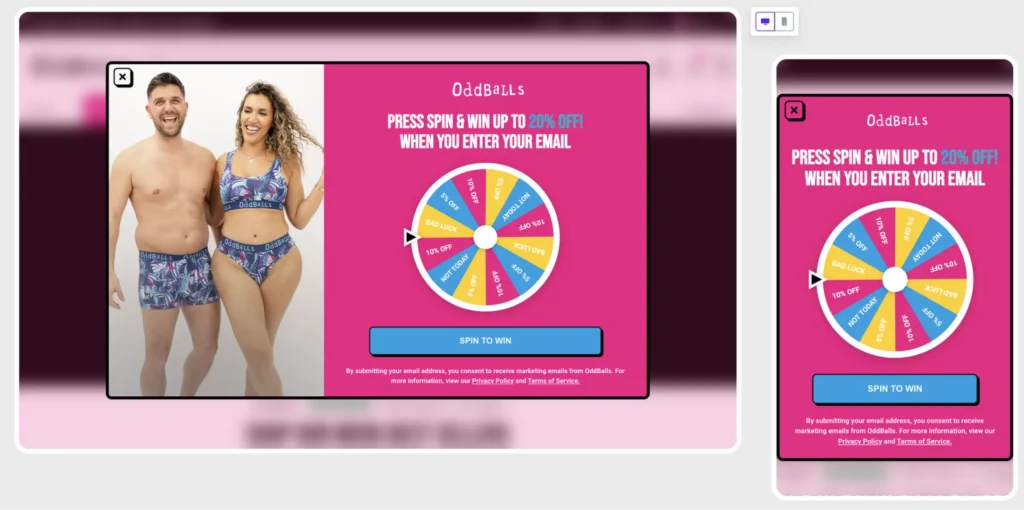
Some stores use a spin-the-wheel popup to make the moment a bit more playful. OddBalls used this style to catch attention and offer a mix of discounts or perks like free shipping.
The reason this discount popup example stood out is because it didn’t require a lot from the visitor. Enter your email, spin, and get your result. People like the feeling of winning something, even if the offer is simple.
Why this worked:
- The design was bright and easy to follow.
- It gave a sense of randomness, which increases engagement.
- The brand could limit spins so people couldn’t keep trying for better deals.
This type of discount popup example is strong when your audience responds well to games, bold visuals, and small surprises.
Best practice:
Only use gamification when it fits your brand tone. If your store has a calm or minimal feel, this may feel out of place. But if your brand leans fun and colorful, it can bring in thousands of leads fast.
5. A “Buy Two, Get One Free” Discount Popup Example
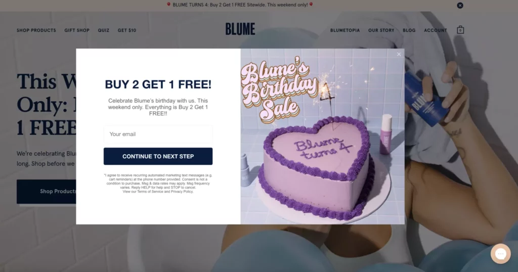
Instead of a percentage, some brands push value by giving something free when people buy multiples. Blume ran a weekend campaign where people could buy two items and get the third one at no extra cost. The design was simple, but the message was clear.
Why this worked:
- The offer felt bigger than a small percentage discount.
- It made sense for self-care products that people restock often.
- The total value stayed reasonable for buyers while still raising average order value.
A BOGO-style discount popup example works best when your product naturally fits into bundles or when people typically buy more than one item.
Best practice:
Make sure your promotional total sits close to your average order value. If your AOV is $50, don’t push a deal that totals $90. People won’t stretch that far, and the popup won’t convert.
Why These Discount Popup Examples Convert Well
These five approaches look different, but every discount popup example in this list does one thing right: it removes hesitation. They all show visitors something simple — a reason to move forward without overthinking.
Patterns across all examples:
- The offer is clear within one second.
- The design helps the message stand out instead of distracting from it.
- The next step is easy. One click. No searching.
- The discount popup example fits the product category naturally.
- The brand gives something that actually matters to the visitor.
There’s no trick. Visitors don’t want drama or confusion. They want clarity. Any discount popup example that converts well has clarity at the center.
5 Best Practices Pulled From All Five Discount Popup Examples
To make this blog more actionable, here are the five practical best practices drawn directly from the reference examples (rephrased, reorganized, and simplified):
1. Make the value immediate.
Every discount popup example works because visitors know what they get without rereading anything.
2. Keep the steps short.
Ask for the bare minimum. If you need extra details, limit it to one or two clicks like the segmentation example.
3. Match the offer to buying behavior.
If your product is something people replenish, use BOGO or bundle deals. If you’re working with higher order values, try a minimum-purchase popup.
4. Add non-discount perks when possible.
Things like guides or early access make your discount popup example feel less transactional.
5. Place the popup where intent is strong.
Free shipping popups, minimum purchase popups, or product-specific offers make more sense when shown on category pages, not random parts of the site.
Also read our article on How to Increase Sales in Retail Through Pricing Psychology and Discounts
Conclusion
A good discount popup example doesn’t try to be clever. It just gives people a reason to take the next step without wasting their time. Pick the format that fits your product, keep the message simple, and let the numbers show you what works.


