5 Best Overlay Popup Examples to Boost Conversion (With Real Brand Inspiration)

I hope you enjoy this blog post. If you want Hello Bar to grow your leads, click here.
Author:
Mansi
Published
October 29, 2025
Table of Contents
Most websites waste the first few seconds of a visitor’s attention. Overlay popups don’t. They appear right when people are focused, cut through the noise, and give them something worth acting on, a discount, a perk, or even just a reason to stay.
When done right, overlay popups aren’t annoying. They convert.
But the key is how they’re used, the design, timing, message, and value all matter. So instead of throwing a random email box on your homepage, learn from brands that do it well.
Here are five overlay popup examples that prove subtle, smart design can drive real results. Each one follows simple, practical rules, no gimmicks, no noise, just real overlay popup ideas that actually get clicks.
1. Nike’s Minimal Email Overlay Popup
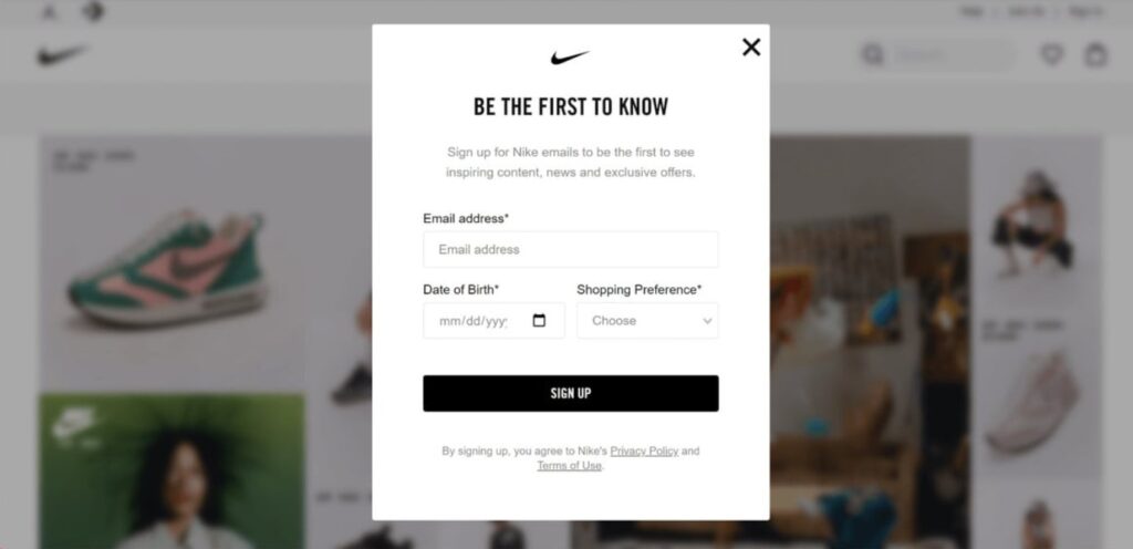
Nike knows attention spans are short, so its overlay popup example is stripped to the essentials. No long form. No flashy animation. Just one clear message: “Be the first to know.”
That short line alone drives curiosity, it makes visitors feel like insiders.
The popup has space to enter an email, date of birth, and product preferences. Simple, but strategic. These few details allow Nike to tailor its email offers and product alerts.
Visually, the design matches Nike’s minimal identity: clean white background, black text, and a bold call-to-action button that pops. The design itself does half the work.
What makes this one of the strongest overlay popup ideas is how it balances simplicity with purpose. It’s not shouting for attention, it quietly earns it.
If your goal is to build a better email list, this example is worth following. Keep the copy tight, keep the design light, and ask for just what you need.
2. Dolce & Gabbana’s Elegant Newsletter Overlay
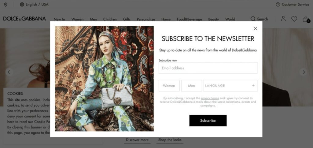
Luxury brands can’t afford to look cheap, even in their popups. Dolce & Gabbana gets this right.
Their overlay popup example uses an elegant black-and-white color scheme, paired with a full-image background featuring a model in D&G clothing. It looks like an ad from a magazine rather than a popup.
The text is minimal: an invitation to join their newsletter and select gender and language preferences. That last part matters, it helps them send more personalized updates that match the customer’s style.
It’s one of those overlay popup ideas that shows how subtle personalization boosts conversions. By asking small, relevant questions, the brand makes the popup feel more like a style profile, not a data grab.
It’s classy, simple, and right on brand. If your product or service has a strong visual identity, let that identity carry through in your popup overlay too.
3. Revolve’s First-Time Buyer Discount Popup
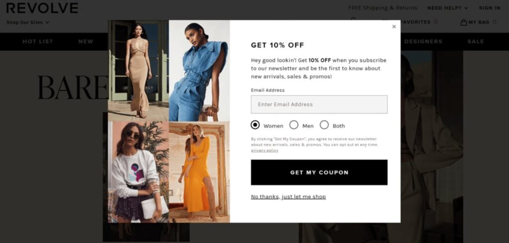
Revolve takes a direct, conversion-first approach. As soon as a visitor lands on their site, they’re greeted with a discount-focused overlay popup example, 10% off for first-time buyers.
It’s simple math: most visitors won’t buy on their first visit, but a discount can tip them over the edge. This overlay popup idea serves two goals at once, build the email list and drive first-purchase conversions.
The popup includes a clear form to collect the visitor’s email in exchange for the discount code. There’s also a small, polite “No thanks, just let me shop” option that makes it easy to close.
The tone is light, the offer is relevant, and the timing is spot-on. By placing the popup early, Revolve catches undecided buyers before they scroll away.
This example proves something simple, popups work when they actually give value.
You’re not interrupting someone when you’re offering something useful.
4. CoSchedule’s Exit-Intent Overlay Popup
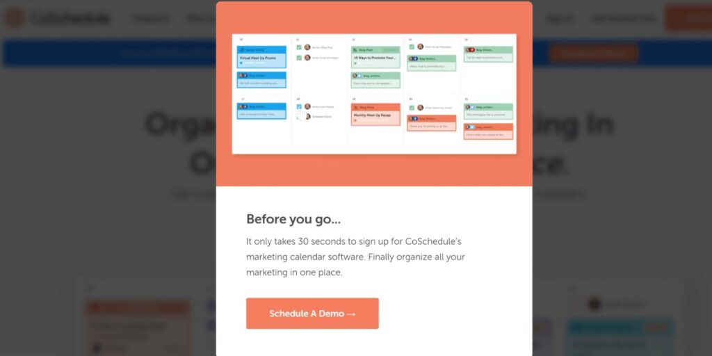
CoSchedule’s approach focuses on timing rather than discounts. When a visitor’s cursor moves toward the exit button, an exit-intent overlay popup example appears with a clear message about their marketing calendar.
Instead of trying to sell right away, the popup invites the user to see how the calendar works or schedule a demo.
It’s direct, but it feels helpful.
The layout is clean: a short headline, a product image, and a strong CTA button that says exactly what happens next. No extra boxes, no distractions.
What makes this one of the best overlay popup ideas is its trigger. It doesn’t interrupt browsing; it waits until someone is ready to leave.
That moment, the second before exit, is your last shot to convert.
CoSchedule uses that window smartly by offering something genuinely useful instead of a random offer.
If your visitors drop off before converting, try a similar strategy: an exit-intent overlay that solves a problem rather than just grabbing data.
5. Bruno Magli’s Instant Discount Overlay
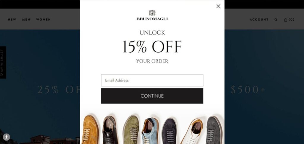
Bruno Magli’s overlay popup example nails timing and value delivery.
As soon as you enter the website, you’re greeted with a clean overlay offering 15% off your first purchase.
There’s no complicated text, no cluttered layout. Just a direct offer that rewards attention.
The popup feels tailored to the brand’s premium style, elegant fonts, muted tones, and product imagery that fits the brand identity.
It’s a straightforward overlay popup idea that captures emails fast and creates a sense of immediate benefit. For most shoppers, that 15% is enough to justify sharing an email.
This example works because it delivers value instantly. People don’t like waiting for rewards, and Bruno Magli’s popup gives them a reason to engage right away.
If you’re running an ecommerce store, this type of overlay can drive consistent results, especially for first-time visitors who might be browsing but not yet ready to buy.
What These 5 Overlay Popups Have in Common
Each overlay popup example above works because it’s built on three basic principles: timing, design, and value. None of them depend on overused gimmicks or aggressive flashing messages.
Here’s what’s consistent across all five:
- They match the brand tone.
The popup doesn’t feel out of place. Whether it’s Nike’s minimalist look or D&G’s luxury aesthetic, each overlay feels like a natural extension of the brand. - They keep it short.
Every one of these overlay popup ideas uses a short message, one clear promise or offer. No one wants to read a paragraph before signing up. - They offer something real.
Whether it’s a discount, early access, or personalized content, the popup actually gives value. - They respect timing.
Exit-intent popups, first-visit popups, and time-delayed ones all appear at just the right moment. That’s what makes them convert instead of irritate. - They’re visually clean.
Overlays cover the screen, so clutter is your enemy. Each of these examples uses contrast and white space to highlight what matters most, the CTA.
These five rules turn average overlay popup examples into conversion tools.
How You Can Apply These Overlay Popup Ideas
You don’t need to reinvent the wheel. You just need to apply what’s working.
Here’s how to use these overlay popup ideas in your own business:
- Start with one goal.
Do you want more email subscribers? Discount redemptions? Free trial signups? Pick one. The rest of your design should serve that single purpose. - Use minimal form fields.
Asking for too much info kills conversions. Nike and D&G only ask for a few key details, email, gender, or preference. That’s enough. - Match your site design.
Don’t make your popup look like it came from another planet. Keep the fonts, color palette, and tone consistent with your brand. - Add behavioral triggers.
Like Hello Bar’s exit-intent overlay, trigger popups based on user actions instead of time alone. It’s more effective and less intrusive. - Test and adjust.
Try different wording, colors, and timings. Sometimes small tweaks, like changing “Sign Up” to “Join Now”, can lift conversions by 10–20%.
Every strong overlay popup example you’ve seen was refined through testing. You’ll only find your best-performing version by running experiments.
Also, read our guide on What Is an Interstitial Popup?
Quick Recap of the Best Overlay Popup Examples
To make it easy, here’s the shuffled list again with each popup’s core value:
- Revolve, First-time buyer discount that collects emails and boosts initial conversions.
- Co Schedule, Exit-intent popup that recovers abandoning visitors with demo or deal offers.
- Dolce & Gabbana, Stylish newsletter overlay with personalized fields for gender/language.
- Nike, Clean, minimal overlay that builds email lists through curiosity-driven CTAs.
- Bruno Magli, Instant 15% discount overlay that delivers value right at page load.
Each example shows how clarity, brand consistency, and timing make the difference between a popup that annoys and a popup that converts.
If you take anything from these overlay popup examples, it’s this: don’t think of them as interruptions, think of them as moments of relevance. When you meet people at the right moment with the right message, they engage.
Conclusion
Good overlays don’t chase attention, they earn it.
When you design them with real intent and value, visitors don’t mind the interruption. They actually click.
And that’s the whole point of a good popup overlay: it works without trying too hard.

