12 Signup Form Examples to Inspire Your Next Website Design

I hope you enjoy this blog post. If you want Hello Bar to grow your leads, click here.
Author:
Mansi
Published
October 8, 2025

Table of Contents
If you run a business, you already know how tricky it is to get people to share their details. A signup form looks simple on the surface, an email box, a button, but it’s where most visitors quietly leave.
That’s why studying signup form examples that actually work can save you months of trial and error. Real brands have already figured out how to make website signup forms friendly, short, and worth a visitor’s time.
This isn’t a list full of buzzwords or “conversion hacks.” It’s about learning what really works when you’re trying to get a human being to sign up for something.
So, let’s get into 12 real signup form ideas you can learn from.
1. Death Wish Coffee – The Power of a Simple Question
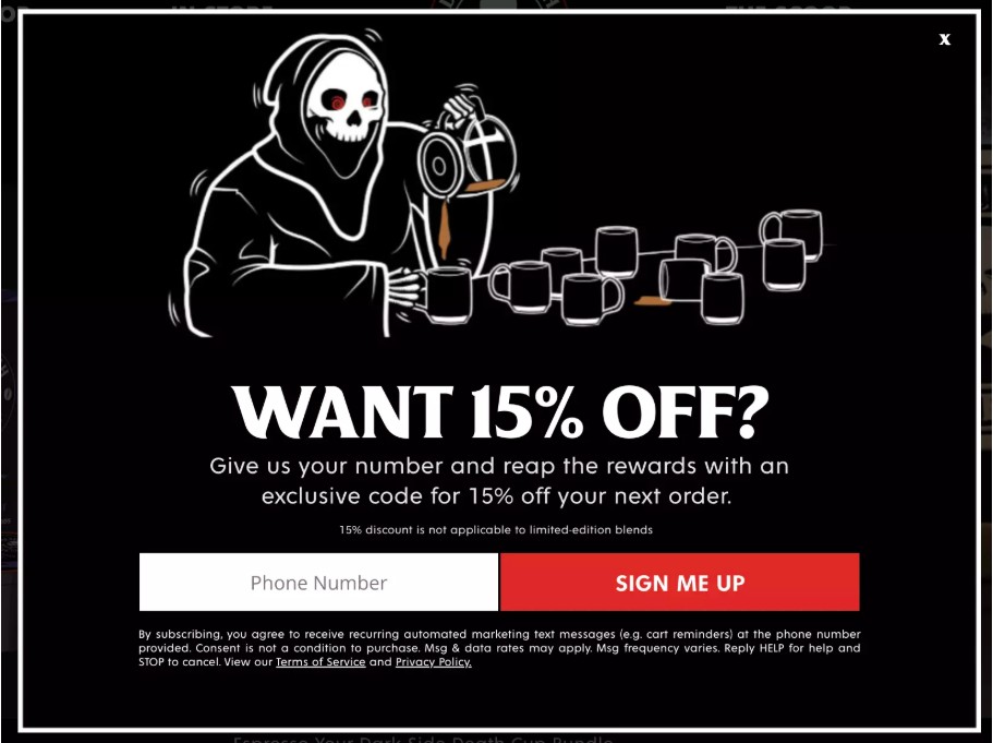
“Want 15% off?”
That’s it. No paragraph. No pitch.
Death Wish Coffee proves that the simplest signup form examples often win. It’s a short SMS popup that just asks one question. If you say yes, it reveals a single input field for your number.
There’s a small detail that matters: they use conversational language. It sounds like a real person, not a form.
If you’re looking for signup form ideas that work for ecommerce, remember this, one line that offers a clear benefit beats long copy every time.
2. Beardbrand – When the Form Feels Like the Brand
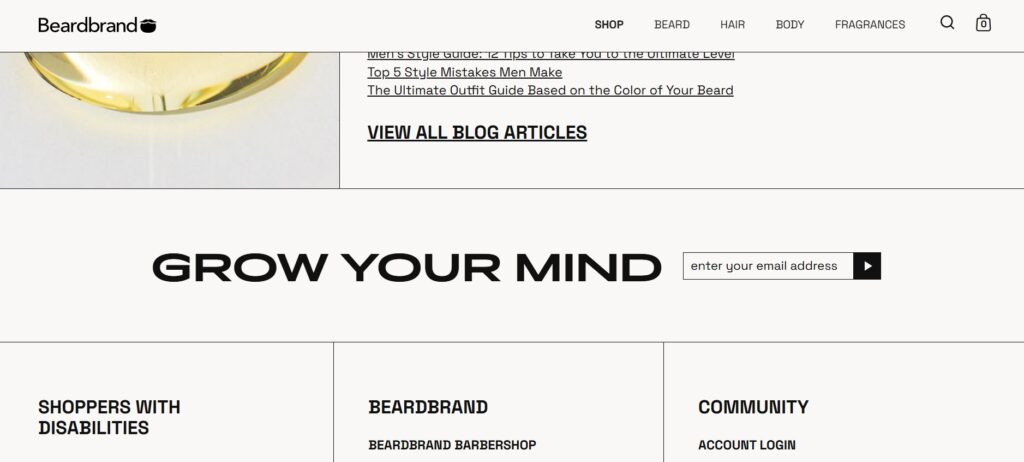
Beardbrand doesn’t just sell grooming products. They sell a lifestyle.
Their website signup forms reflect that.
Instead of pushing discounts, they invite people to join a “grooming club” where they’ll get beard tips, giveaways, and behind-the-scenes stories. The message feels personal, like a note from someone who gets you.
This form shows how tone matters more than design. If your brand has a voice, use it. Your signup form examples should feel like a natural part of your story, not an ad interruption.
3. Queen Garnet – Turning a Form into a Personality
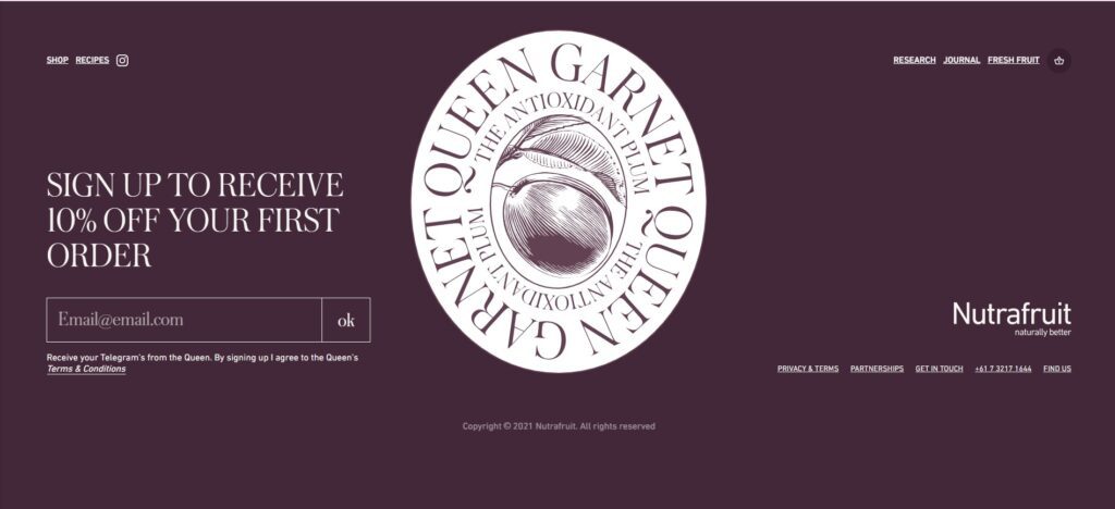
Queen Garnet sells juice made from the world’s darkest plum.
Their signup form example starts with a headline that reads:
“Telegram from the Queen.”
It’s witty, a bit royal, and perfectly fits the brand. There’s just one email field, that’s it. Even the confirmation message continues the royal humor.
This example proves how personality builds trust. You don’t need fancy graphics. Just words that sound like your brand.
If you’re brainstorming signup form ideas, start with your tone, not your color palette.
4. Blume – The Personalized Discount Popup
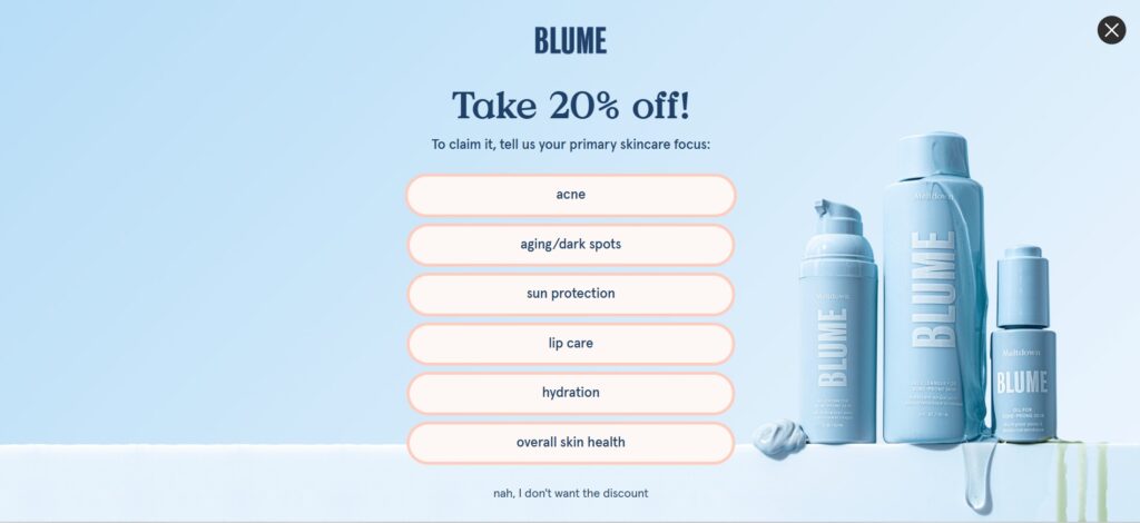
Blume’s popup doesn’t just throw out a random discount — it starts with a question. Before giving 20% off, it asks visitors to choose their main skincare focus: acne, hydration, sun protection, and more.
This one small interaction turns a basic discount into something personal. It helps Blume understand what each visitor actually cares about, while making users feel seen and understood.
The design matches their brand perfectly — soft blues, rounded buttons, and calm energy that feels like skincare should.
It builds a connection before conversion. By asking a quick, relevant question, Blume collects valuable segmentation data and makes every offer feel tailored. It’s smart marketing disguised as a friendly quiz — and it works beautifully.
5. Highway Robery – When Copywriting Does the Heavy Lifting

“Sign up for the news and notes from around the robe.”
That’s their line.
It’s clever, funny, and fits their quirky robe brand perfectly. There’s no image, no animation, just smart writing.
If you want to learn from real signup form examples, start by studying their tone. They prove you can make a memorable form with nothing but words.
Among all the signup form ideas here, this one teaches the most important lesson: personality converts better than polish.
6. WP Standard – The Minimalist Connection Popup
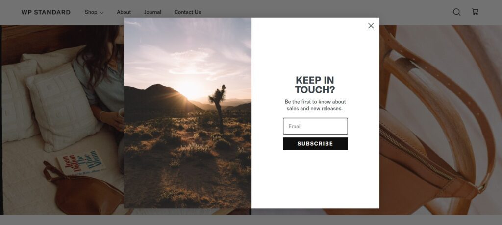
WP Standard keeps things simple and true to its aesthetic. Their popup doesn’t shout discounts or push urgency—it quietly asks, “Keep in touch?” and invites visitors to subscribe for updates on new releases and sales.
The design mirrors the brand’s style: calm photography, muted tones, and clean typography. There’s just one email field and a black “Subscribe” button—nothing extra, nothing forced.
It respects the visitor. This popup feels like an open door, not a sales pitch. By aligning tone and design with the brand’s laid-back, crafted identity, WP Standard turns a basic email capture into a subtle expression of trust and taste.
7. Holo Taco – Simple, Playful, and Consistent
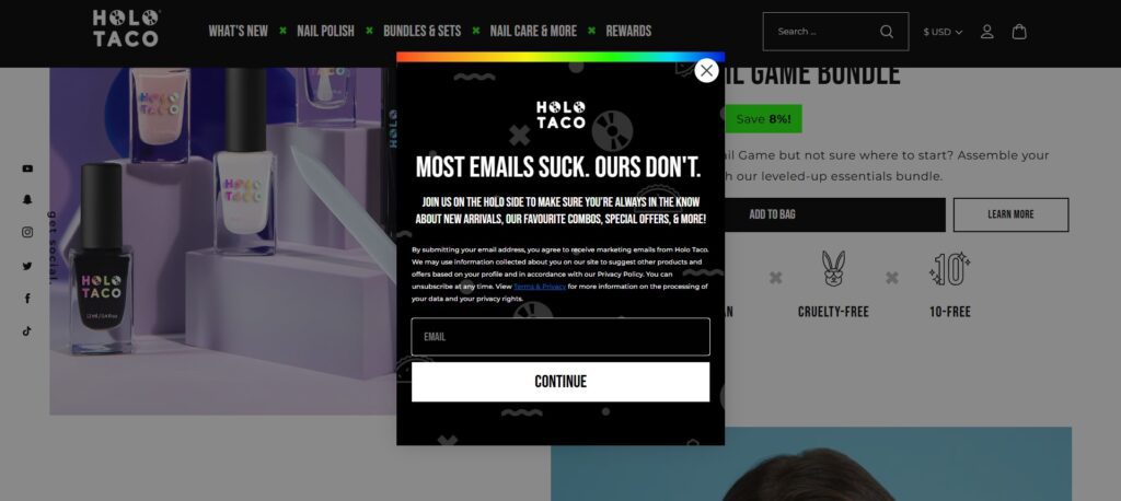
Holo Taco, a nail polish brand, keeps everything consistent with its fun, playful vibe.
Their signup form example sits fixed between sections on the homepage, small, stylish, and on-brand.
It only asks for one thing: your email. The copy is short and casual, matching their product packaging and tone across social media.
The lesson here? You don’t need to overdesign your forms. The best signup form examples are clean, simple, and blend naturally with the website.
8. Pedego Bikes – Using Notification-Style Forms
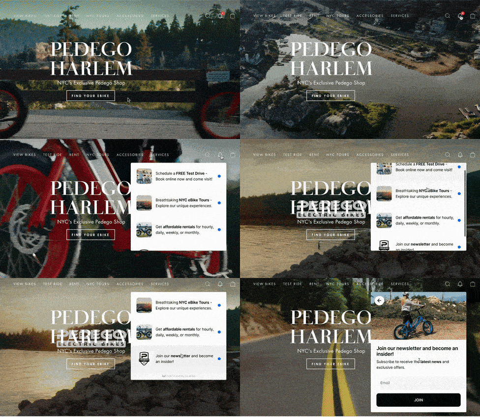
Pedego’s form stands out not for its look, but for its placement.
Instead of a popup, it appears in an onsite feed, like a social notification bubble.
Visitors can click the little bell, scroll through messages, and find the signup form example among updates and offers. It’s interactive and feels more like browsing content than filling a form.
This is one of those signup form ideas that breaks the traditional mold. You don’t have to rely on popups, try new placements that feel natural to the browsing flow.
9. Stumptown Coffee Roasters – The Invitation Popup
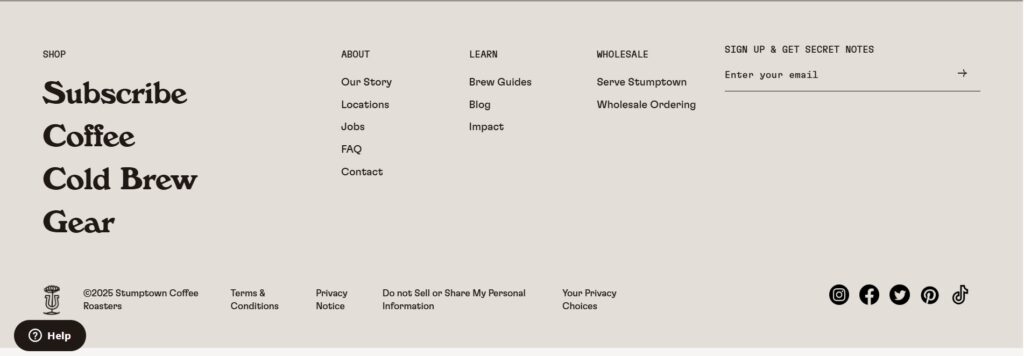
Stumptown keeps its email signup as cool and understated as its brand. Instead of bright colors or flashy animations, their form quietly sits in the site footer with the line: “Sign up & get secret notes.”
It’s simple — one email field, a thin underline, and a small arrow. But that phrase “secret notes” does the heavy lifting. It feels personal, like being invited into an insider circle rather than a mailing list.
It speaks in the brand’s language. Stumptown turns a routine signup form into something that feels exclusive and authentic. The copy fits their tone — creative, confident, and a little mysterious — which makes even the smallest form feel like part of the brand experience. Stumptown’s signup form example features a looping gif of coffee swirling into a galaxy. It’s hypnotic, you can’t not look at it.
Design aside, the structure is simple: one field for the email, one clear discount offer. The combination of visual movement and minimal input fields makes it both attractive and effortless.
For ecommerce stores, this is one of the website signup forms worth studying. Visuals don’t have to be flashy, just something that catches the eye long enough for someone to type their email.
10. Gymshark – The Subtle Account Teaser Popup
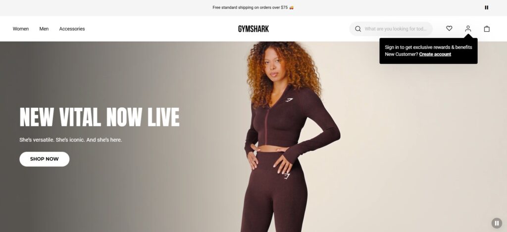
Most brands tuck their signup boxes into footers or popups.
Gymshark took the opposite route, they built a full web page just for signups.
On the left: the actual form.
On the right: a list of reasons to join, exclusive launches, workout content, and first-access deals.
It’s longer than most signup form examples, but it’s balanced by clarity. You know exactly what you’re signing up for.
If you’ve got a strong brand and community, dedicating a page can work well. It feels more intentional, not like an afterthought.
11. Williams Sonoma – The Sweepstakes Popup That Feels Premium
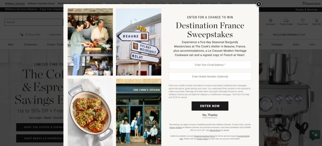
Williams Sonoma’s popup isn’t about discounts — it’s about experience. It invites visitors to enter the “Destination France Sweepstakes” for a chance to win a five-day culinary masterclass in Burgundy, complete with luxury cookware and accommodations.
The layout is elegant and photo-driven — rich imagery of food, travel, and craftsmanship paired with minimal text and simple entry fields for email and phone. It feels more like a magazine feature than a marketing popup.
It elevates engagement into aspiration. Williams Sonoma knows its audience values quality and lifestyle, not just deals. This popup sells the dream of French cooking — and in doing so, collects leads from people who genuinely connect with the brand’s world.
12. Primal Pet Foods – Smart Form, Smart Data
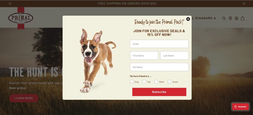
Now this one’s clever.
Most website signup forms only ask for an email. Primal Pet Foods goes further, they ask for your name, zip code, and even details about your pet. But it doesn’t feel heavy because the form uses dropdowns and quick taps instead of long text boxes.
You can pick your pet type, product interest, or region in seconds.
This approach turns a simple signup into a mini-survey, and gives the brand data to personalize offers later.
If you’re collecting info, take a note from this signup form example: more fields are fine as long as they’re easy to answer.
What You Can Learn from These Signup Form Examples
After looking at all these signup form examples, a few patterns start to appear:
- Keep it short. People don’t want to fill long forms. One or two fields are enough.
- Make the reward clear. Whether it’s content, discounts, or access, say exactly what they’ll get.
- Use your tone. Every one of these brands writes in a voice that matches their product.
- Test placement. Popups work for some, embedded forms for others. Try what fits your flow.
- Avoid friction. Use dropdowns, one-click answers, or short copy to make the form effortless.
If you’re building website signup forms, this is the mindset that works. Don’t just paste a template. Think about what your form says about your brand before anyone even hits submit.
And if you’re testing tools to build these forms, you can use something like Hello Bar. It lets you create popups or embedded forms, try out different signup form ideas, and see which one actually makes people click.
Also read our blog on How To Create The Perfect Popup Messages For Your Website
One Honest Takeaway
People don’t sign up because your form looks perfect. They sign up because they trust you.
All the best signup form examples on this list have one thing in common, they feel human.
And that’s the only real trick.


