5 Common Mistakes When It Comes to Exit Popups (And Their Quick Fix-Its)

I hope you enjoy this blog post. If you want Hello Bar to grow your leads, click here.
Author:
Ryan Bettencourt
Published
August 9, 2018

“Not all popups are bad.”
How do you separate good ones from the rest?
Is it the conversion rate? The average conversion rate of all popups is 3.08%. The ‘best’ popups (top 10%) convert at an average of 9 times out of 100. That’s not bad, but it can definitely be higher.
Is it a red CTA? While call-to-action button color is among the first things to be A/B tested when it comes to design, it doesn’t really matter. Besides, it won’t make a bad popup good.
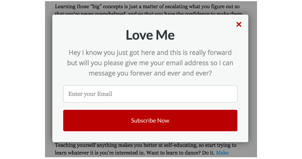
Is it timing? Could be – popups that appear immediately after arrival feel intrusive. But you’d be happy to see this popup a few seconds (ideally, about 10) after your arrival at an eCommerce site:
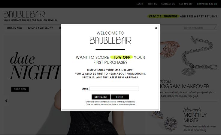
Would a visitor arriving to this site reject an offer of 15% discount? Not likely.
And that’s the secret – all good popups have one thing in common – they offer value, just when it’s needed.
What’s an Exit Popup?
‘Exit popups need an overwhelmingly valuable offer’ – cites Hello Bar’s co-founder Neil Patel, in this post from Quicksprout.
This is a popup that appears just when a user is about to leave the site. Hence the name.
They do so by tracking the visitor’s mouse movements. When the visitor moves their mouse up towards the URL bar, the exit popup appears as a last chance opportunity to gather the person’s attention – and their email address.
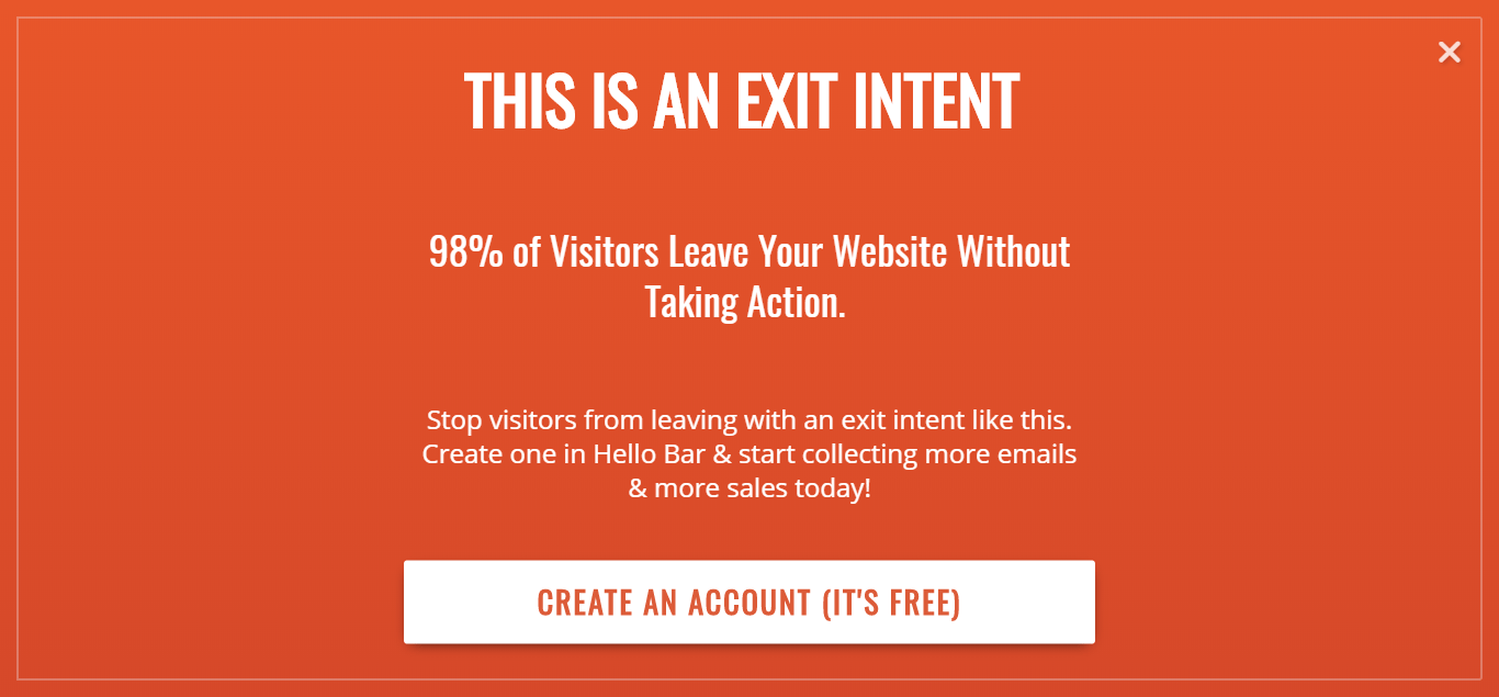
Many sites prefer exit popups because they don’t get in the way of content consumption. They only appear when someone is already getting ready to leave a site, meaning that they don’t interfere with any functionality or design of the website. Plus, exit popups aren’t likely to get you downlisted in Google mobile SERP (more on this in #5).
If your website or landing page is allowing visitors to exit without ‘converting’ (98% of visitors will leave your website without converting, after all), it falls on the exit popup to convince the visitor to give you an ‘in’ – an email address, for instance – which you can use to stay on top of their mind or bring them back to your site.
In this post, we’re discussing 5 mistakes everyone makes while creating exit popups – and their fixes – to make sure you don’t leak any traffic before it converts.
Mistake 1: Poor Targeting
“This site uses cookies to improve your experience.”
Almost every website you visit will show a variation of this message upon your arrival – “We’re dropping cookies on you. You can click ‘accept’, or you can continue to browse, by which we’ll assume you accept.”
Guess what? Popups are part of the site experience. The cookies your site drops on the user is used to collect first party data that you can read in your analytics dashboard – and use to understand your users and improve popup targeting.
Conversions drop when there’s a mismatch between who sees your popup and what offer is being displayed. A repeat visitor – who has already subscribed to your blog, mind – would not appreciate being hit in the face with a ‘Subscribe’ popup every time he/she is trying to exit.
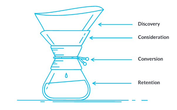
If your content has a lot of page views but an equally high exit rate, visitors are leaving without engaging with the rest of your site and content. They are still drifting about at the top of your content marketing funnel, and it’s your job to take them forward.
#Fix-it: Understand where your users come from, which pages they see, and where they drop-off without converting. Your Google Analytics ‘User Flow’ report (found under the Acquisitions tab) is a good place to start mapping user interest and awareness to an extent.
Select Source/Medium as your primary dimension. Let’s say you’re optimizing your offer for direct traffic whose interaction begins with /blog.
Per this highly detailed guide to direct traffic in Google Analytics, the simplest reason you have direct traffic (in Google Analytics terms: source/medium = direct/none) is because the users arrive to your page via bookmark or by typing the address directly in the address bar.
Logically, that would imply that this traffic segment values your blog as a good source of information. Go through further interactions and find pages that have high drop-offs. This implies that while the content is great, it still fails to keep the users interested enough to explore further or convert.
Let’s say your direct traffic starts with /blog, reaches a page with the slug ‘e-commerce-marketing’, and then drops off. You can show them a link to more content on e-commerce marketing when they are about to exit, an e-book on a related topic in exchange for a lead gen form, or a curated newsletter for this category of content in exchange for their email address. Plenty of possibilities.
Then target this segment like so:
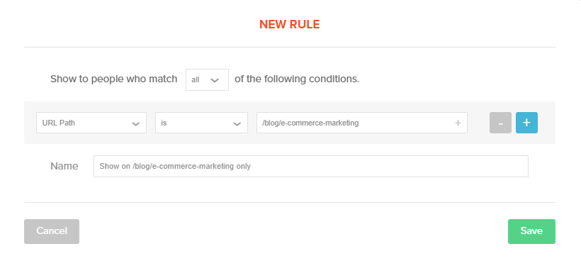
Map more traffic interactions by their referrer sites and create similar exit popups for pages with high drop-offs. Hello Bar lets you target the popup by referrer URL, so you can show different popups on the same page to traffic from different sources.
I stress ‘related topics and categories’ because context matters, which brings me to my next point.
Mistake 2: Offers Out of Context
Gary Vaynerchuk (best-selling author, investor, and CEO of VaynerMedia) is quoted saying, “Content is king. Context is God.” Here’s a little story he tells of his experience with Acura.
“I was on ESPN on mobile to check football scores and trying to click out of a pop up ad, but it ended up clicking through to Acura’s website instead.
My experience was actually sold back to Acura as an “impression” and a “click through.” Which, for you non-marketers, means intent or interest. And yet nothing could be further from the truth. I had no intent or interest whatsoever. Acura stole my most precious asset: time.”
Error: Acura thought it better to target their ads based on a person’s browsing history (instead of matching the ad to the content of the page it appeared on). This is called behavioral advertising.
#Fix-it: An ad for a car would be significantly less jarring if it appeared next to content that’s about automobiles. This is called contextual targeting in the advertising space.
Targeting an ad (and your own popup) by context plays upon the interest that a visitor has already shown by arriving on a particular type of content on your site. A popup with an offer that matches with the subject matter on the page makes it less jarring, while the context of what’s on the page strengthens the value proposition of your offer. Suddenly, it becomes relevant.
Optimize existing popups for contextual relevance. Start by going through pages with the highest exit rate. Create exit-popups with offers related to the content on those pages.
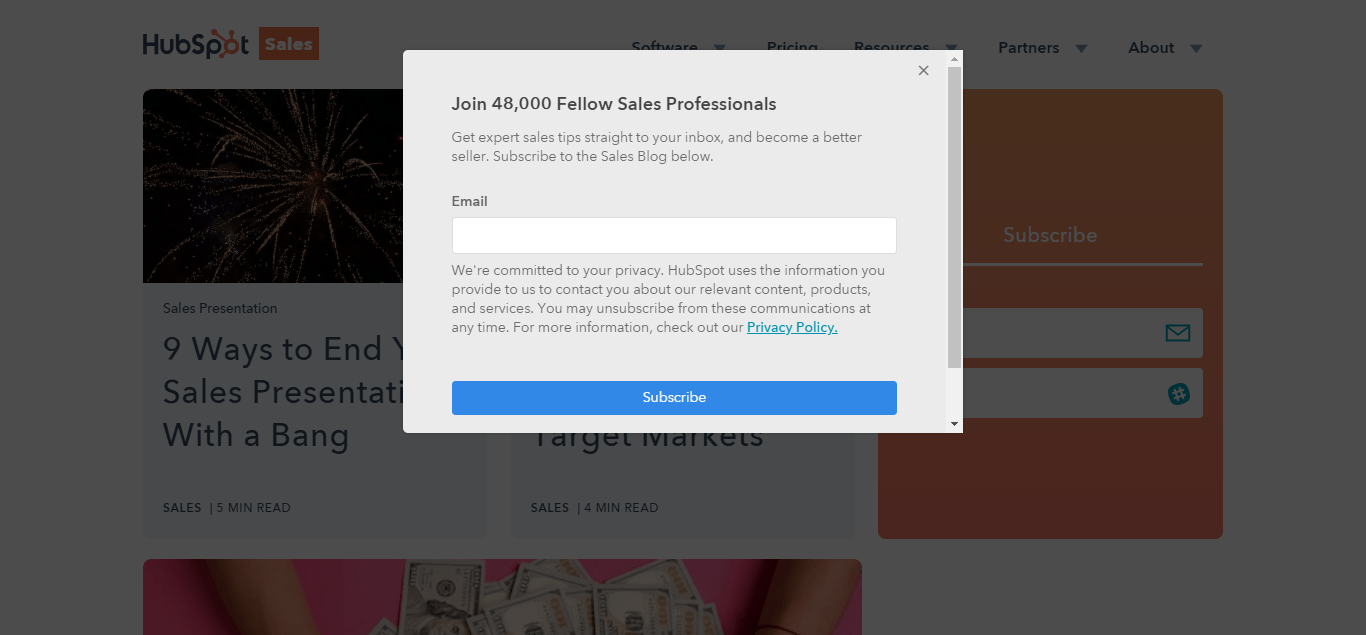
I went through so many conversion optimization product sites to gather examples of well-done popups for this post. Here are two simple examples of context by Hubspot. Pay attention to the popup copy in both.
First, as you’re about to leave their sales blog:
Then, on their (customer) service blog:
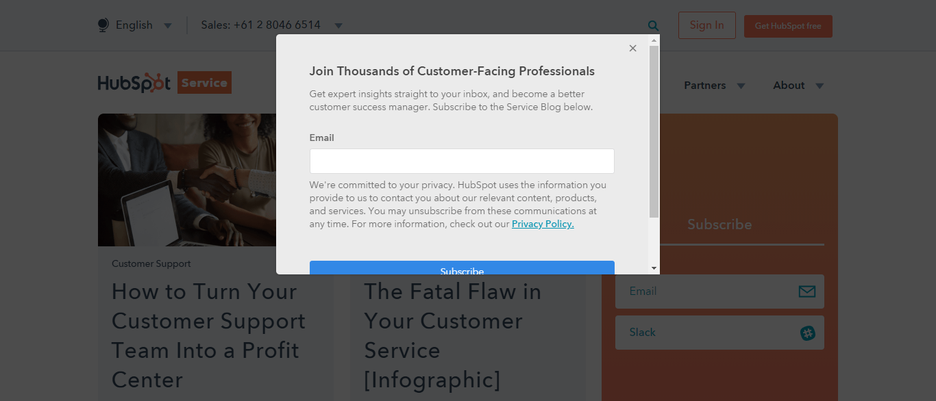
These popups are related to the page (sales or service blog). The copy is direct [“Join 48,000 Fellow Sales Professionals”], which brings me to my next point.
Mistake 3: Bad Copy
Copy can be bad without intending to be. Let me explain with examples.
1. Length: “Do I leave, or do I stop to read a comprehensive essay extolling the virtues of your content?”

2. Clarity: “Do I want to give hugs? Am I receiving free access to hugs? What is going… Wait, I just realized I hate hugs.”
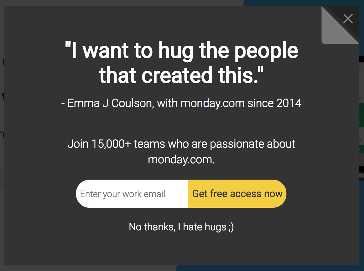
You won’t shout witticisms – or a glowing review left by some previous customer – at someone who is about to leave your store without purchasing anything. You’d lead with an offer that gives them pause. That’s what you need to do in your exit-popup.
Thankfully, bad copy is among the easiest things to fix once you know what to aim for.
#Fix-it: Neil Patel shared some awesome headline copywriting tips (with examples), which you can steal. As for the rest, make sure to:
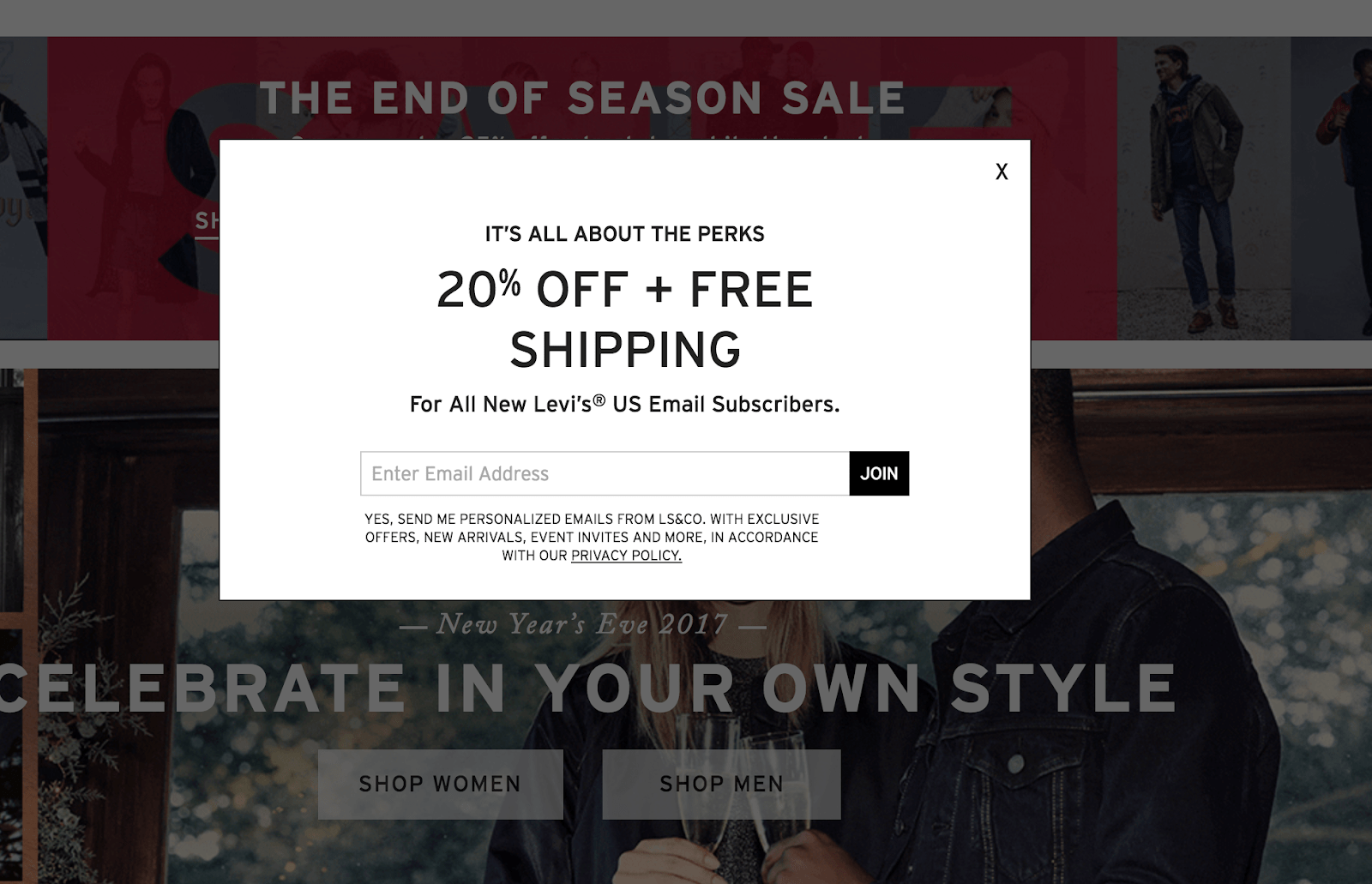
Be direct: It’s better to be clear than clever. Make sure the popup clearly conveys what you’re offering, and what you’re asking for in return.
This popup on Levi product page accomplishes that.
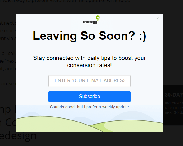
Keep it Short and Simple (K-I-S-S): There’s a time and a place for superlatives and minutiae. An exit popup is not it.
This CrazyEgg exit popup remains short and sweet while telling me everything I need to know:
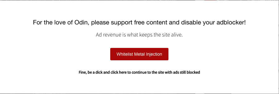
Add some personality: This can be tricky to pull off, but extremely rewarding. The idea is to shock the average human out of their browsing-induced stupor (aka banner blindness) by adding some personality to your popup copy.
Here’s an anti-adblock message (used commonly by ad-supported publishers), asking the user to turn off their browser’s adblock extension for their site.
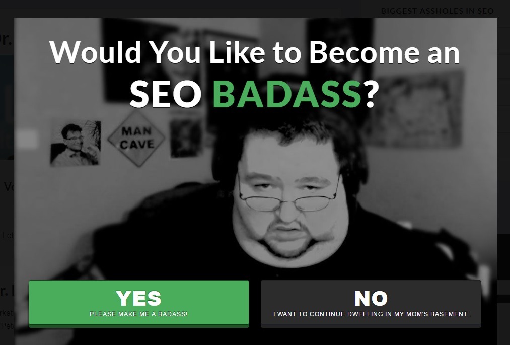
If you confirm-shame, be respectful: No-one likes passive-aggression. If you ‘shame’ your visitors for not doing as you asked, tone it down so it’s respectful.
Look at the ‘No’ button in this popup and tell me if it doesn’t raise your defensive hackles:
4. Mistake 4: Design Don’ts
There are no hard-and-fast rules about design, except making sure that the alignment isn’t off and the colors don’t make your eyes bleed. You don’t even have to complement your site theme – Hello Bar found that some popups convert better when they are bright colors that don’t necessarily match the site theme.
And yet, Mashable managed to mess it up with this:
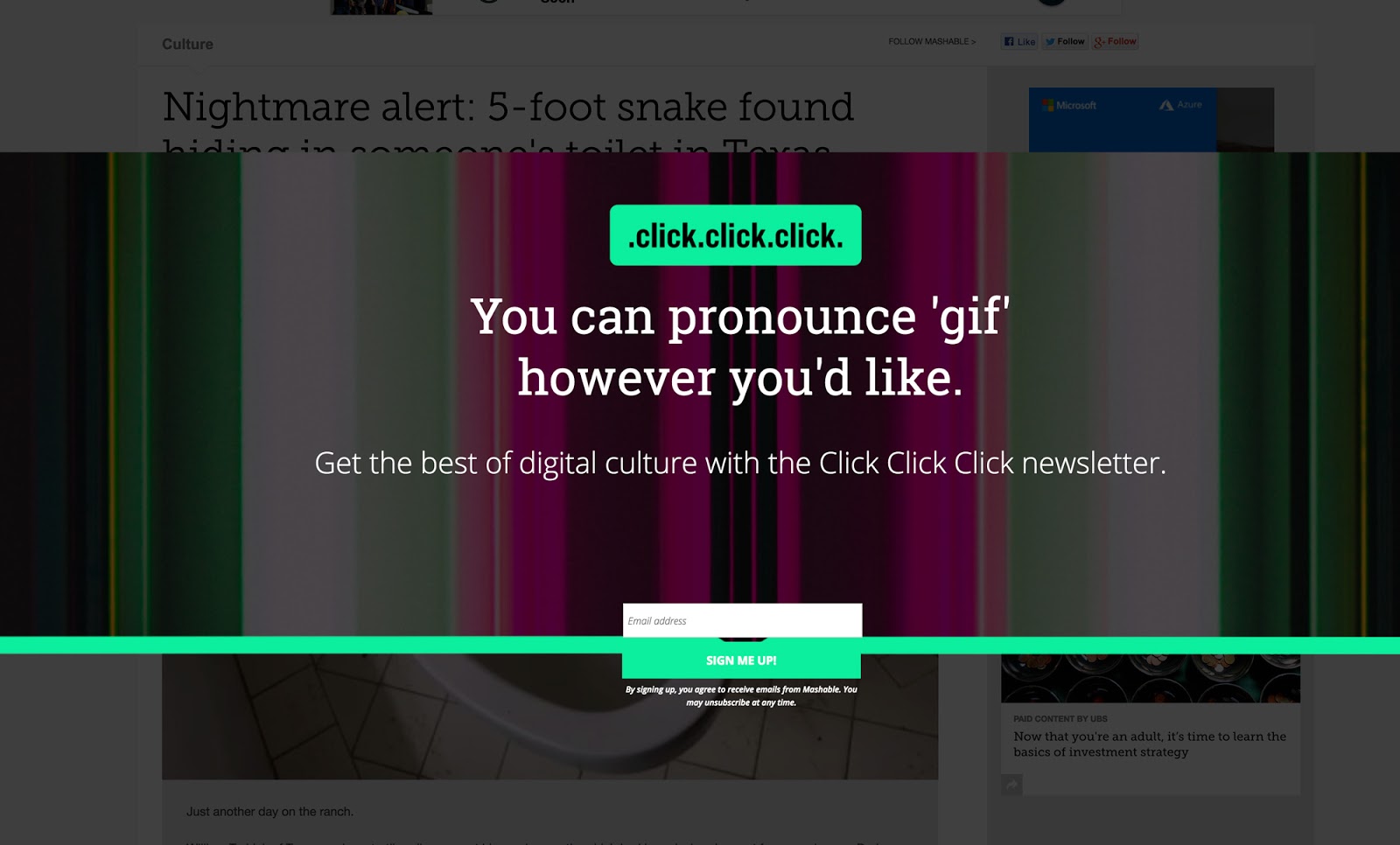
That green line with the button hanging off of it flies in the face of everything you hold dear about symmetry. The headline looks like a button – which is a play on the ‘Click click click’ name but ends up being misleading.
The whole thing reinforces the importance of following basic design principles, like ‘less is more’.
#Fix-it: Just be clean and keep the following in mind:
- Reduce noise / distraction. Remove unnecessary elements from your design. The Mashable example above has a noisy background and the design distracts from what is being offered.
- Align the elements from center to ensure it doesn’t feel ‘off’ to the users. If you want to use asymmetry, do it in accordance with the golden ratio principle to highlight elements that matter.
Here’s an example that does this:
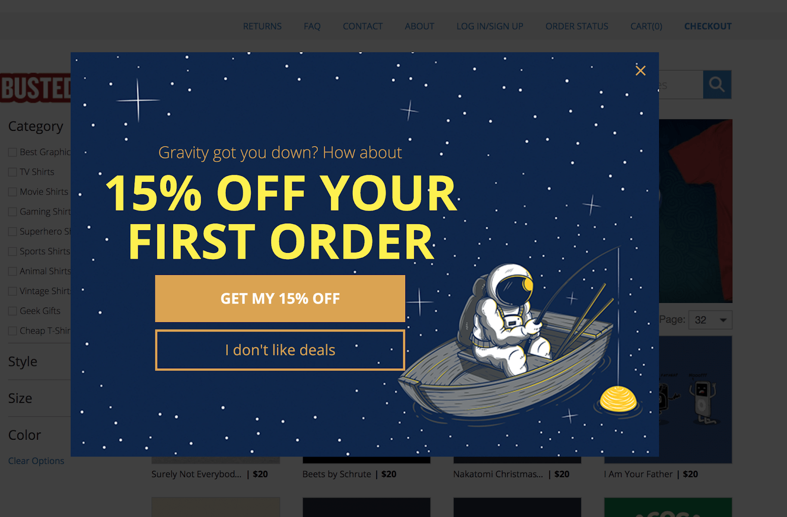
Other than that, the sky’s the limit. Go nuts.
5. Mistake 5: Ignoring Mobile Experience
A popup that appears on arrival is a perceivable, identifiable cause of bad experience. This will not only annoy your visitors, but also impact your organic search traffic after the January 2017 update to Google’s mobile search algorithm.
Thankfully, exit intent popups are excluded from Google’s mobile search penalty. John Mueller (Google Switzerland) is quoted on Search Engine Journal, explaining this:
“What we’re looking for is really interstitials that show up on the interaction between the search click and going through the page and seeing the content. So that’s kind of the place we’re looking for those interstitials. What you do afterwards, like if someone clicks on stuff within your website or closes the tab or something like that then that’s kind of between you and the user.”
But making your desktop popup ‘responsive’ and calling it a day won’t fly either.
#Fix-it:
- Large ‘Close’ button: Your popup should have a ‘close’ button that’s visible and large enough for a tap – especially if the popup covers over 70% of the viewport and cannot be dismissed when the user taps outside it.
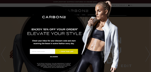
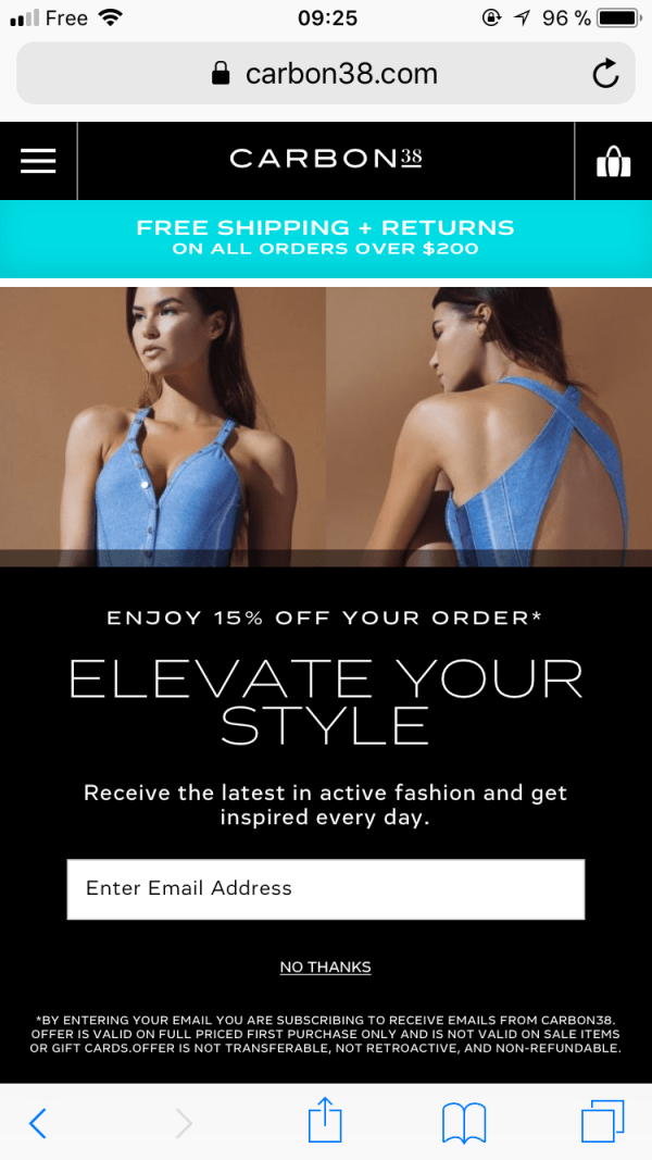
- No Images: A good, high-gloss image is usually great in a popup, but can be too heavy for mobile bandwidths and too much for the limited space available. Consider removing them from the mobile popups.
Here’s Carbon38’s popup on desktop:
And here is the same on mobile:
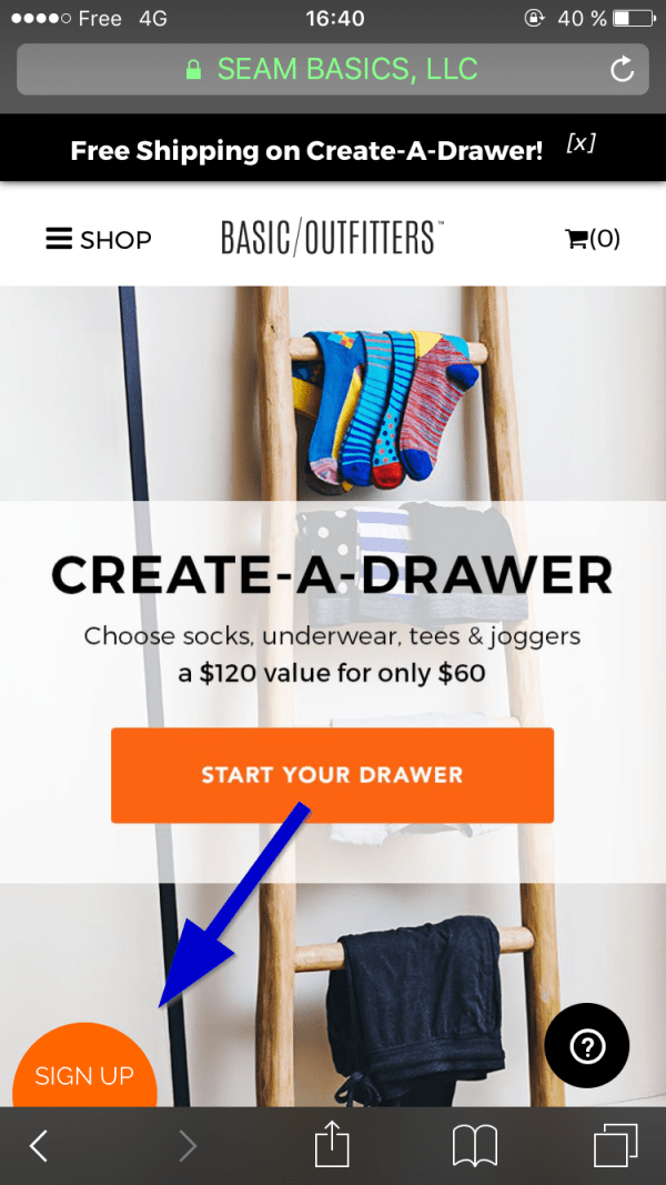
- Progressive disclosures: Minimize clutter further by taking the user through the motions one step at a time. For instance, show the offer, let the user denote interest (by clicking the button), and then take them to a screen with the input field.
Here’s a good example:
Tl;dr
An exit popup needs an offer that gives a person who’s about to exit a reason to stick around. It is your final shot at a conversion. You can ensure it doesn’t suck by making it:
- Targeted – Think Who sees it
- Contextually relevant – Where does it appear
- Direct – What is in it
- Clean – How does it look
- Optimized for mobile – Because it’s a no-brainer when over half the population is on mobile.
As you tick off points listed in this post, your popup becomes less likely to miss and more likely to convert.
Share your exit popup do’s and don’ts in the comments below!
Author Bio: Payal is a content marketer at AdPushup. She writes about conversion and revenue optimization for web publishers and bloggers so they can stay in business and continue to provide the world with awesome and freely-accessible content.


