5 Best Ebook Popup Examples to Capture Leads

I hope you enjoy this blog post. If you want Hello Bar to grow your leads, click here.
Author:
Mansi
Published
October 24, 2025

Table of Contents
Most websites talk about lead magnets. Few actually make them work. Ebooks still do — if you present them right.
That’s where ebook popups come in. A simple, honest offer that appears when your visitor is ready to engage. It’s direct. It’s personal. And when done well, it doesn’t annoy people — it helps them.
Let’s look at the why ebook popups in 2026, how to create one and five ebook popup examples that actually do their job: pull attention, deliver value, and bring in leads without cheap tricks. Each one uses design, timing, and messaging smartly enough to make visitors stop and think, “Yeah, I want that.”
Why ebook popups in 2026
People still trade their emails for something that feels genuinely helpful. What’s changed isn’t the idea — it’s how you time and present it. The best ebook popup examples appear when a visitor has already shown interest, not the second they land on a page. That moment of timing — through scroll triggers or exit intent — is what makes the offer feel natural, not intrusive.
Relevance also matters more than reach. You don’t need a million visitors; you need the right ones seeing the right offer at the right moment. When your ebook solves a real problem for your audience, that small popup suddenly becomes a quiet but powerful conversion tool.
How to create an ebook popup that actually converts
If you’ve looked through enough ebook popup examples, one thing’s clear — good ones aren’t accidents. They’re built with small, intentional choices. Here’s how to create yours without overcomplicating it:
Step 1: Pick the right ebook.
Start with something people genuinely want. Make sure it fits the page they’re on — if they’re reading about marketing, offer a short guide, not a random industry report. Relevance beats volume every time.
Step 2: Design it clean.
Keep the layout light. Show the ebook cover, write one honest line about what’s inside, and add a button that feels human — something like “Send it to me.” You don’t need more than that.
Step 3: Time it smartly.
Use triggers like scroll depth or exit intent. Don’t interrupt readers right away. Let the popup feel like a nudge, not a block.
Step 4: Test and adjust.
Try small variations — headline, button, colors. Watch what gets people clicking. The best ebook popup ideas usually come from testing, not guessing.
5 Best Ebook Popup Examples & Ideas
1. DigitalMarketer: Give real tools, not empty promises
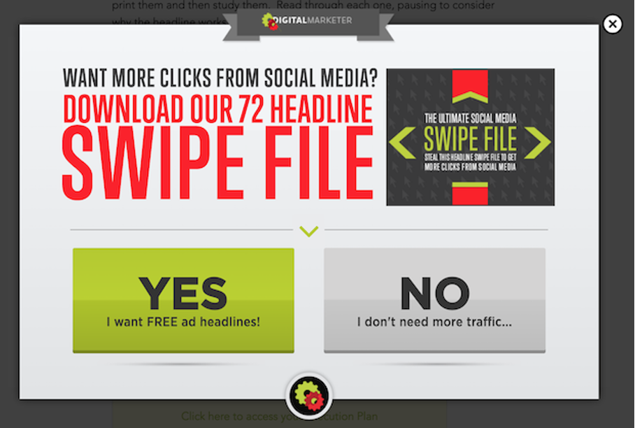
Among all ebook popup examples, DigitalMarketer’s is one of the boldest. They don’t offer vague “marketing guides.” They hand over a real swipe file — 72 ad headline ideas marketers can use instantly.
The popup headline hits directly: a short line, no fluff. The copy gets straight to the value — not “learn,” but “get.”
Two buttons seal the deal:
- “Yes, I want free ad headlines.”
- “No, I don’t need more traffic.”
That second line works like quiet reverse psychology. It makes saying “no” feel ridiculous, especially for anyone trying to grow online.
This is one of those ebook popup ideas that works because it respects the reader’s time. No long explanations. Just clear payoff.
The takeaway?
If you’re giving away an ebook, make it something people can use immediately. Not theory. Not fluff. Actual, practical help. That’s what keeps this popup ahead of hundreds of others trying to trade generic PDFs for emails.
2. BOOM! by Cindy Joseph: Know exactly who you’re talking to
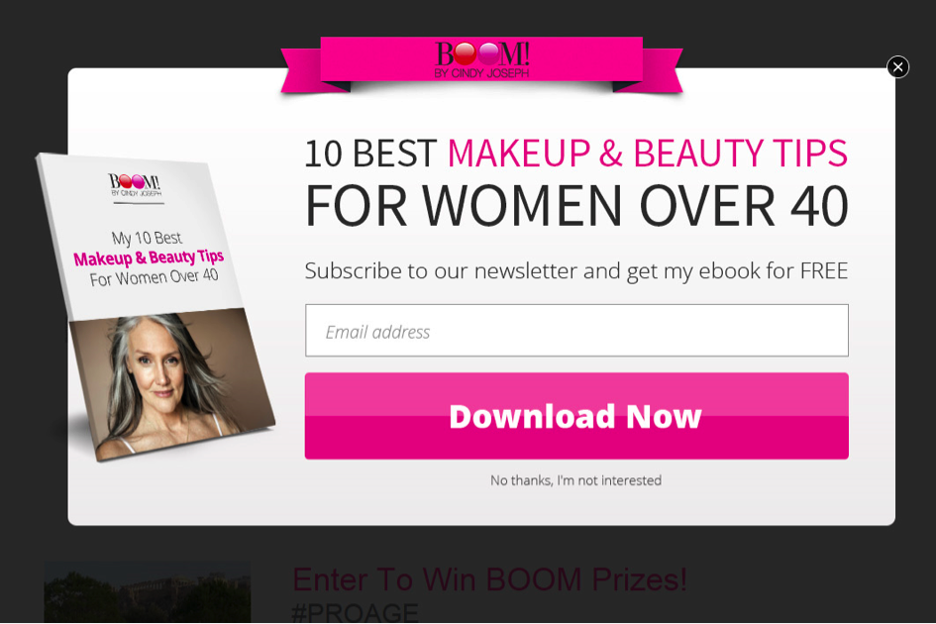
Some ebook popup examples fail because they talk to everyone. BOOM! by Cindy Joseph does the opposite — they talk to one person, clearly and confidently.
Their popup offers a free ebook filled with makeup and skincare tips — but specifically for women over 50. That small detail changes everything.
The tone feels warm, not pushy. The visuals are calm and elegant, matching the brand’s style. The ebook cover image looks like something you’d actually want to flip through, not just another stock design.
This is one of those ebook popup ideas that builds instant trust because it feels like it was made for you. It doesn’t scream “lead generation.” It feels like a brand sharing something useful and relevant.
Lesson?
Don’t write an ebook that fits everyone. Write one that fits someone. When you narrow your message, your popups convert better — and your readers remember you longer.
3. Antavo: Match your ebook to your expertise
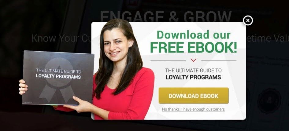
Antavo is all about loyalty programs, so their popup gives away an ebook about — you guessed it — loyalty strategies.
But what makes this one stand out among other ebook popup examples is how clean and purposeful it looks. There’s no over-design. Just a bright yellow call-to-action button that says, “Download Ebook.” The rest of the popup stays minimal, with enough breathing space to feel professional and inviting.
It’s simple, but it works because everything aligns:
- The topic fits the brand perfectly.
- The color and layout reinforce confidence.
- The message makes sense in one glance.
Many ebook popup ideas go wrong because they try to sound exciting instead of helpful. Antavo’s doesn’t do that. It lets the value speak for itself. When a visitor sees it, they know immediately what’s being offered and why it matters.
If your brand has deep expertise in one area, make your ebook about that — not something broad. Then design the popup so it feels like an extension of your product, not an interruption.
4. The Turmeric Co.: When visuals do half the talking
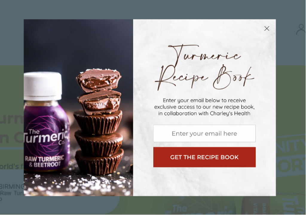
The Turmeric Co. is one of those ebook popup examples that proves visuals can sell without words doing all the work.
Their popup offers a free turmeric recipe book — a smart move for a wellness-focused brand. The moment it appears, you see bright, healthy ingredients, smooth color contrast, and design that instantly connects to the brand’s energy.
No complicated copy. Just a headline that says what it is, and a clear invitation to get it.
The best part? They use exit-intent triggers — meaning the popup appears when someone is about to leave the site. It catches attention without interrupting the browsing flow. That one small timing detail makes a big difference in how people perceive it.
This is one of those ebook popup ideas that feels natural because it fits both the brand and the customer’s mindset. It doesn’t push. It offers something that belongs right there in that context — free recipes for people already looking into health and nutrition.
For any brand in wellness, beauty, or food, this approach is gold: Show, don’t shout. Let your visuals and timing do most of the persuasion.
5. Omnipemf: Align the offer with the mood of your audience
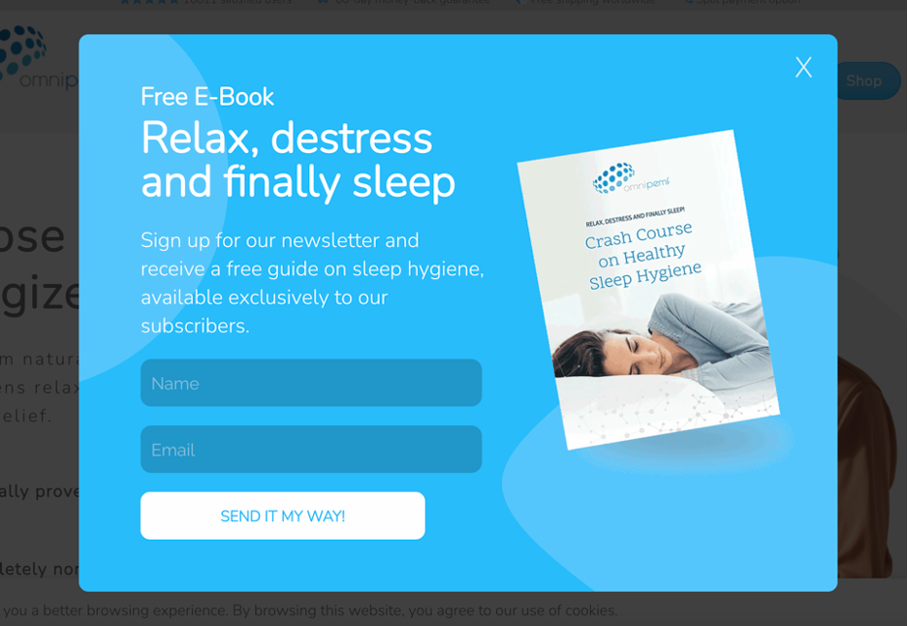
Omnipemf’s popup is another great entry among ebook popup examples — quiet, calm, and on-brand.
The company focuses on sleep and relaxation products, and their ebook on “Sleep and Stress Relief” fits that perfectly. The popup design follows the same rhythm — soft colors, calm layout, and an inviting call-to-action button that reads, “Send it my way.”
That CTA stands out because it’s conversational. It doesn’t feel like a transaction. It feels like a favor — a friendly tone that builds comfort and trust.
This is one of those ebook popup ideas that proves tone is everything. You can have the best visuals in the world, but if your message sounds robotic, you’ll lose the connection. Omnipemf wins because their language, visuals, and offer all say the same thing: slow down, rest, breathe.
And that consistency is what makes the popup effective. When everything — from copy to design — supports one emotional idea, visitors don’t just click. They feel it.
Also read our blog on Lead Capture Popups: How to Create?
What makes these ebook popup examples work?
When you line up these five ebook popup examples, a few patterns show up.
They’re not random designs or recycled ideas — they’re intentional choices based on audience understanding.
Let’s break that down:
- DigitalMarketer shows the power of offering tools people can use right away.
- BOOM! by Cindy Joseph teaches the importance of knowing your audience deeply.
- Antavo highlights how clean, relevant design builds credibility.
- The Turmeric Co. proves visuals and timing can make or break engagement.
- Omnipemf shows how emotion and tone can convert just as much as design or offers.
What connects them all is restraint. None of these brands overload the screen. They don’t throw in long forms or generic headlines. They focus on one clear exchange: “We’ll give you something valuable, and in return, you give us a way to stay in touch.”
It’s fair. It’s balanced. And that’s why it works.
Final thought
The best ebook popup examples don’t feel like popups. They feel like small, well-timed gestures — useful, friendly, and on-brand.
If your ebook solves a real problem and your popup respects the visitor’s space, people won’t mind sharing their email. They’ll appreciate it. That’s what turns an ebook popup idea from a gimmick into a genuine connection.


