6 Best Exit Intent Popup Examples (That Actually Work)

I hope you enjoy this blog post. If you want Hello Bar to grow your leads, click here.
Author:
Mansi
Published
October 30, 2025

Table of Contents
When someone’s about to leave your site, that’s usually it, they’re gone.
But not always.
With the right message, you can stop that exit in its tracks. That’s what an exit intent popup does. It tracks behavior like mouse movement or scroll patterns, and when it detects that a visitor’s about to leave, it shows a small window with a message, offer, or question.
It’s simple, but powerful. The average business loses more than 90% of visitors without getting a single action. A well-timed exit intent popup changes that by giving people a reason to stay, buy, or share feedback.
At Hello Bar, we’ve seen this tactic save thousands of abandoned carts and bring back visitors who were seconds from leaving.
Here are six exit intent popup examples that actually work, based on real data and real behavior, and how you can create each one using Hello Bar. We’ve jumbled the order so you can see different approaches without assuming one size fits all.
1. Free Shipping or Add-On Offers
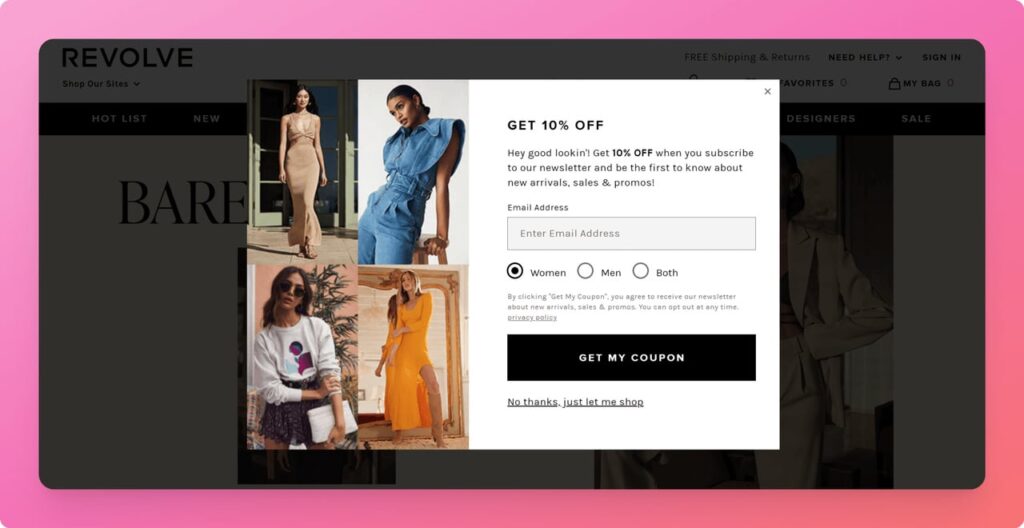
Let’s start with a problem everyone knows: shipping costs. You’ve seen it happen, someone adds items to their cart, heads to checkout, and then leaves as soon as they see shipping fees.
A free shipping exit intent popup solves that moment of hesitation.
Imagine a popup saying:
“Add $10 more and get free shipping.”
or
“Complete your order now and we’ll ship it for free.”
It’s small, but it changes how people see value. They don’t feel pressured, they feel rewarded.
Brands using Hello Bar often set this up to appear only on checkout pages. That way, it feels natural, not random. Quince uses a similar approach with a clear, single-line offer that turns price friction into a benefit.
Out of all exit intent popup examples, this one works because it directly fixes what’s pushing people away. A small offer solves a big problem, and helps close the sale.
2. Content Upgrades for Readers
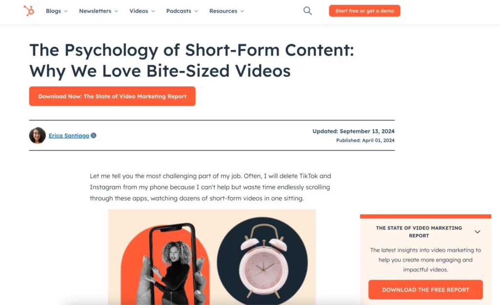
Some visitors aren’t shopping, they’re learning. Maybe they’re reading your blog, comparing ideas, or researching a product. They’re valuable too, even if they’re not buying yet.
That’s where content upgrade exit intent popups work perfectly. HubSpot uses it perfectly.
Let’s say someone’s reading your post about improving conversion rates. Just as they reach the end and start to leave, your popup says:
“Want a free checklist to improve your conversion rate? Enter your email and we’ll send it.”
That’s not pushy. It’s useful.
They get value, and you get a lead.
This is one of those exit intent popup ideas that helps you grow your list while also giving your visitors something relevant.
At Hello Bar, we’ve helped publishers and SaaS blogs use this exact approach. You can trigger it when a visitor spends a set amount of time on the page or scrolls to the bottom. The more targeted you make it, the more natural it feels.
It’s one of the most underrated exit intent popup examples, but for content-driven sites, it’s pure gold.
3. The Quick Feedback Popup
Sometimes, you don’t need another sale, you need insight.
If someone leaves your site, wouldn’t it help to know why?
Maybe they couldn’t find what they needed, or the price didn’t match their expectations. You can only fix it if you know it.
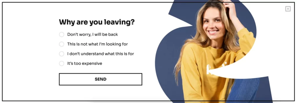
Getsitecontrol’s short feedback exit intent popup works wonders for this.
Something like:
“Leaving so soon? Can you tell us what stopped you from checking out?”
Followed by a few short options, “Price,” “Shipping,” “Didn’t find the product,” “Just browsing.”
That’s it. No forms, no clutter. Just quick, honest feedback.
Using Hello Bar, you can design these popups to appear only on product or cart pages, so the responses actually make sense. Businesses that use these exit intent popup examples often discover small friction points they never noticed before, things that quietly kill conversions.
It’s one of those exit intent popup ideas that doesn’t just capture data, it helps you make your entire site better.
4. Limited-Time Countdown Popups
Urgency makes people act. Not because they’re tricked into it, but because they don’t want to miss something real.
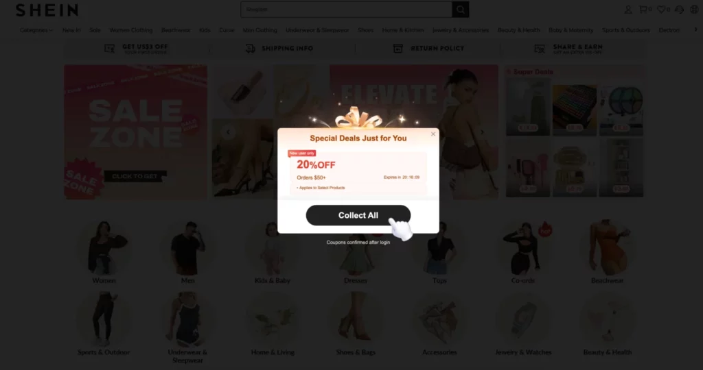
A limited-time exit intent popup uses a countdown or clear deadline to create that small push.
Picture this: someone’s about to close your tab, and a popup appears saying,
“Wait! Get 15% off if you check out in the next 10 minutes.”
Now there’s a reason to decide right now, not later.
You can use Hello Bar’s built-in countdown timers to make this automatic. The message appears only when someone shows exit behavior, and the timer starts ticking immediately.
It’s one of the strongest exit intent popup examples for ecommerce, especially during seasonal or flash sales. Shein and similar brands do this often, not with spammy messages, but with real short-term deals that make sense in context.
If you’re testing exit intent popup ideas, try this one when you’re running a time-bound campaign. It turns passive visitors into fast buyers.
5. Discount Popups to Save Abandoned Carts
This one’s the most common, and for good reason.
When a shopper abandons their cart, you’re losing someone who was already interested. A discount exit intent popup gives them one final reason to finish the purchase.
Something as simple as:
“Wait! Here’s 10% off your order if you complete it now.”
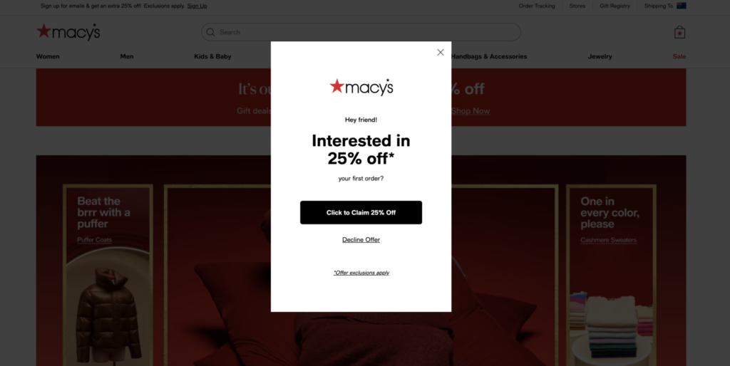
Macy’s does this well. Their exit popup says, “Sign up for 25% off your first purchase.” It doesn’t scream for attention; it just gives a fair trade, an email for a discount.
With Hello Bar, you can automate this by setting rules for specific pages like checkout or cart. When the visitor’s cursor moves toward the exit, your popup slides in instantly.
Among all exit intent popup examples, this one delivers consistent ROI because it turns hesitation into decision. Even a small discount feels like a thank-you, not a trick.
6. Newsletter Sign-Up Popups
Some visitors won’t buy, won’t fill a form, won’t take a survey. But they might want to hear from you later, if you ask right.
That’s why newsletter exit intent popups are such a good long-term play.
A visitor looks at your products, seems interested, but decides to leave. Then your popup says:
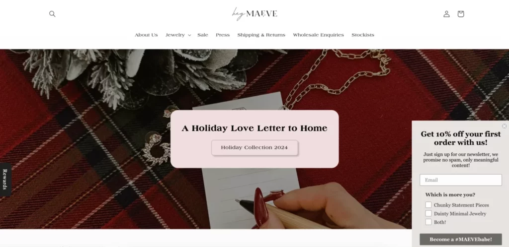
“Join our email list and get 10% off your first order.”
They don’t have to think too hard. It’s one simple choice: leave, or join for a small benefit.
At Hello Bar, these popups are among the most-used templates. They’re lightweight, easy to customize, and perfect for growing your audience.
The real win is what happens after. Once that visitor’s on your list, you can stay in touch with future offers or updates, without relying on ads or random visits.
Of all exit intent popup examples, this one might not bring instant conversions, but it builds consistent engagement and future sales.
What Makes These Exit Intent Popup Examples Work
All six exit intent popup examples above share the same pattern. They appear right when the visitor is about to leave, they give something meaningful, and they don’t waste words.
That combination is what makes them work.
A popup isn’t supposed to interrupt. It’s supposed to help.
When someone’s halfway out, the message shouldn’t be loud, it should be relevant.
Here’s what every effective exit intent popup idea has in common:
- Right timing: It triggers based on behavior, not a timer.
- Real value: A discount, a free guide, a quick question, something that makes sense.
- Simple design: Clear headline, short text, single call to action.
- Respectful tone: It asks, not demands.
At Hello Bar, we’ve seen that the best performing popups usually look boring on purpose, no flashing colors or long forms. Just a clean box with one good reason to stay.
Also, read our blog on Elementor Popup Builder Advanced Triggers (Scroll Depth, Exit Intent)
How to Build One That Fits Your Business
If you’re trying exit intent popup ideas for the first time, don’t overthink it. Start with one page, like your checkout or blog, and test a single message.
A few pointers:
- Make the offer real. If you say “limited time,” mean it.
- Use fewer words. A headline and a short line are enough.
- Don’t show it too early. Only trigger it when someone’s clearly about to leave.
- Match it to the page. If it’s a blog, offer a guide. If it’s a cart, offer a discount.
- Keep testing. Change the copy, timing, and offer every few weeks to see what works best.
Hello Bar lets you A/B test all this without code. You can try multiple exit intent popup examples at once and track what actually brings clicks or sign-ups.
Final Thought
A good exit intent popup doesn’t feel like a popup. It feels like a last-minute bit of help.
The best exit intent popup ideas don’t push, they offer. And when you do that at the right moment, people respond.
Start small, keep it honest, and let Hello Bar handle the timing. You’ll be surprised how much difference one popup can make before someone decides to leave.

