15 Famous Websites with Popups in Real (And Why You Should Use Them Too)

I hope you enjoy this blog post. If you want Hello Bar to grow your leads, click here.
Author:
Mansi
Published
October 7, 2025
Table of Contents
If you’ve spent even ten minutes browsing the web, you’ve seen popups. They greet you with discounts, ask for your email, remind you about that item you forgot in your cart, or just tell you something worth knowing.
And whether you love or hate them, there’s no denying one thing: they work.
The smartest brands out there use website popups not to annoy you, but to guide you, to help you take that one step closer to what you already wanted. That’s why looking at famous websites with popups is a shortcut to learning what actually works.
In this guide, you’ll see 15 detailed websites with popups examples, what they do, how they’re designed, and why you might want to borrow their ideas. By the end, you’ll have plenty of website popup ideas that can fit any business, from e-commerce to SaaS to local retail.
1. Lemme – The Two-Step Popup
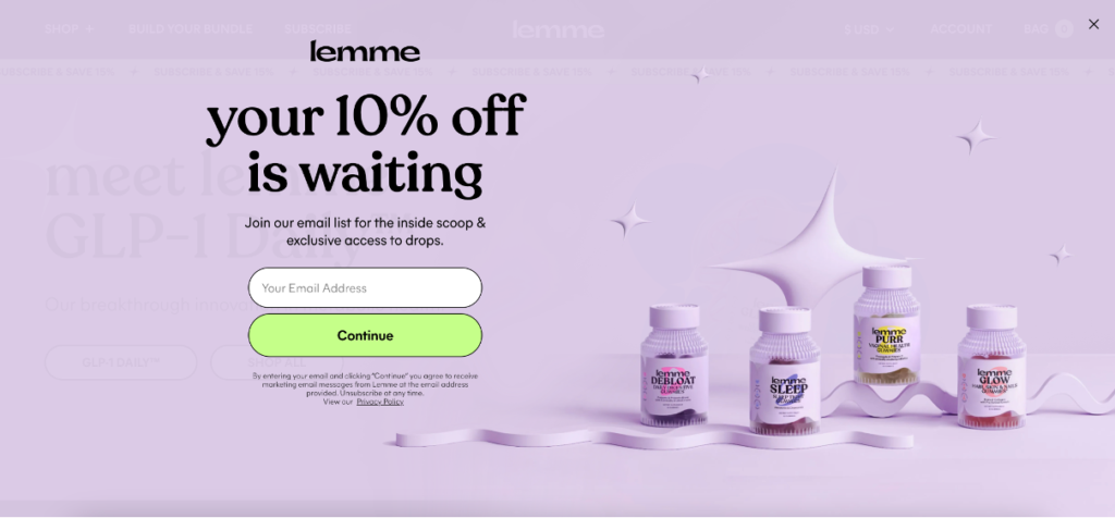
Lemme (Kourtney Kardashian’s wellness brand) uses a two-step website popup that feels elegant rather than intrusive.
Step one: the popup asks for your email in exchange for 10% off.
Step two: once you click, it asks for your phone number.
This layered approach makes users comfortable sharing information gradually instead of being asked for everything at once.
The visuals are soft, minimal, and fully on-brand, pastel background, simple text, and space to breathe. It’s one of those website popups examples that shows how pacing matters as much as design.
Instead of chasing quick sign-ups, they build trust.
For any business collecting both email and SMS leads, this is a great website popup idea to model, one that grows your list without feeling like a push.
2. Sephora – Event Promotion Popup
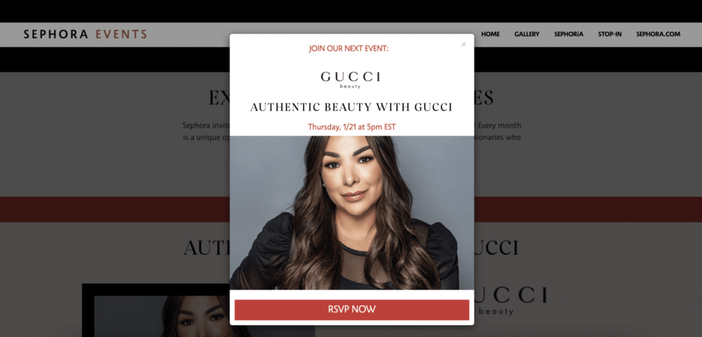
Sephora often runs live events and product launches. Their timed popup appears after a few seconds, inviting visitors to RSVP for a “Live Gucci Experience.”
This isn’t just a sales tactic, it’s a smart way to collect leads tied to intent.
People signing up aren’t just random subscribers; they’re users interested in beauty and fashion events.
It’s one of the great websites with popups idea for brands hosting workshops, webinars, or launches.
3. Glossier – Humor and Personality
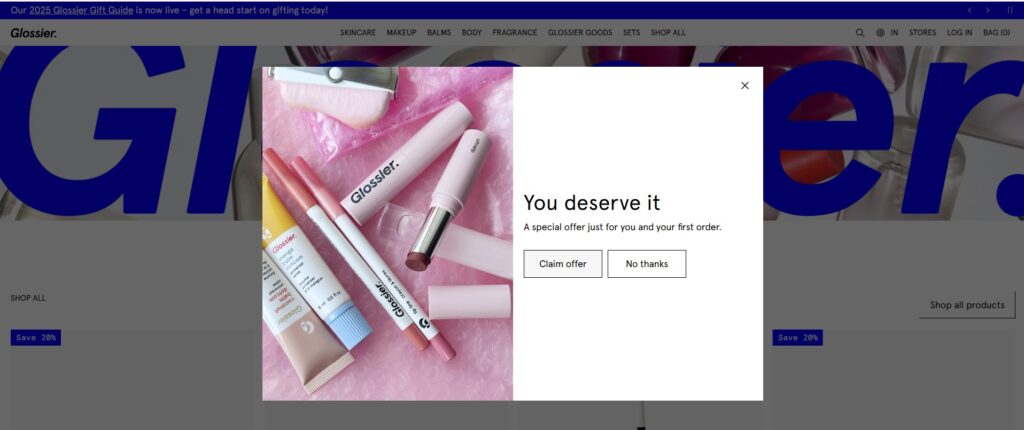
Glossier’s popup keeps things simple, kind, and beautifully on-brand. Instead of screaming for attention, it opens with a gentle line — “You deserve it.” It offers a small reward for first-time shoppers, framed as something earned, not given.
The design is clean: soft product visuals on one side, clear text and two calm buttons — “Claim offer” and “No thanks.” No pressure. No noise.
Why it works: it feels like a friend offering a little treat, not a company pushing a sale. This is the kind of popup that builds goodwill while still driving conversions — proof that empathy sells just as well as urgency.
4. Caraway – Free Shipping Fullscreen Popup
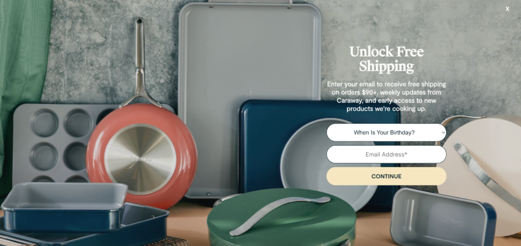
Caraway uses a fullscreen popup promoting free shipping. It’s bold, unavoidable, and valuable.
Instead of chasing an email, they use the popup to nudge immediate purchases.
This kind of website popup is great for high-ticket products where customers hesitate at checkout. Sometimes, a little reassurance, like “Free shipping on all orders”, removes the last barrier.
5. ClickUp – Product Value Popup
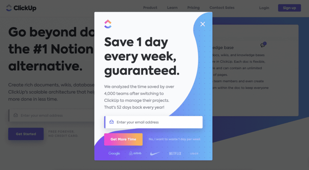
ClickUp doesn’t bother with discounts. Their popup tells you why their app saves time and boosts productivity. For SaaS companies, that’s gold.
This is a website popups example of using messaging, not offers.
Instead of “Get 10% off,” it says, “Here’s how much time you’ll save using ClickUp.”
They lead with the problem and position their product as the fix.
Takeaway: Not every popup has to be about sales. Some can simply remind people why your tool matters.
6. Urban Outfitters – The Soft Opt-in
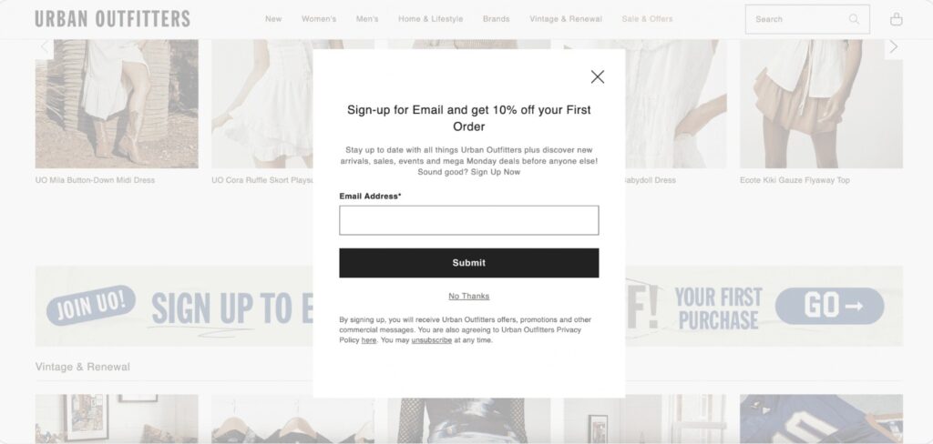
Urban Outfitters’ website popup fits seamlessly into their design, subtle fonts, neutral colors, and a “No Thanks” link that’s easy to see.
Why is that good? Because it respects user choice.
People don’t feel trapped or tricked.
This small detail builds trust.
It’s one of those underrated website popup ideas, don’t just focus on conversion; focus on how it feels to interact with your popup.
7. Pandora – Cart Reminder Popup
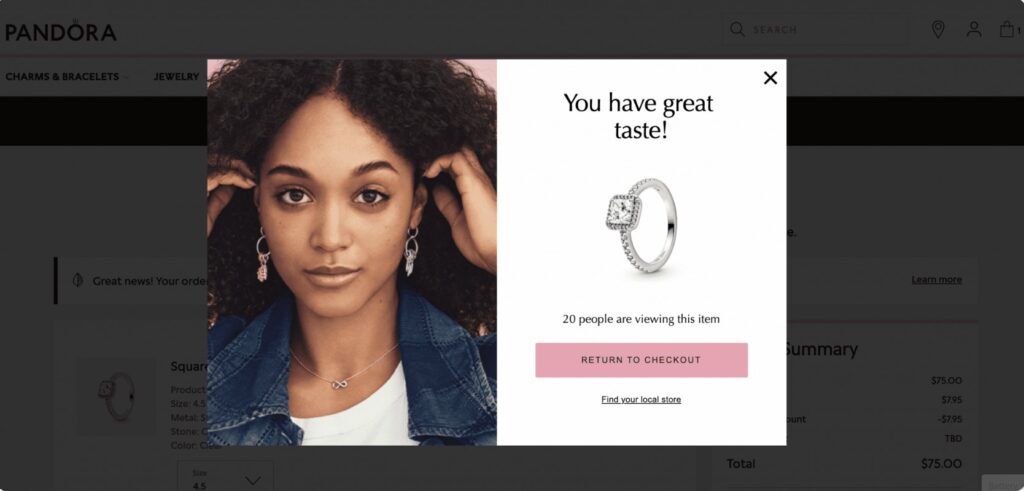
Pandora does something clever. When someone leaves items in their cart, a popup says:
“Others are viewing this item right now.”
This is social proof plus scarcity, two strong triggers combined.
It turns passive browsers into active buyers.
This website popups example works because it adds urgency without pressure.
You’re simply reminded that the item isn’t guaranteed to be there later.
8. The Farmer’s Dog – Feedback Popup
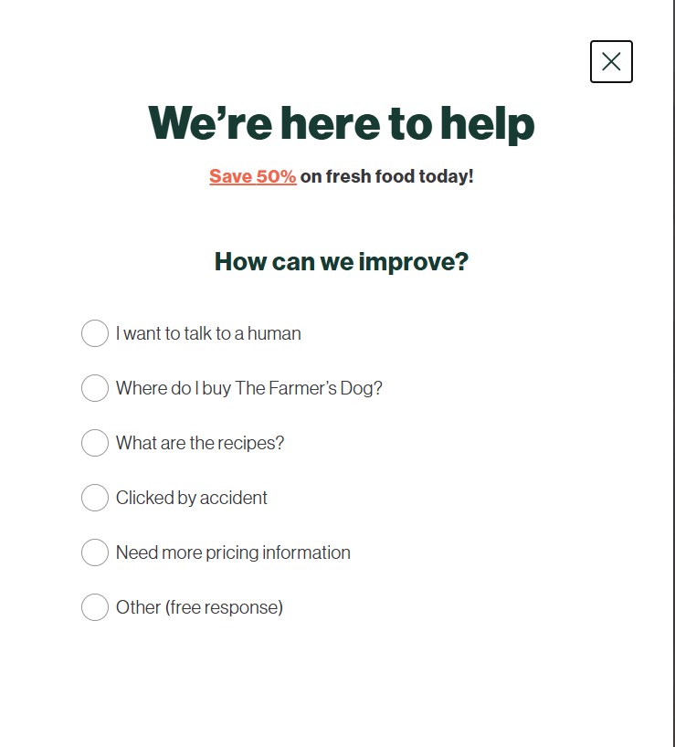
The Farmer’s Dog uses a friendly, customer-first popup that appears when visitors start to leave the site. The message isn’t about saving the sale — it’s about understanding the customer. It asks, “How can we improve?” and offers simple options like “Need more pricing information” or “I want to talk to a human.”
The tone is empathetic and the design is clean, just a few lines of text and clear choices. It feels more like a conversation than a survey.
Why it works:
Because it listens instead of pushing. By asking direct, human questions, The Farmer’s Dog learns exactly what’s confusing or missing for potential buyers. That data shapes better experiences — pricing, content, and support — turning honest feedback into future conversions.
9. Kylie Cosmetics – Localized Popups
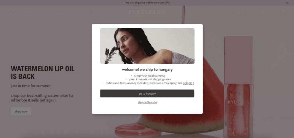
Kylie Cosmetics uses location-based popups that inform users about shipping availability in their country.
For example, a visitor from Hungary might see, “Good news! We ship to Hungary.”
That’s reassurance. And reassurance drives action.
It’s a perfect website popups example for global brands that want to make international customers feel included.
10. Bearaby – Interactive Mystery Offer
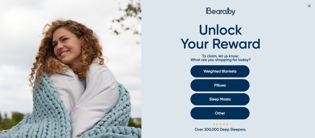
Bearaby uses a playful spin-the-wheel style popup. Visitors answer a simple question, “What are you shopping for today?”, and get a surprise offer.
Interactive website popups like this tap into curiosity and personalization.
People are naturally drawn to small, gamified experiences.
Why it works: You get engagement first, then conversion.
And even if they don’t buy right away, you’ve built memory, which helps long-term recall.
11. Victoria’s Secret – Rewards Program Popup
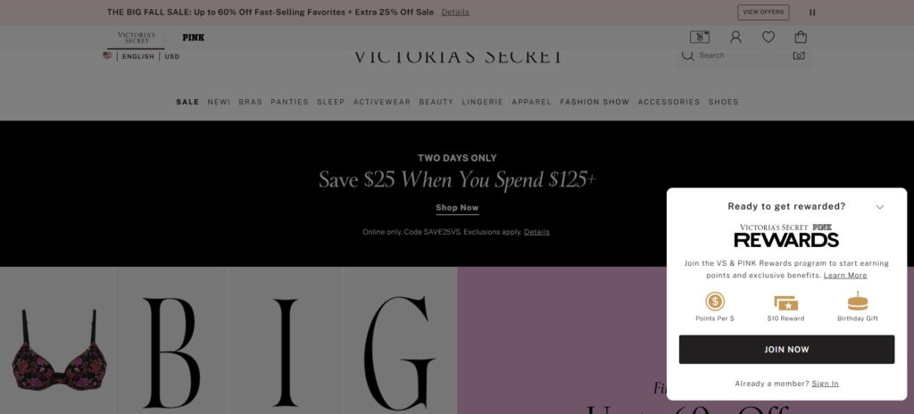
Victoria’s Secret promotes its loyalty club using a small popup that highlights “Join The Collective” for exclusive rewards.
It’s not pushy. It’s aspirational.
The design feels premium, matching the brand’s tone.
This is one of those websites with popups that focus on community, not coupons.
If your business has a membership, course, or subscription, take this route.
12. Snow – The Interactive Welcome Popup
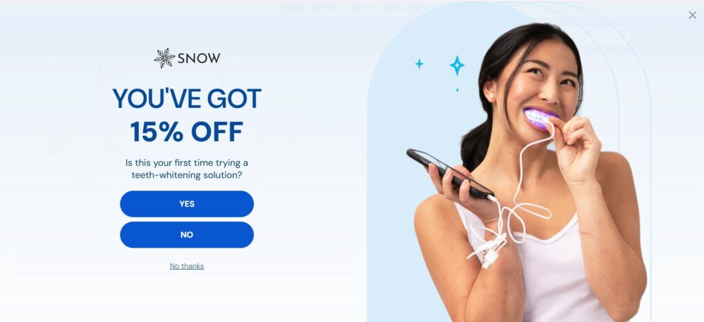
Snow greets visitors with a clean, bright popup that immediately offers 15% off their first order. But instead of a plain discount form, it adds a small question: “Is this your first time trying a teeth-whitening solution?”
This turns a simple offer into a short, interactive moment. Visitors feel engaged, not sold to. The “Yes” and “No” buttons make the experience quick and personal, while the clear “No thanks” link keeps it respectful.
Why it works:
Because it combines incentive with insight. Snow isn’t just giving away a discount — it’s learning about its audience. That one question helps them segment new users from returning ones, personalize follow-ups, and keep the tone friendly and human. It’s conversion and research rolled into one.
13. Hootsuite – Extended Trial Popup
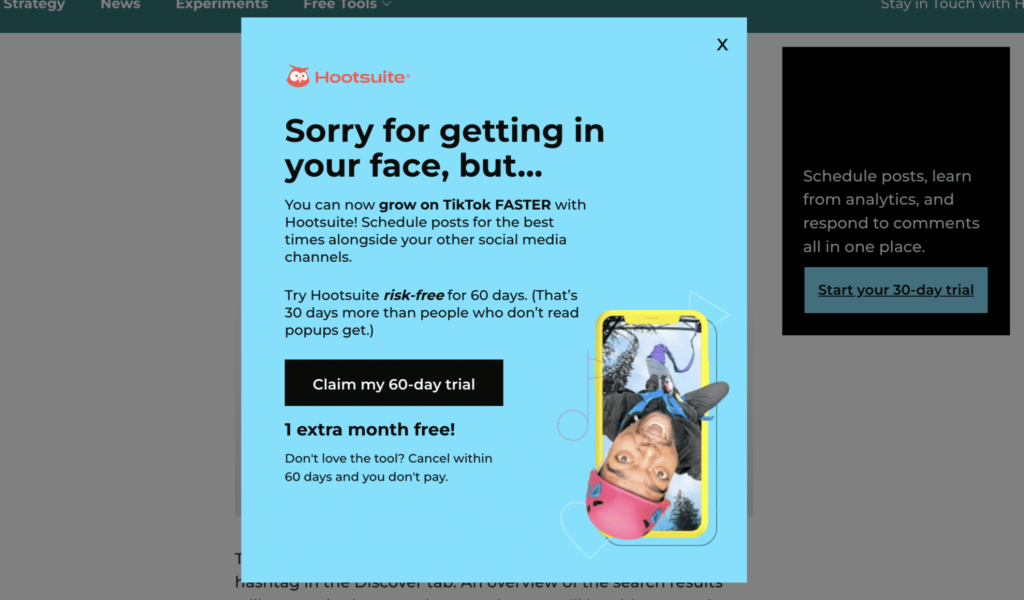
Hootsuite offers a 60-day trial through a popup. Normally, their trial is 30 days, so this feels special.
The difference here is urgency and exclusivity.
The offer exists only in the popup. That makes people act faster.
This is one of those website popups examples that prove, sometimes, giving a little more time or value can outperform any discount.
14. Fiverr – App Download Popup
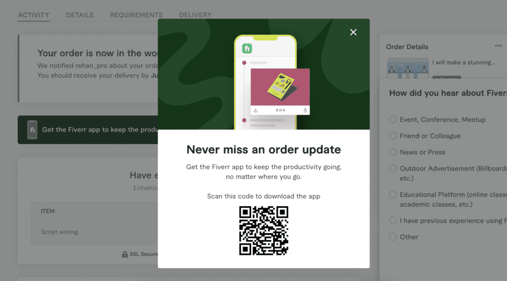
After a user signs up, Fiverr triggers a second popup asking them to download the app.
It includes a QR code, scan it, and you’re in.
This is smart funnel design.
The first popup converts a visitor into a user. The second deepens engagement.
If you run a platform or app, this website popups example is worth studying. It shows how popups can move people through stages, not just capture emails.
15. Drunk Elephant – Refer-a-Friend Popup
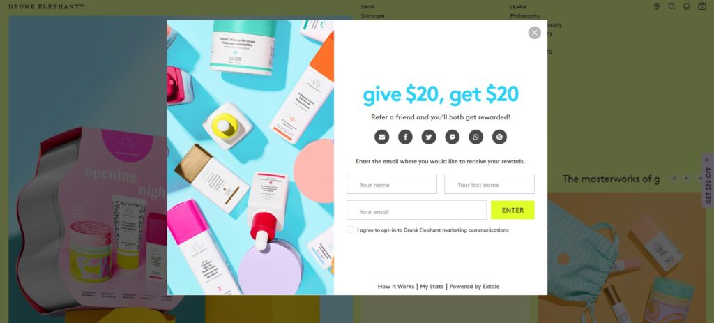
Drunk Elephant’s popup doesn’t sell anything. It rewards.
The message is clear: “Give $20, get $20.”
Simple, direct, and built on reciprocity, one of the oldest principles in marketing.
It’s a website popups example that blends acquisition and loyalty beautifully.
You’re not only gaining new customers through referrals but also strengthening your bond with existing ones.
This kind of website popup works best for e-commerce or subscription brands because it turns happy buyers into ambassadors.
If you’re looking for a website popup idea that drives word-of-mouth without spending on ads, this is the one to copy.
Why Popups Still Work (When Done Right)
Popups are old. But they’ve survived for a reason.
They make people pause, and pausing is where conversion happens.
Here’s why most websites with popups keep them running year after year:
- They re-capture attention. Visitors skim and scroll fast. Popups bring focus back.
- They collect first-party data. With privacy rules tightening, an email address is gold.
- They create micro-moments. A quick yes-or-no, a short quiz, a small gift, these are touchpoints that matter.
- They personalize. With behavior-based triggers, you can show the right message at the right time.
But yes, they can also be annoying.
The difference between helpful and frustrating popups is relevance. Show the right message to the right user, and your website popups stop being interruptions and start being tools.
Smart Ways to Use Popups Without Being “That Site”
Let’s talk about what separates great website popups examples from bad ones.
- Timing matters. Don’t hit visitors the second they land. Give them 10–15 seconds or after scroll.
- Context matters. Match popup content to the page they’re on.
- Design matters. Make sure the popup looks like part of your site, not a random ad.
- Exit intent is gold. Capture those leaving your site, not those still exploring.
- Respect matters. Always include a visible close button.
You’ll notice every one of the 15 websites with popups above follows at least three of these rules. That’s why their results are consistent.
Also read our blog on Build High-Converting Webinar Popups
Different Strategies You Can Borrow
If you’re planning your next campaign, here are a few practical website popup ideas drawn from these examples:
- Discount Popups: Offer 10–20% off on the first order.
- Free Shipping Popups: Convert hesitant buyers at checkout.
- Event Popups: Collect leads for upcoming launches or webinars.
- Exit-Intent Surveys: Ask why visitors are leaving.
- Gamified Popups: Use quizzes or mystery offers.
- App Promotion Popups: Push downloads after signup.
- Loyalty Program Popups: Invite users to join rewards clubs.
- Feedback Popups: Gather reviews post-purchase.
- Cart Abandonment Popups: Add urgency before they leave.
- Localized Popups: Show region-specific info or shipping notices.
Each of these website popups examples serves a different goal, but all of them improve engagement when used thoughtfully.
The Real Rule of Popups: Value First
Popups don’t convert because of color or animation. They convert because they give something of value. That could be a discount, information, convenience, or even just clarity.
When someone sees your popup, they ask:
“Why should I care?”
If your popup answers that honestly, it will perform.
Every one of the famous websites with popups above focuses on one clear takeaway, help the visitor, and the conversion follows.
One Final Thought
Popups aren’t about trapping attention.
They’re about catching it at the right time, with the right message.
If your website popup makes someone’s decision easier, you’ve done it right.


