What Is a Website Lightbox? A Straightforward Guide for Businesses Using Popups

I hope you enjoy this blog post. If you want Hello Bar to grow your leads, click here.
Author:
Mansi
Published
June 17, 2025

Table of Contents
Let’s talk about something simple that shows up on websites all the time but still confuses a lot of people: the website lightbox.
If you’ve ever been on a site and had a popup take over the screen—dim background, message front and center—that’s a website lightbox. It’s not magic. It’s not even fancy. But it works. And if you run a business, especially online, it’s something you should probably understand and use.
Let’s break it down piece by piece—without fluff, buzzwords, or selling you anything.
So, what is a website lightbox?
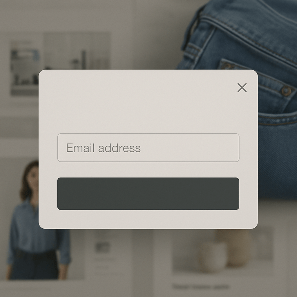
A website lightbox is a popup window that shows up on top of a webpage while the rest of the page dims out in the background. The point is to draw your attention to the box. Nothing else. Just that box.
Think of it like a spotlight. When it’s on, the background fades and everyone’s looking right where the light hits.
That’s why people use lightboxes: to get you to look at one thing—like an email signup form, a discount, a message, or a video.
What is a lightbox on a website, really?
It’s just a way to focus someone’s attention. It’s not a new idea. Retail stores have been doing this forever—put the flashy sign in the window, make it big and clear, hope people respond.
Online, it works the same way.
But here’s what makes it different from a regular popup:
- It dims the background.
- It locks your attention.
- It often forces an action. (close it, sign up, click something)
The rest of the page is still there, but you can’t use it until you deal with the lightbox.
That’s the whole trick. A website lightbox is meant to stop you for a second and make you decide.
Why businesses use website lightboxes
Let’s be real: getting someone’s attention online is hard. People click fast, scroll fast, and bounce even faster.
That’s where the website lightbox comes in. It pauses the noise and gives you a small window to ask for something—an email, a sale, a download, a “Hey, don’t leave yet!”
Here’s how businesses actually use them:
- To grow an email list: Show a 10% discount if they subscribe.
- To reduce cart abandonment: Pop up with a “Wait! Here’s a deal!” when someone tries to exit.
- To highlight something new: New product? Throw it in a lightbox.
- To show limited-time offers: Like a flash sale countdown.
You’ve seen all of these. The reason they’re everywhere? They work—if done right.
Website lightbox example: the basic kind
Let’s say you run a small online shop. A first-time visitor lands on your homepage. After 7 seconds, they get a lightbox that says:
“Sign up and get 10% off your first order.”
There’s a field to enter an email and a button that says “Get My Code.” Simple. Clean. Focused.
That’s a classic website lightbox example.
It’s not trying to be slick. It’s just doing one job: Get the email.
A few other website lightbox examples that actually make sense
Let’s go beyond the typical.
1. Exit intent lightbox
Someone moves their mouse toward the “X” on their browser tab. Right then, the lightbox kicks in:
“Leaving so soon? Get free shipping if you stay!”
2. Product launch notification
You’re releasing something soon, and your homepage has a lightbox:
“Be the first to know when it drops. Enter your email.”
3. Video popup lightbox
Instead of just reading a page, someone clicks a “Watch demo” button. A lightbox opens with a video right in the middle of the screen, background dimmed. That’s another website lightbox example.
These are all ways to use the same basic idea: stop the scroll, show something that matters, and prompt one simple action.
Also read our guide on Website Visitor Tracking and CRO: Everything You Need To Know
But what is a website lightbox vs. just a popup?

Image by rawpixel.com on Freepik
A lot of people mix up the two. Fair.
Here’s the easiest way to think about it:
- A popup can be anything that appears over your page—top bar, slide-in, toast message, banner.
- A website lightbox is a very specific kind: full focus, dimmed background, central box.
So yeah, all lightboxes are popups. But not all popups are lightboxes.
It’s about how much they interrupt. Lightboxes are louder. They want your attention now.
What is a lightbox on a website not good for?
Let’s be honest. They’re not perfect. And if you use them the wrong way, they’re annoying.
Here’s when they don’t work:
- If they show up too early. Someone just got to your page. Let them breathe.
- If they block important content. Don’t shove a lightbox over the cart page when someone’s about to pay.
- If they show up too often. Once per visit is enough. Don’t be that site that throws up a new lightbox every time you blink.
And please, don’t use them for stuff that doesn’t need to be urgent. Not everything needs to be in a lightbox. Use it when you really want someone’s attention—not just because you can.
Do website lightboxes hurt SEO?
Short answer: No—if they’re done right.
Google mainly cares about mobile. If your lightbox blocks the whole screen on mobile and the user can’t do anything until they interact with it, that’s a problem.
To avoid issues:
- Make it easy to close.
- Don’t show it immediately.
- Don’t block your entire content on mobile.
Google wants users to find what they’re looking for. So as long as your website lightbox doesn’t get in the way of that, you’re good.
How to make a website lightbox that doesn’t suck
Here’s the thing: bad lightboxes feel like spam. Good ones feel helpful.
If you’re going to use one, keep it tight.
- One goal. Don’t ask for five things. Just one.
- One button. Keep the choices simple. Yes or no.
- Short message. People don’t read big chunks in lightboxes.
- Clear close button. Don’t trap people. That just makes them mad.
And please, test them. Don’t just slap one up and hope. Look at how many people click. How many bounce. How many convert. Then adjust.
Lightboxes are easy to use. But they’re even easier to get wrong.
Common mistakes with website lightboxes
Let’s call out the usual suspects:
- Too much text. If it looks like a blog post, nobody’s reading it.
- No “X” to close. That’s just mean. Nobody likes that.
- Mobile disaster. Test it on your phone. If you can’t close it or scroll, fix it.
- Too frequent. Show it once. Maybe twice per visit. Not every 30 seconds.
These small mistakes make a website lightbox go from “nice” to “ugh” real quick.
Do people still click them?
Yes. And no.
People have gotten smarter. They know what lightboxes are. They’ve seen them a million times.
But they still work when the message is good, the timing is right, and the offer is clear.
A good website lightbox doesn’t beg for attention. It earns it. If someone’s already interested and your lightbox shows up with the right nudge, it can seal the deal.
If you’re interrupting for no reason? It won’t do a thing.
Real data helps
Some email platforms will tell you your lightbox conversion rate. That’s helpful. But go deeper.
Look at:
- Where users came from
- What page they were on
- How long they stayed before it showed
- What percentage clicked
And then try small changes: different words, shorter forms, later triggers.
A small tweak in your website lightbox can lead to real results.
One more website lightbox example (just to be clear)
You have a blog about coffee. Someone’s reading a post about brewing methods. Halfway down the page, a lightbox shows up:
“Want our 3-step cheat sheet for the perfect cup? Grab it free.”
Name. Email. One button. That’s it.
This is a great example of a website lightbox used mid-content—relevant, timely, and valuable. Not in the way. Not random. Just well-placed.
Final word
If you’re still wondering what is a website lightbox or what is a lightbox on a website, just think of it like this: it’s a popup that stops the noise and asks for something simple.
Done right, it can help your business grow. Done wrong, it just annoys people.
Use it with some respect for the user, and it’ll work better than most things on your site.
That’s all.


