21 Proven Exit Popup Formulas That Will Increase Conversion Rates

I hope you enjoy this blog post. If you want Hello Bar to grow your leads, click here.
Author:
Ryan Bettencourt
Published
July 22, 2024

You might have heard that exit-intent popups don’t work well. Many marketers criticize them as having poor performance and an annoying user experience. But should you avoid using exit popups on your website?
No, you just need to optimize them for conversions and sales.
It all starts with understanding your target audience. You can only create a good exit popup if you know what your customer wants. It’s that simple.
But when done right, exit popups can be powerful. A recent study found that exit-intent popups can save up to 13.5% of abandoning visitors.
You can significantly boost signups and sales on your website by continually testing and refining your exit popup formulas. In this guide, we’ll show you exactly how to create exit-intent popups that work, along with plenty of exit intent popup examples to inspire you.
What Are Exit Intent Popups?

Before we get into specifics, let’s define the word “popup.” Broadly speaking. it’s used to describe a box or other message that appears over the traditional content on a web page.
For instance, if you visit the website for popular teen clothing brand Shop Justice, you’ll see a popup at the bottom of the page.
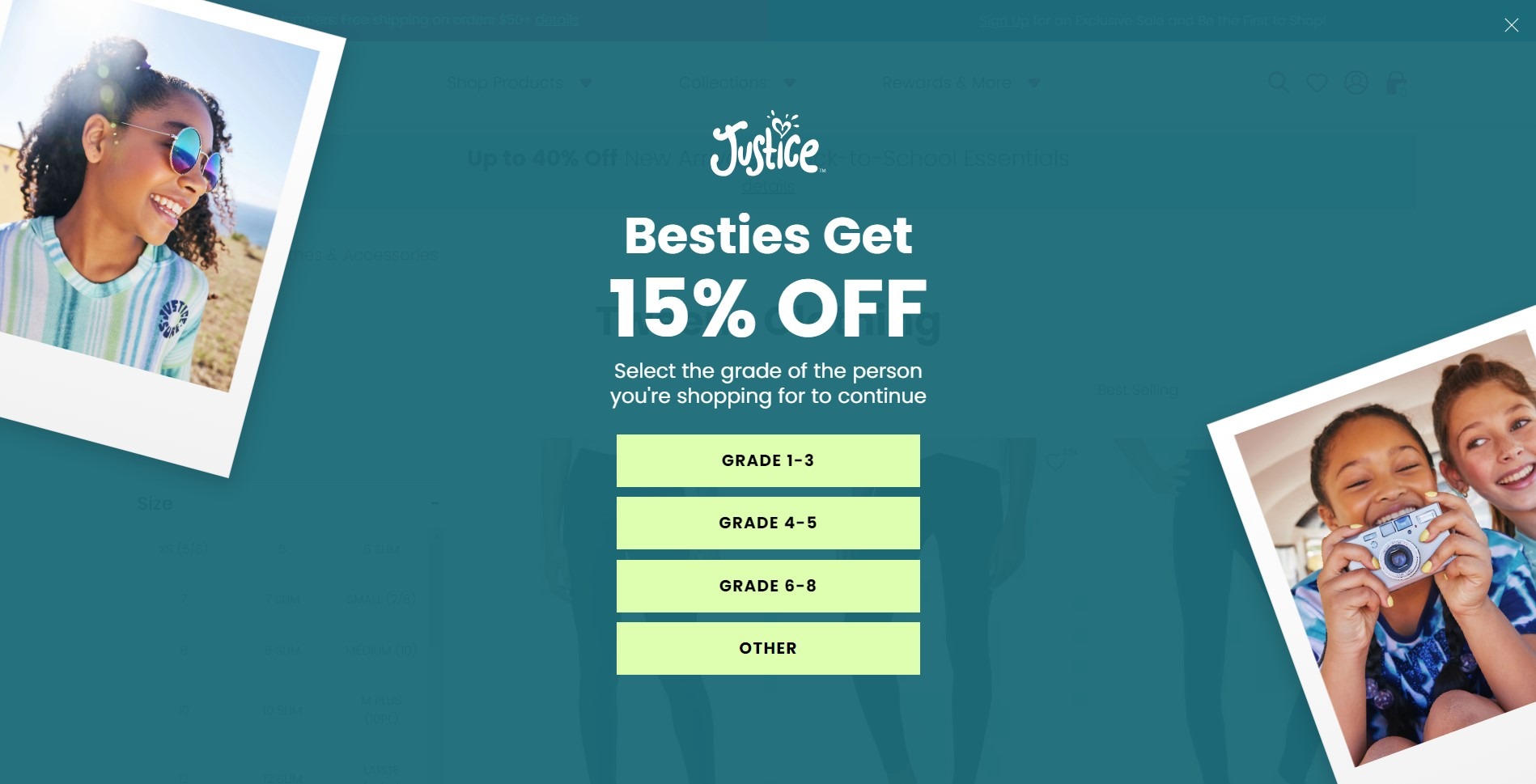
Image via Shop Justice
Do you see that X in the top right-hand corner. That’s your first clue that it’s a popup. If you’re not interested in joining the CR Squad, you can click the X and restore the page to its normal appearance.
These types of popups generally appear as soon as you arrive at a site — or on a time delay. They’re often restricted to first-time visitors or to people who haven’t visited in a long time.
An exit-intent popup serves the same purpose but has a different action mechanism. Instead of appearing immediately, the user attempting to close the browser triggers to come on the screen.
Exit intent triggers are based on visitor behavior, such as cursor movements toward the top of the browser window.
This technology allows the popup to appear at the precise moment when a website visitor is about to leave, giving you one last chance to encourage visitors to stay or take action.
To see an example of an exit popup, visit the website for men’s clothing, Brooks Brothers.
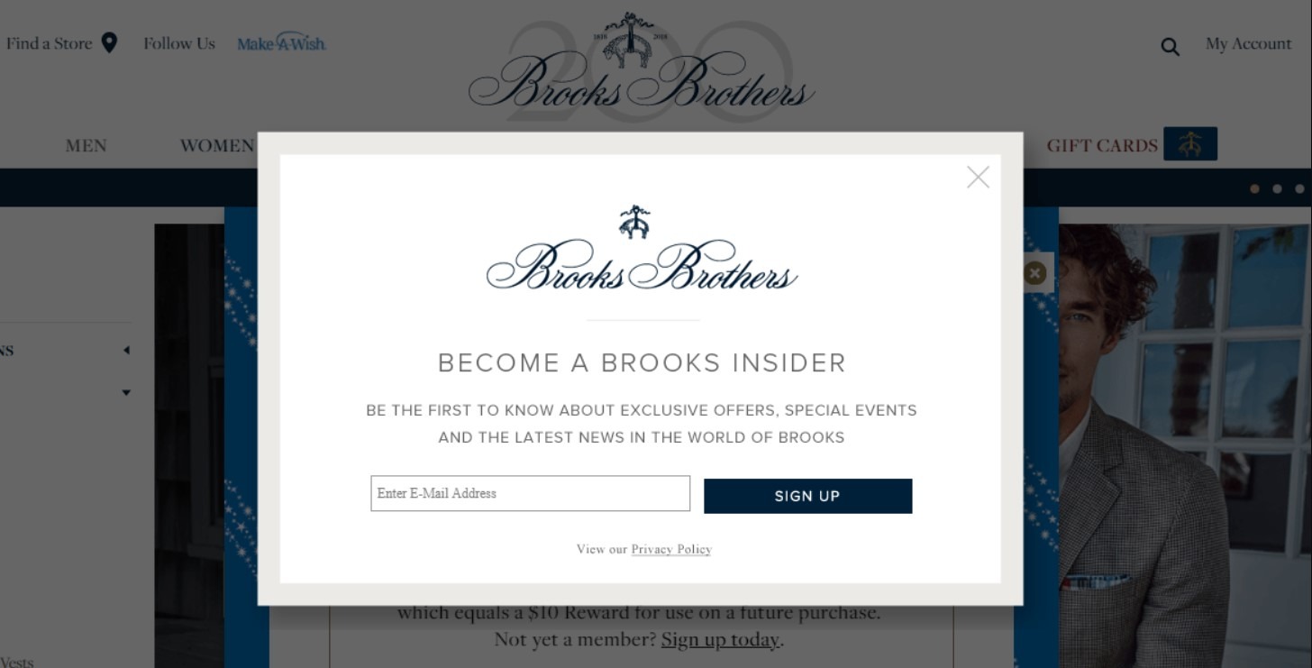
Image via Brooks Brothers
We caused the popup to trigger by moving our mouse toward the X button on our browser. The popup invites us to become Brooks Insiders by providing our contact information in a short field.
Types of Exit Popups
Exit popups come in different forms and types, each designed to serve a specific purpose. Here are four common types of exit popups you can use to boost your conversions.
1. Discount Offer Popups
These popups offer a special discount to visitors about to leave your site. Discount exit intent pop ups are perfect for ecommerce stores looking to increase sales and reduce cart abandonment.
Discount popups can turn hesitant browsers into buyers by offering a little extra incentive, such as a unique discount code or free shipping. They help convince shoppers interested in certain items to complete their purchase.
For example, this Pipsnack exit popup offers a discount and creates a sense of exclusivity.
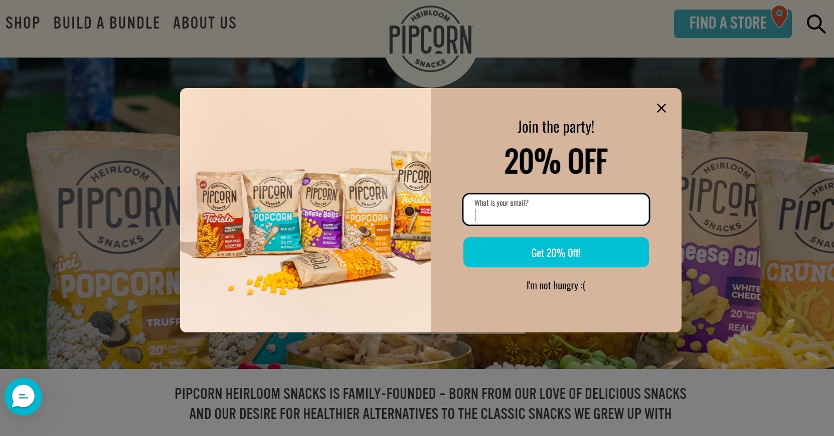
Image via Pipsnacks
Pro tip: Make your offer time-sensitive. Reports show that popups with countdown timers convert 25.48% better than those without.
2. Content Upgrade Popups
Content upgrade exit pop ups offer additional, valuable information related to what the visitor is already reading. They’re perfect for blogs, educational sites, and content-heavy businesses.
For instance, if someone is reading an article about social media marketing, you can use a popup form to offer a free downloadable guide on “10 Advanced Social Media Tactics.” This gives readers a reason to share their email and stay engaged with your content.
Take a look at this content upgrade popup example from HubSpot.
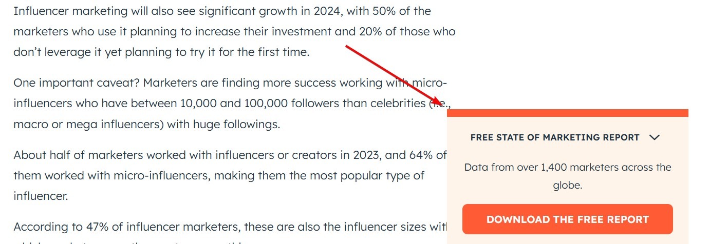
Image via HubSpot
3. Survey Popups
Survey popups ask visitors for feedback just as they’re about to leave. This type of popup helps you gather valuable insights about why people are leaving and how you can improve.
For example, you might ask, “What stopped you from purchasing today?” with multiple-choice answers. This gives you direct feedback from potential customers about what’s holding them back.
While survey popups might not directly lead to conversions, their insights can help you improve your site and increase conversions in the long run.
This Survicate popup is an excellent example of a survey popup.
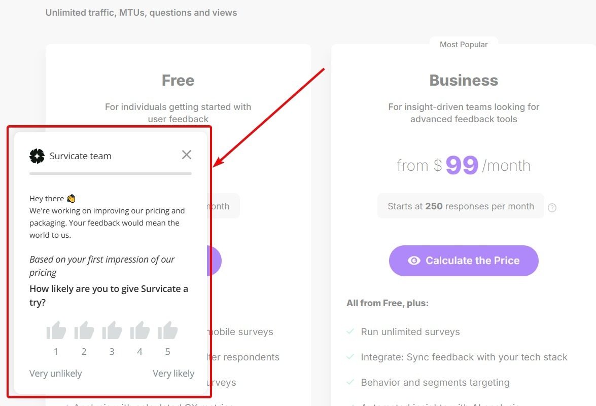
Image via Survicate
4. Social Proof Popups
People trust other people’s recommendations more than anything, and social proof popups can take advantage of this. It showcases positive reviews, testimonials, or statistics about your product or service.
They’re effective for businesses looking to build trust and credibility. Social proof can sway undecided visitors by showing that others have had positive experiences with your brand.
Create a popup that displays a compelling testimonial or statistic when a user shows exit intent. Just like this Casper popup.
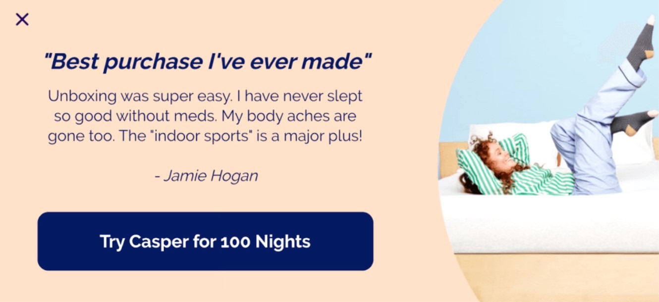
Image via Casper
Exit Popups: Common Uses
Exit popups can be used to promote numerous offers, including:
- Content upgrades
- Lead magnets (like a free course or free demo)
- Discounts and promotional codes
- Email opt-ins
- Requests to participate in surveys
You get the idea.
Essentially, you can use exit-intent popups for any purpose that might help you acquire or retain more customers. These popups can significantly boost your small business marketing success.
However, you have to keep two things in mind:
- People access and exit a website for different reasons; and
- Some people really hate popups.
You can’t do anything about the latter group. They exist. But you can improve the popup experience to help endear prospects to your offer.
Let’s say you’re visiting a website for the first time. You’ve never heard of the brand and you’re not familiar with its inventory.
What’s your purpose? It’s like investigating product pages and learning about the company.
Now, you’re ready to leave the website. You haven’t found any products you can’t live without.
What’s your purpose? You might head to a competitor’s website or abandon the purchase altogether.
So, how do you recapture your visitors’ attention?
Design an exit popup that says, “Hey, before you go, here’s something you haven’t considered before.”
Ensure its eye-catching and attention-grabbing so it serves its purpose.
Exit Popup Software and Why It’s Important for Business
If you have the skills, you can indeed hand-code an exit popup. Software programs like Hello Bar make creating these popups far easier. You just enter the information you want to appear in the popup and push it live.
The software solves other problems, too.
For instance, what if you want to A/B test different exit intent popup examples? That’s the best way to determine which offers, CTAs, and other elements work best with your audience.
If you’re manually coding your popups, you have to manually assess the data based on conversions, sales, or other metric you want to measure. That takes valuable time and resources.
Hello Bar automatically tells you which variation of a popup “wins” an A/B test. There are no mathematical calisthenics or guesswork involved.
Additionally, Hello Bar gives you maximum control over the look and design of your popup. You don’t have to know any coding languages, so you won’t risk taking down your entire site with a misplaced string of symbols.
The form editor allows you to create professional-looking popup forms without extensive technical knowledge.
Exit Popups vs Immediate Popups
As mentioned above, exit intent popups differ from immediate popups. The latter appears on a site within seconds of a visitor’s arrival regardless of their activity on the page.
It might sound like a better option. After all, you want to present a visitor with an enticing offer immediately, right? In actuality, though, it’s more likely to annoy your audience.
When you visit a website page, you’re looking for something. You might be shopping, anticipating an informative article, or something else entirely different. If a popup appears immediately and obscures the content you want to consume, you get irritated.
Annoyed consumers don’t buy from your company.
It’s distracting. Plus, it diverts the visitor’s attention from their desired goal.
Exit popups work better because they respond to visitors’ desire to leave. You’re giving them one last chance to engage with your brand.
It’s not annoying, either. Visitors can simply click the exit button and leave the page if they aren’t interested.
This is why exit intent technology is so valuable.
21 Exit Popup Hacks That Will Increase Your Website Conversion Rate

Now that we’ve covered some of the basics of why popups work and how they’re effective, what should a popup look like? How can an exit popup improve your conversion rate or boost your sales?
That’s what we’ll cover in the following 21 proven exit-popup formulas. Let’s dig in!
1. Personalize Your Interactions With Website Visitors
Personalization has become one of the hallmarks of good online marketing. It’s not just about addressing email subscribers by name, though.
A great way to personalize exit popups is to use an exit popup headline like “Before You Leave…”
This tells the visitor that you understand their intent. It’s a small signal but a powerful one. You know they’re getting ready to leave your page, so you’ve created a special offer or incentive just for them.
It’s also a good idea to create special popups for specific audiences. For instance, if you attract a lot of local traffic, you could limit a popup to people who live in your city or town. Similarly, you could target people who have recently visited your site with a tailored message, such as “Welcome Back!”
All these personalization options can help you boost conversion rates by anticipating what specific segments of your target audience might want.
2. Personalize Your Exit Popup by Referral Domain
With software like Hello Bar, it’s easy to target very specific members of your audience with particular popups. A great strategy is to personalize the exit popup by referral domain.
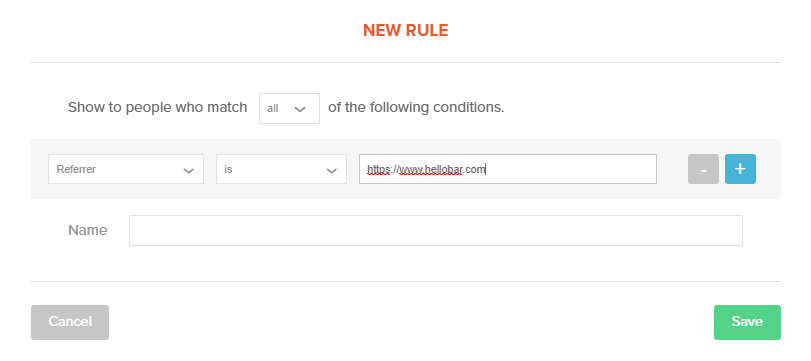
When you create your popup, select “Referrer” from the first drop-down menu. You can then type a URL into the text field so that this specific popup will only appear for people who land on your site from that referral domain.
Let’s say that you’ve recently published a guest blog post on a popular website. You might want to greet people from that site with a special message and offer. Exit intent popups let you show those visitors that you appreciate their clicks.
You can also infer intent based on the referral source. If people find your website through an advertisement on social media, they might be ready to buy right away. Use the exit popup to snag potential sales with a special, one-time discount.
Alternatively, you could personalize your popups based on the time your visitors arrive on your site. Using two rules, you can set a time span for that particular popup, then personalize it with “Good Morning” or “Good Afternoon.”
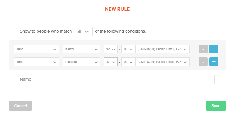
The options are nearly endless.
3. Offer Upgrades, Suggest Related Posts, or Advertise Products
Exit popups should serve a valuable purpose. More specifically, they should incentivize a desired action.
Let’s say you want to collect more email addresses for your contact list. That’s easy enough to do with a popup.
However, simply asking people to fork over their contact information doesn’t always work. People are tired of flooded inboxes, so many will only give up their emails if there’s something in it for them.
A content upgrade could help.
Alternatively, perhaps you want to increase the time spent on your site. You’re building brand awareness and establishing relationships with your visitors.
Consider using an exit popup to suggest posts related to the one your visitor has just read. That will keep them on your site for longer periods, which might even result in a faster sale.
Finally, you can always use exit-intent popups to advertise your products. Choose your flagship or best-selling product to highlight. Consider combining the advertisement with a discount, an offer for free shipping, or some other incentive. If it’s true, you can even warn visitors that you have limited stock, which creates urgency.
4. Use These 10 Special Mental Triggers to Increase Conversions
Psychology becomes extremely useful in marketing, especially when writing great copy and incorporating visual cues. Even the smallest detail can send a message to your audience.
We’ve compiled 10 special mental triggers that can help push your visitors over the conversion fence. They won’t work every time, or with every buyer persona, but they’ll help bolster the numbers.
Think of a mental trigger as a subliminal message. They’re subtle but powerful cues that your audience won’t necessarily notice on a conscious level, but will still aid you in persuading them to accept your offer
Just remember to keep your specific audience in mind. Some of these mental triggers might not appeal to your target audience because of their values, beliefs, shopping styles, or other unique qualities.
Always design your exit popups around your audience. You can’t go wrong.
1. Add a progress bar on your exit popups
A progress bar — especially one that’s animated — can prove extremely motivating. People like to accomplish tasks, cross items off lists, and feel like they’ve gotten stuff done. A progress bar appeals to that instinct, making your popup forms more engaging.

Think of progress bars as motivation to complete the next desired step. If it shows that the visitor is already halfway through the process, even better.
We don’t like to leave things undone. If we see that we’re close to reaching a goal — even one created for us by someone else — we’re instinctively inclined to complete it.
This type of incentive works particularly well for email signups. Prospects will be more inclined to participate since it only takes a second to type in an email address and complete the signup process.
Furthermore, an animated progress bar draws attention to itself. Something that users might otherwise overlook becomes a central focus on the page.It beckons the visitor to do something about it.
2. Use high-quality pictures in your popups
Imagery is an important and often-overlooked element of any marketing asset. This is especially true of exit popups.
You want an eye-catching, attention-grabbing visual to compel the visitor to take a second glance. If you just type a few boring sentences into the popup, your visitors might not even notice it.
Consider incorporating a surprising image that will catch your prospects off-guard. It doesn’t have to be irreverent or even funny, but it might seem out-of-place in the context of your site.
Error pages — particularly 404s — are great places to look for inspiration. Many businesses have created truly unique 404 error pages that keep visitors on the page and encourage them to dive deeper into the site.
If you want to stay on-brand with your image, make sure it’s something that will at least give your visitor pause. Don’t use a generic stock photo or a poorly made, hand-drawn image. Think creatively. If you use an image of a person or animal, make sure the eyes are pointed at the CTA. This is another subtle cue marketers use to direct visitors’ attention.
3. Offer a discount or a free sample
Consumers love two words more than any other when it comes to shopping: free and discount. Free is obviously preferable, but we’ll take a 30-percent-off coupon code if that’s what you’re offering.
We mentioned before that exit-intent popups often work because they incentivize visitors to return to the page and reconsider leaving. If the prospect has was considering purchasing one of your products, you want to push that person toward the sale using an exit-intent popup.
A discount is a great way to do that. It says, “Okay, maybe that price point scared you a bit, so let me remedy the situation.”
Free samples also work well. If you sell digital downloads or services on Etsy, you could offer a free product sample or consultation.
It’s not just about ingratiating yourself to your prospects. It’s about demonstrating as much value as possible. If prospects perceive value, they’ll want to buy from you.
Here’s a great discount popup example from Avanchy.
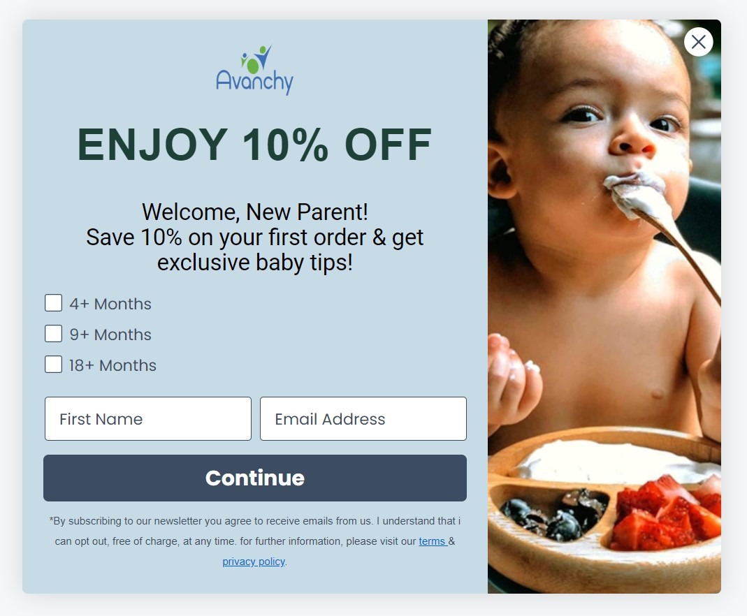
Image via Avanchy
4. Offer free shipping on all or certain purchases
Shipping costs are one of the primary reasons people still buy products in brick-and-mortar stores. They don’t want to spend $10 to get something they could pick up at Walmart down the road.
If you eliminate this common objection with a free shipping offer in your exit intent popup, you might convince more people to accept your offer.
Providing an offer of free or discounted shipping in an exit popup gives your visitor a reason to stop, think, and reconsider.
Many businesses can’t stay afloat if they offer free shipping on everything. If you have to cover the shipping on a product that costs $3, you won’t make a profit.
However, if you sell more expensive products, you could offer blanket free shipping. It’s easy to build shipping into the prices of products that cost hundreds of dollars.
If you sell less-expensive items, consider offering free shipping if the shopper spends more than a certain amount, such as $99. It’s not only a way to overcome the shipping obstacle, but also a way to encourage people to buy more products in the same transaction.
5. Create scarcity and urgency behind the offer
You’ve heard of “impulse buys,” right?
You’re standing in line at the supermarket, see a Three Musketeers bar, and realize you need a dose of chocolate to get through the day.
Or maybe you see a shirt you love at a local clothing store, and there’s only one left on the rack in your size. If you don’t buy it now, you might never get the chance again, so you snag it without even checking out the price tag.
Impulse buys are made without much consideration. So are scarcity buys. You can recreate that same phenomenon in an online store by incorporating scarcity or urgency into the offer on your exit popup.
For instance, you could offer a 20 percent discount on the visitor’s next order if they place it within 24 hours. If the visitor doesn’t act soon, they miss out on the discount for good.
Alternatively, you could set a time limit on the product’s availability or reveal that only a few remain in stock. Make sure you’re telling the truth — fake scarcity will only annoy your prospects — but use it liberally when you get the chance.
Just don’t forget to change your popup as circumstances change. You don’t want an old copy on your popup because you might confuse or irritate potential customers.
6. Use the word “wait” on your exit popups
The word “wait” is sort of like the word “stop.” It commands attention.
When you ask someone to wait, you send the subtle message that you’re about to share something they want to know. It’s psychological marketing at its finest.
Consider using that single word as your headline on the popup.
Other trigger words and phrases could include stop, hold on, before you leave, hang on, or don’t miss this. Trigger words should appear in bold, high-contrast print to ensure they’re very visible.
Here’s an example from Olive and Piper.
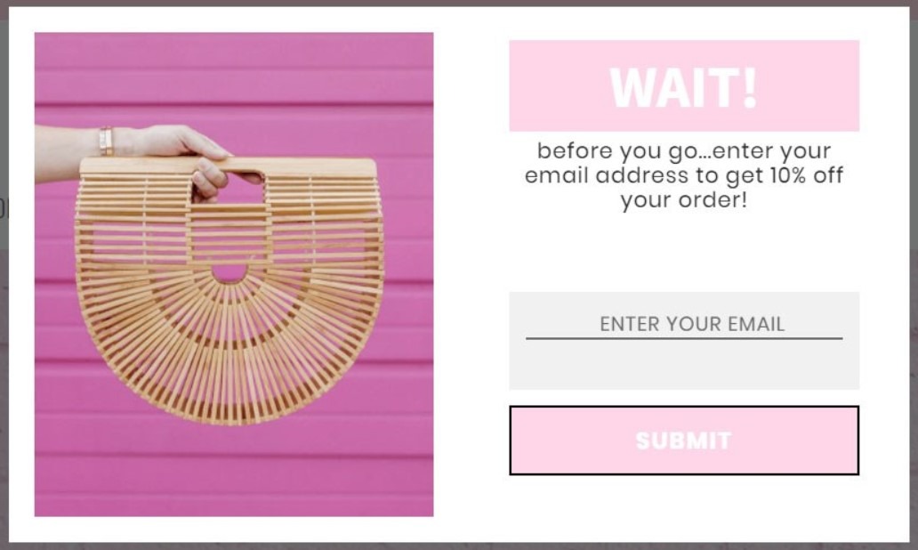
Image via Olive and Piper
7. Use humor when appropriate
Humor can either work for you or against you. If you make a joke that nobody else gets — or, worse, that offends your target audience — you could crush your conversion rate instead of skyrocketing it.
However, if you can incorporate tasteful, relevant humor into your popup, do so. It shows off your brand’s personality.
8. Include testimonials in your exit popups
Testimonials are a form of social proof. Consumers tend to believe fellow consumers over marketers, so letting your existing customers talk for you can pay off in spades.
A single testimonial with the customer’s full name and, if possible, a photograph will work wonders. The more credibility you can give your testimonials, the better.
Video testimonials can also work extremely well. They’re more personal and intimate and lend authenticity to the recommendations.
9. Incite your visitors’ curiosity
Curiosity is a powerful way to attract consumers. Once you have it, you can present your offer in an intriguing way.
You have numerous opportunities to incite curiosity, whether you lead with a fun fact or interesting statistic or present the visitor with a humorous image. The important thing is to know your audience.
A promise can also inspire curiosity. For instance, as mentioned above, Neil Patel used a statement of fact and an impressive feat to generate more conversions. He explained that he could do something extremely difficult.
The promise here is that he can help customers do that, too.
10. Ask your visitors’ opinions
People like to say their thoughts out loud. They love it when brands want their opinions.
Use your exit popup to invite people to share their feedback. It could be a survey, poll, or even an email. Let your audience know you’re interested in hearing their thoughts and feelings.
5. Overcome Common Objections
One of a marketer’s or entrepreneur’s most important jobs is overcoming objections. You know this because you’re a consumer yourself.
When you go to the supermarket, you don’t throw something in the cart just because you want it — unless, of course, you’re really hungry. You go through a list of questions in your head.
How much does it cost? When will you eat it? How many will it serve? Is it healthy?
Sometimes you go through those questions and their answers without even realizing it.
As a marketer, you can use exit popups to deal with objections right up front. If you acknowledge potential objections, consumers won’t see them as quite so scary.
Following are some of the most common objections to buying a product or service:
- Limited funds: “Maybe I can’t afford this right now.”
- Perceived value: “I’m not sure I’ll get my money’s worth.”
- Unfamiliarity with your brand: “Who are you again?”
- Lack of education about the product or service: “I’m not really sure how this works.”
- Concern over difficulty of using product or service: “It’ll take too long to figure out.”
- Timing and delays: “I can’t wait six months before I make a decision.”
- Competition: “I’ve been using this other company for years.”
- Fear of change: “Using something new will be uncomfortable.”
- Procrastination: “I don’t really need this now.”
Choose one objection to answer in your exit-intent popup. Make it so compelling that the consumer no longer feels nervous about purchasing.
For instance, let’s say that people might be concerned that they won’t be able to figure out how to use your product. That’s a common objection, especially when it comes to appliances, electronics, and toys.
Use a diagram or explainer video to allay those fears in your popup. Reinforce that you include easy-to-follow instructions with every product.
6. Suggest Your Most Popular Product
When creating exit intent popups, pushing one high-value product is better. Choose the most popular item in your online store, for instance, or the best value from your service offerings.
This focused approach can help increase your conversion rates by presenting a clear, compelling offer to your site visitors.
7. Offer More Value or Discount an Upsell
You can also use exit popups to upsell to your audience. For instance, you could offer a $100 discount on your most expensive product. That’s a huge savings.
You could also add value to a product. Let’s say, for instance, that you’re selling a pair of high-end athletic shoes. Offer to throw in a pair of absorbent sports socks for every pair your customer buys.
8. Ask Visitors to Take a Quick Survey in Exchange for Something Valuable
Conducting surveys can be extremely useful for marketers, but only if they incorporate best practices:
- Ask specific questions that invite elaboration.
- Don’t give consumers more than two options.
- Avoid asking consumers to “rate” something; instead, invite feedback.
- Limit the number of questions to 10 or fewer.
Many surveys are too broad or general to prove useful. They require the survey taker and the business to make assumptions, which renders the data useless.
While many people love to give their opinions on topics of all kinds, it helps to incentivize the survey in your exit popup. For instance, everyone who takes the survey will receive a free copy of an e-book or a $10-off coupon for use on any product in your store.
When you include an incentive, you automatically increase the sample size for your survey. The more people who take your survey, the more accurate the results become.
9. Offer to Chat With Your Visitors
One-to-one communication has become somewhat rare in the online marketplace. Consumers read FAQs instead of calling 800 numbers. They do their own research instead of asking questions.
To remedy this problem, you can present your visitors with a way to get in touch. A live chat feature might work best. It’s simpler and more convenient than email or phone calls.
Integrating live chat with your website has become much easier over the last few years. You can either manage it yourself or use a chat bot — both have proved extremely effective.
If live chat doesn’t appeal to you, invite your audience to send you a DM on Facebook, an email, or some other form of private communication. In other words, make yourself (or your team) accessible to the prospect.
Another way to invite your visitors to get in touch is to use the call goal in Hello Bar.
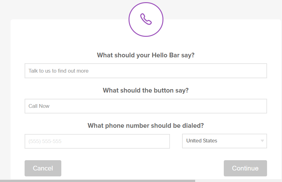
Fill in the necessary information to create your Hello Bar.
Your visitors on mobile can simply tap the CTA to call you directly.
10. Give the Visitor Limited Options
Have you ever felt so overwhelmed by a decision that you failed to make any choice at all? It’s a common problem that results in a kind of paralysis. Since you can’t decide on one thing, you decide on nothing.
That’s not the response you want your exit intent popup to inspire. Instead, you want your visitors to take immediate action.
Ideally, your pop up should include just one offer and a CTA. Explain the incentive, then tell your visitors what to do about it.
Never include more than two or three possible offers. Even that might be pushing it, especially if you don’t know your target audience very well.
Remember that a popup isn’t like a static website page. The visitor can’t necessarily return to it.
What if your prospects want all three offers you put in front of them? They have to choose just one, at which point they feel cheated. Plus, you lose potential sales or leads.
It’s better to take the pipeline approach. After your prospect converts on one offer, present them with another. Give people just one decision to make at a time. This strategy can significantly improve how well your exit intent popups work.
11. Use Authority Credentials in Opt-in Popups
Do you have a title, certification, license, or other impressive credential that gives you authority in your space? If so, mention it when you use an opt-in popup.
Let’s say, for instance, that you have a doctoral degree. Make sure you use the prefix Dr. before your name. It suggests that you have more authority than someone without such a designation.
Maybe you have a trade credential that will impress your audience. Mention that, as well. If you’re offering a service for which you’re certified, let your audience know.
Other credentials can also help improve authority. Maybe you’ve landed on a best-of list in your industry or sold more widgets than any other company. Don’t forget to let people know.
12. Use Impressive Numbers
Numbers are extremely persuasive because they’re concrete and capable of being proven. Big numbers impress your target audience.
Let’s say, for example, that you have 25,000 subscribers on your email list. That’s pretty impressive, right?
To increase conversion rates, include a call-to-action like this one in your exit popup:
“Join 25,000 other subscribers and get instant access to our weekly, informative emails.”
“More than 12,000 travelers have booked business class flights using our amazing deals.”
Of course, you’ll want to adjust it to fit your offer and incentive, but you get the point.
13. Use Arrows and Animations to Direct Visitors’ Attention
Photographers use a concept known as “leading lines” to subtly communicate the image’s subject to viewers. A leading line can be as simple as a road or railroad track, or as complex as the intersection of telephone wires.
In marketing, leading lines show website visitors where to look on the page.
An arrow can work extremely well. For instance, your call-to-action could look like this:

That’s pretty easy to throw together.
However, you can also get fancier with it if you want.
Consider using dotted lines to trail from your exit popup headline to the body copy to the call-to-action. The lines will guide your visitor from one important element to the next, just like reading a page of copy.
Animations, such as those available with Hello Bar, can also prove extremely useful.
You could have an exit popup slide from one edge of the screen. You can also use the CTA button “wiggle” to capture your visitor’s attention.
While too many animations will likely irritate your prospects, using subtle animations can call attention to your offer and force visitors to pay attention. This is particularly important for mobile devices, where screen space is limited and you need to make every element count.
14. Use Social Media Badges to Increase Your Following
Social media has become an integral part of selling any product or service. When you integrate social media into your website or blog, you create a sphere of influence for your brand.
Remember that website visits aren’t the only traffic to worry about. You want people to like your Facebook page, read your tweets, and check out your latest Instagram posts. They should become part of your community.
To increase your following and gain access to a larger audience, use your exit popup to promote your social platforms. Which one or ones do you use most often? Which help drive traffic back to your website the best?
The great thing about social media badges is that (almost) everyone recognizes them. They’re like the Google or Apple logo — almost universally understood.
And that’s good for your brand.
People don’t often search for ways to follow companies on social media. They do follow brands, but only when they’re specifically invited to do so.
Maybe you’ve struggled with attracting Twitter followers, or perhaps your Instagram account doesn’t get as much engagement as you’d like. Your exit-intent popup can help.
In the popup, specifically ask visitors to follow you on Twitter, like you on Facebook, or take some other specific action. That way, all they have to do is click to fulfill the social contract.
If you tell them what they’ll get out of the deal — special promotions, for instance, or expert insight — you’ll hook them even faster.
15. Assume the Close
Confidence is a big part of marketing. However, it’s not the only thing.
In sales, when you assume the close, you enter into each conversation with the assumption that your prospect will inevitably buy your product. You can do the same with your website.
Many marketers figure that “assuming the close” means overdosing on confidence and cockiness. Nothing could be further from the truth.
Instead, assuming the close means trusting that you’ve done the research necessary to present your target customer with an offer they can’t refuse. It has nothing to do with you and everything to do with the prospect.
Go back to your buyer personas. What do you know about each member of your target audience? What makes them unique?
Check out any data you’ve collected over the years. Look at buying patterns, seasonality, CTA copy, and other variables that might impact conversions.
If you’re armed with sufficient knowledge, you can assume the position. Create your exit popups with the assumption that more people will convert than not.
16. Use Compelling CTA Copy
The call to action (CTA) is arguably the most important part of any exit-intent popup. Without call-to-action, your visitors won’t know what to do next.
The call-to-action spells out exactly what you want your visitor to do after reading your copy. You’ll use different CTAs based on the action you want them to take.
Following are a few common CTAs for getting people to sign up for your email list with a lead magnet:
- Download My Free E-book Now!
- Yes, I Want My Free E-book
- Sign Me Up to Get a Free E-book
- Give Me My E-book
You can see that these are all written in the first person. You don’t have to do it that way, but it can make the copy feel more intimate.
What if you’re asking people to buy your most popular product? Your CTA might look like one of these:
- Yes, I want 15% off new shoes!
- Buy Now
- Check Out Our Shoe Selection
Don’t try to be witty here. You don’t want to confuse your reader or leave any doubt about what you’re asking visitors to do.
Ideally, your call-to-action will be on a button. You’ve seen these all over the web.
The button creates an almost tactile experience between the visitor and your website. The button might be two-dimensional, but it feels more visceral than simply clicking a text link.
17. Host a Contest
People love to win stuff. However, they also love the anticipation of winning stuff. That’s why people buy lottery tickets despite the extremely low chance of taking home the coveted jackpot.
An exit popup creates the perfect opportunity to host a contest for your target audience.
What you might not know is that the winners aren’t the only ones who matter in a contest. People who don’t win might realize how much they want your product or service and then buy it once you announce the winners.
It’s great publicity, it engages your website visitors, and it gives people a reason to come back to your site.
The contest could be a simple giveaway, such as names drawn out of a hat, or you could solicit user-generated content related to your products or services. Alternatively, consider asking people to name your next product.
Any contest will do. Just make sure you’re clear about how participants can enter and what they’ll win if they’re successful.
If your first contest becomes a success, don’t hesitate to repeat it. Encourage participants to share the contest on social media and, if applicable, to enter more than once.
Additionally, make sure you advertise your contest elsewhere. You don’t want it to exist in an exit popup alone. Direct people to the primary page where you’re holding your contest, whether it’s on your website or on social media.
18. Use Color and Brightness Contrast
Design matters when it comes to website popups, especially when you’re relying on them to attract interest. You might have heard of “ad blindness.” It’s when people become blind to ads on a web page because they’ve seen them all before.
It happens with exit popups, too.
Your goal should be to force your visitors to pay attention. Color and brightness contrast play a big role in this process.
Take a look at this example of two CTA buttons:

In this example, we’ve used two different background colors and the same text color. Which one pops the most?
You probably answered with the second one. The words are more clearly defined against the lighter background. It would work the same way if we switched the foreground and background colors — pale words on a dark background.
The more contrast you get, the better.
Here’s another example, this one related to color contrast:

In this case, we have one CTA button with a blue-on-blue color scheme. In the second CTA, we’ve used a deep orange against a light blue.
The second one has far more contrast. It’s easy to know that we’re supposed to look at the words in the CTA.
19. Hide Your Exit Popups From Existing Subscribers
Earlier, we talked about how important it is to avoid annoying your website visitors. If people feel irritated, they’ll associate that emotion with your brand.
That’s not good news. And it’s probably happened to you before.
Maybe you like a website where you buy certain products, but you’re always bombarded with the exact same popup. You’ve become blind to it in terms of content, but having to click that “X” every time has become annoying.
One way to avoid annoying visitors is to avoid showing them popups they don’t need. For instance, a visitor who already subscribes to your email list probably doesn’t want to see an exit popup advertising your list every time they exits your site.
Via Hello Bar, you can use targeting rules to hide your exit popups from people who wouldn’t be interested in them, such as subscribers on an email opt-in popup.
Consider using Hello Bar’s cookie feature to only show the exit popup to users after a certain number of visits (e.g., every seven visits). Once someone has taken the action you want them to take, you can set the cookie success duration to 0 so they don’t see it again.
Although it’s not a deal-breaker, it can further personalize yourself and avoid creating ill feelings among your site visitors. Establishing a positive relationship with potential customers is the first step toward building credibility and brand loyalty.
20. Figure Out What the Visitor Wants
We mentioned visitor intent above. It deserves another mention because it’s perhaps one of the most important elements of nailing your exit popups.
Let’s say, for example, that a visitor finds one of your blog posts via organic search. It’s an educational article with a tutorial and lots of advice. The visitor starts to leave.
What can you infer from that experience? The visitor was probably searching for information, and now they have finished the article, the person is ready to move on.
In this case, you could show an exit popup that suggests related articles. This will keep the visitor on your site and expose them to your brand for future sales and loyalty.
On the other hand, let’s say a visitor clicks on a Facebook Aad for a pair of shoes and arrives on a product page on your e-commerce site. You can probably infer that the person is interested in buying shoes.
Directing that person to blog posts via a popup probably won’t work. The person is at the bottom of the funnel, ready to buy, and has therefore passed the information-gathering phase.
For this visitor, an exit popup with an offer for 20 percent off his or her next order would probably work much better. Maybe the visitor was on the fence about the shoes because of the price. Since you anticipated his or her intent, you might get the sale after all by discounting the shoes.
21. Combine These Hacks to Boost Conversion Rates
There’s no law that requires you to stick to one exit popup hack or formula. In fact, you shouldn’t.
Think of your audience as a blank face icon with a question mark over it. You’re not quite sure exactly what will work for them until you test different options.
Hello Bar comes with built-in A/B testing that couldn’t be simpler. You don’t even have to pore over the data yourself. Hello Bar will declare a winner at the end of your A/B test so you can move on to testing something else right away.
Additionally, you can run multiple popups based on specific targeting. For instance, you wouldn’t want to show the same popup to someone who’s visiting your site for the first time as you would to someone who visits daily.
Take into account geography, time of day, referral source, and the specific page on which the popup appears.
And don’t assume that design doesn’t matter. Even if you have a slam-dunk offer and a compelling CTA, the wrong design can turn off visitors who might have otherwise converted.
It’s not always about nailing the perfect shade of orange or blue. Instead, it’s about arranging elements on the popup so they’re pleasing to the eye.
FAQs
Q1. What are some key elements to include in an effective exit popup?
An effective exit intent popup should include:
- A clear and compelling offer
- Eye-catching design
- Strong call-to-action
- High-quality images
- Persuasive copy
- Sense of urgency (e.g., countdown timers)
These elements work together to create a good exit popup that captures attention and drives action.
Q2. How can exit popups be personalized to target different audience segments?
Personalize exit popups using data like browsing history, referral source, or geographic location.
For example, show different offers based on the products a visitor has viewed. You can also or tailor messages for first-time vs. returning visitors. Likewise, use dynamic content to insert personalized elements like the visitor’s name or recently viewed items.
Q3. What are the most common mistakes to avoid when designing exit popups?
Avoid these common exit popup design mistakes:
- Using too many form fields
- Displaying popups too early or frequently
- Creating popups that are difficult to close
- Using generic or irrelevant offers
- Neglecting mobile responsiveness
- Using aggressive or misleading language
Q4. How can A/B testing be utilized to optimize exit-intent popup performance?
Use A/B testing to compare different popup elements, such as headlines, images, offers or CTA buttons. Test one element at a time to clearly identify what impacts performance. Analyze the results and implement the winning variations to improve your conversion rates continually.
Q5. What role does timing play in the effectiveness of exit popups?
Timing is crucial for exit popup success. These popups are typically triggered when visitors show exit intent, such as by moving their cursor toward the browser’s close button.
Consider using a time delay (e.g., 8 seconds) or scroll depth trigger to ensure visitors have engaged with your content before showing the popup. This can improve the user experience and increase visitor engagement.
Conclusion: Exit Popups for Increased Conversions
When used correctly, exit-intent popups are powerful marketing tools for boosting conversions and sales. By implementing the 21 proven exit popup formulas we’ve discussed, you can create engaging popups that capture your audience’s attention and drive results.
Remember to focus on understanding your target audience, offering genuine value, and continually testing and refining your approach.
Whether you’re using discount offers, content upgrades, or social proof, make sure your popups are personalized, well-timed, and relevant to your visitors’ needs. With these strategies, you’ll be well on your way to turning exiting visitors into loyal customers and subscribers. Good luck!
What kind of exit popup are you going to create with Hello Bar?


