Email Popups – 13 Best Practices to Insanely Grow Your Conversions

I hope you enjoy this blog post. If you want Hello Bar to grow your leads, click here.
Author:
Ryan Bettencourt
Published
July 30, 2024

Email popups aren’t like a jack-in-the-box. They don’t startle, irritate, or offend your readers. Your email popups should appear at the right time and provide so much value that your website visitors don’t mind them.
At least, that’s how it’s supposed to work.
Many marketers try email popups and discover that those popups increase bounce rates and worsen the user experience. That’s because they’re doing it wrong.
If you know what you’re doing, you can implement email popups on your website and enjoy increased conversions, better brand awareness, and a more faithful community of followers and customers.
How? Let’s see.
What Are Email Popups?
Email popups are overlays that appear in front of your normal website content. They can be small or large, depending on your goal, and they typically have an X in the corner so website visitors can get rid of them if they’re not interested in the offer.
More specifically, email popups are designed for email collection. You offer your audience something of value in exchange for their email addresses.
We’ll discuss the parts of an email popup later, but remember that every element matters. You won’t get conversions if you’re not targeting the right audience with the right offer.
Simply pushing email popups live on your website via Hello Bar won’t automatically improve your metrics. Instead, you have to find the perfect storm of elements to tempt your audience.
Email Popup Statistics and Curious Facts
Email marketing statistics are widely available.
According to a study, email popups have had 74% more success on mobile devices than desktops. So, if you want to grow your email list quickly, you should prioritize mobile-optimized popups.
Another study analyzed over 1.1 billion popup displays and discovered that the average conversion rate increased from 3.8% in 2023 to 4.01% in 2024.
This suggests that businesses are getting better at creating engaging popups that convert more visitors into email subscribers. The top 10% of popup campaigns averaged an impressive 21.57% conversion rate.
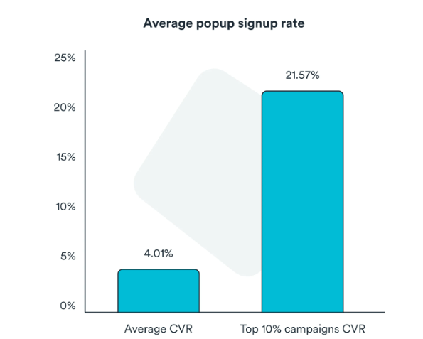
Image via Wisepops
The same study reveals that incorporating an extra step into your popups can also enhance conversion rates by as much as 43%. Implementing a two-step popup, where users click to claim an offer before providing their email, can significantly boost engagement and signups.
You May Also Like:
- 18 Fantastic Abandoned Cart Email Tips to Increase Your Conversions
- 51 Catchy Email Subject Lines Proven To Boost Conversions
Why Email Popups Are Important to Your Business
Email popups can be a powerful tool for growing your reach, and here are six benefits of using them:
- Capture Attention Quickly: Email popups are effective tools for grabbing user attention. While they can be distracting if not used wisely, a well-timed popup can gently guide website visitors through the signup process.
- Complete Customization: You can choose when and how the popup appears—whether on page load, when a user attempts to leave, or after a few seconds of browsing. This flexibility allows you to tailor the popup’s visibility to suit different situations.
- Grow your Email List: Popups encourage visitors to share their email addresses for your mailing list. One effective strategy using gated social media popups, which require users to log in through their social accounts. These gated popups allow you to gather additional information beyond just their email.
- Create a Sense of Urgency: Email popups can promote time-sensitive offers, creating a sense of urgency that encourages users to act quickly. Offering limited-time promotions can motivate visitors to purchase before the offer expires.
- Increase Engagement: Strategically displaying popups at key decision-making moments can compel visitors to spend more time on your site and engage further with your products or services.
- Upsell and Cross-Sell Opportunities: Popups can suggest complementary products once customers have purchased or added items to their cart. For instance, if they buy a new phone, you can display a popup with relevant accessories like phone cases or screen protectors. This enhances their shopping experience and potentially increases your average order value.
Different Types of Email Popups
Email popups come in various forms and serve different purposes. Using the right popup can influence user engagement and conversion rates.
Let’s explore the types of email popups to inspire your next design:
1. Standard Email Popup
Standard email popups are the most common type of popup. The popup appears as a small window that hovers over the webpage’s main content, capturing the visitor’s attention.
These popups are effective for collecting email addresses, promoting lead magnets, or offering discounts.
2. Fullscreen Popup
Fullscreen popups occupy the entire screen, eliminating distractions and ensuring the visitor’s full attention. These are great for delivering important messages or promoting high-value offers, as they compel the target visitors to engage with the content before proceeding.
An example of this type of popup is a lightbox popup, which overlays a portion of the screen, leaving everything else out of focus.
3. Side message Popup
Side messages are nonintrusive popups that appear on the side of the screen. They deliver messages or offers without disrupting the visitor’s browsing experience. They are useful for providing subtle calls to action or highlighting relevant content without annoying visitors.
4. Sticky Bar Popup
Sticky bars are popups that remain fixed at the top or bottom of the screen as the visitor scrolls. They are effective for conveying sitewide messages or offers without requiring immediate interaction. Sticky bars allow visitors to engage with the content at their own pace.
Selecting the appropriate popup type depends on your specific goal, target audience, and overall web page design. You must carefully consider the timing, frequency, and content to maximize the effectiveness of your email signup popup while minimizing user irritation.
You May Also Like:
- Email Copywriting: 19 Proven Formulas to Use on Your Next Campaign
- 51 Catchy Email Subject Lines Proven To Boost Conversions
Email Popup Design Checklist
Design matters. If your email popups don’t engage visitors or interest your audience, that little X will get clicked more often than you want.
There are four primary elements involved in an email subscription popup. Let’s build one together based on those factors. We’ll pretend we’re creating an email popup for an ecommerce company that sells sporting equipment.
Ready? Let’s dive in.
Popup Copywriting
You need good popup copywriting to really sell your offer. If you use bland, vague, or unappealing language, your audience will assume that your lead magnet or other incentive doesn’t stack up to what they want.
Speaking of lead magnets, you need a highly valuable offer. Learning how to create a lead magnet is an art form, and we encourage you to master it.
Back to email popup copywriting. What should your headline say? How can you attract attention and compel your reader to look at the rest of your popup?
We recommend a popup copywriting that creates a buzz and excites the reader. Let’s write a headline for our email popup that a fitness audience won’t be able to ignore.
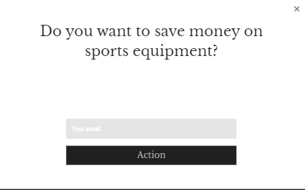
That’s pretty compelling, right? If you buy lots of sports equipment, you want to protect your bank account. Great headlines often ask questions the marketer already knows the answer to. It sets up the rest of the email popup for success.
But that’s not enough. We need a visual to send home the headline.
Visual Content
Visual content can make or break your email popup. You don’t have to include an image, but we highly recommend it. We’re naturally drawn to photographs, illustrations, and other graphics. In fact, using artificial intelligence for photo retouching can massively enhance your visuals and attract your visitors’ attention.
To spice up our email popup, we’re going to add an image that relates to the headline. In other words, we’re mirroring the headline so the reader recognizes its congruence.
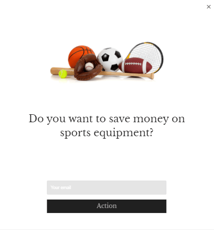
See what we mean? We have a clean, crisp stock photo of all different types of sports equipment. You can use your own images or look for stock photos — whatever works for you.
Value Proposition
The headline and image are great, but we’re not done yet. Now, we have to send home the value proposition.
So far, we’ve only hinted at the lead magnet we have in store for our fictional audience: A way to save money on sports equipment. With the body content or subheadline, we need to specify exactly what people who sign up will receive.
If you’re vague, your audience won’t know what exactly you’re offering. And because of that confusion, they’ll ignore the offer.
Here’s what we came up with:

In this case, I’ve given readers two reasons to sign up. First, they get my lead magnet — a pricing guide to help them make sure they don’t overspend when they could find an item for a cheaper price — as well as weekly coupons. Compelling, right?
Call to Action
We’re almost done, but we haven’t written a call to action. The call-to-action phrases you use will determine whether your audience fills in that box with their email addresses. It’s that important.
We could use any number of calls to action. You have limitless possibilities. And later, we’re going to show you how to A/B test your CTAs so you find the best wording for your audience.
For now, though, we’re going with one of our favorites:
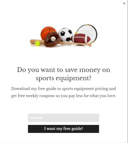
We like this type of call-to-action phrase because it’s written in the customer’s voice and it restates the lead magnet. Plus, it’s energetic and punchy.
Don’t use something generic like “Subscribe” — or worse, “Submit.” Get creative with your CTAs.
You May Also Like:
- Newsletter Subject Lines: Tips to Create Yours In Under 1 Minute
- What is Lead Nurturing: 11 Best Practices and Tactics (2024)
13 Email Popups Best Practices and Examples to Insanely Grow Your Conversions
We’ve made our own email popup, but how can you ensure you’re creating the most effective popups possible?
Our 13 tips and best practices will help you maximize the effectiveness of your email subscription popup campaigns. We’ve also shared a few other email popup examples to ensure you’re well-prepared for your audience
1. Your Email Popups Should Feature One Powerful Call to Action
If you try to use multiple calls to action, you’ll either confuse your audience or irritate them.
You might have heard of a phenomenon known as analysis paralysis. When confronted with too many options, people often shut down.
It’s like staring at a closet full of clothes and thinking, “I have nothing to wear.” That’s not true, of course, but it feels true because you’re overwhelmed by too many choices.
Since you have to get dressed in the morning, you’ll eventually recover from that form of analysis paralysis. However, your readers don’t have to sign up for your opt-in email list.
This doesn’t mean you can’t have multiple calls to action on your site. We’ll discuss that later, but for now, just limit yourself to one CTA per email popup. And make sure it’s powerful, convincing, and click-worthy.
2. Your Email Popups Should Have an Eye-Catching Design
Consumers respond well when they’re faced with aesthetically pleasing design. You want your audience to see your elegant email popup and take notice.
Colors, images, font choices, and other elements should blend together seamlessly. Let’s take a look at an email popup example from Optimonster.
OptinMonster’s welcome email popup is striking, with a clean layout, high-quality image, and a color scheme that perfectly matches its branding.
The popup is easy to read and navigate, making it engaging for new subscribers. Optinmonster sets a great example of creating an eye-catching welcome email popup that you cant help but notice.
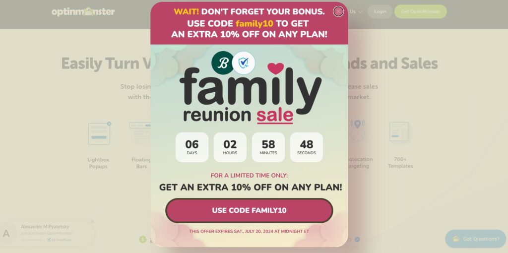
Image via Optinmonster
3. Your Popups Should Be Triggered at the Right Time
When you create a Hello Bar email popup, you get to decide when it appears. Some websites trigger an email popup to appear as soon as someone accesses the website. That’s not a good choice.
Your visitor hasn’t had a chance to acclimate him or herself to the site. When target visitors are automatically faced with a popup, they often leave the site entirely or, at the very least, close the popup. They’re not ready for it yet.
You have two primary options for triggering Hello Bar email popups.
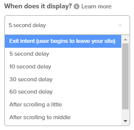
You can trigger them after a specific time delay between five and 60 seconds, or you can have your popups triggered based on scroll activity. Either way, your target visitors get used to your web page and better understand what you’re all about. Only then do you make your offer.
4. Your Popups Should Be Personalized for Specific Website Pages or Specific Traffic Sources
Let’s go back to our sports equipment email popup example. We created a fictional lead magnet to help our fictional visitors make better buying decisions for sports equipment.
That’s a great lead magnet for people who are at the top of the funnel. They’re not ready to buy.
We might use that email signup popup on our blog pages and homepage. Visitors to those pages are typically getting to know the brand and seeking helpful information.
But what about our sales pages? If someone is looking at a page that sells a particular piece of sporting equipment, they’re farther along in the buyer’s journey. In fact, they might be ready to buy.
In this case, we might offer a lead magnet like a discount popup or coupon code. Not only does it incentivize the visitor to join our email list, but it also gives them another reason to buy the product — saving money.
5. Your Popups Should Be Optimized for Mobile Users
Your Hello Bar dashboard not only allows you to create email subscription popups for different screen sizes, but also to preview how a particular popup will look on those screens.
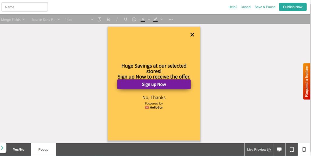
As you can see, the image from the popup we showed you at the beginning of this article disappears when a visitor views it on mobile. That way, there’s more room for the text and the email input field.
Never discount the need for an amazing user experience. If your popups aren’t mobile friendly, you’ll lose potential leads.
You May Also Like:
- How to Generate Leads from Email Marketing: 11 Ways
- Ecommerce Email Marketing – 20 Tips to Increase Sales
6. Your Popups Should Not Disturb Your Website Visitors
We already touched on this before, but we want to restate it. Don’t use email popups as a disruption. You’ll just irritate your prospects.
That’s why we recommend time delays. If you give your visitors the chance to settle in, so to speak, before you trigger the popup, they’ll be more likely to give it careful consideration.
7. You’ll Present a Popup at the End of Your Content to Reward Visitors Who Made it to the End
One option when designing your Hello Bar email popups is to trigger the popup when the visitor scrolls to the bottom of the page. The idea behind this setting is to reward visitors who read the entire page.
These popups are great for blog posts. You’ve given your audience lots of exclusive content to read, and if they complete the article, they get a surprise treat, such as a lead magnet or coupon.
8. Use an Amazing Exit Intent Popup
Another option is to use an exit intent popup. This type of popup takes over the entire screen when a visitor attempts to leave your site. You can see an email popup example of an exit intent right here on the Hello Bar blog.
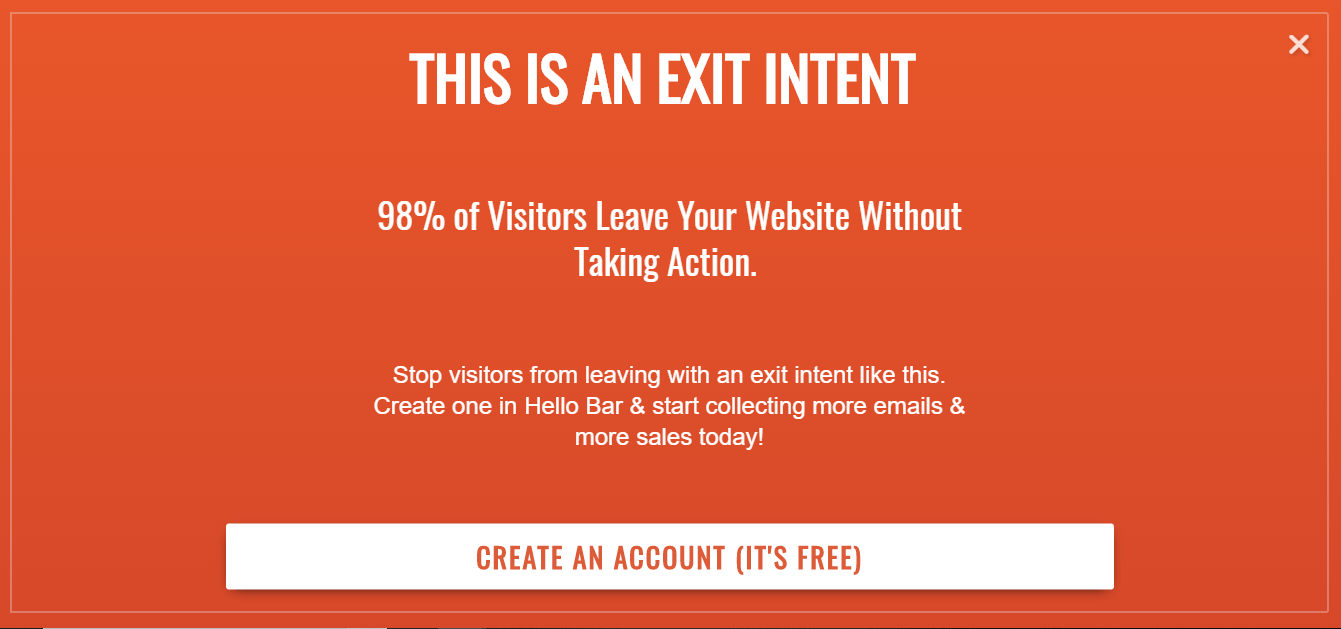
Exit intent popups are great for capturing email addresses at the last moment. You can also use them for other goals. For instance, our Hello Bar exit intent encourages visitors to create a free account.
9. Use a Top Bar and Side Bar on Your Website Pages With Awesome Calls to Action
Top bars and sidebars are also effective for email collection. For instance, you can use Hello Bar to create a bar that appears at the top of your site.
![]()
Ensure you use a catchy call to action so new visitors are compelled to click. You can also animate the CTA so it draws more attention to itself.
10. Offer a Lead Magnet Using a Popup to Grow Your Email List
Lead magnets are all the rage. They allow you to contribute something of value.
Back in the old days — six or seven years ago — you could get email signups simply by inviting people to do so. These days, people get more email than they want, so you have to spice up the deal. That’s what lead magnets do.
Let’s look at Brennan Dunn from Double Your Freelancing as an email popup example. He created a popup offering an email course, which is a clever way to collect leads and provide value simultaneously.
When someone signs up through the popup, they’re enrolled in a sequence of follow-up emails that are sent out over days or weeks. Each email contains a lesson from the course, teaching them something new and valuable.
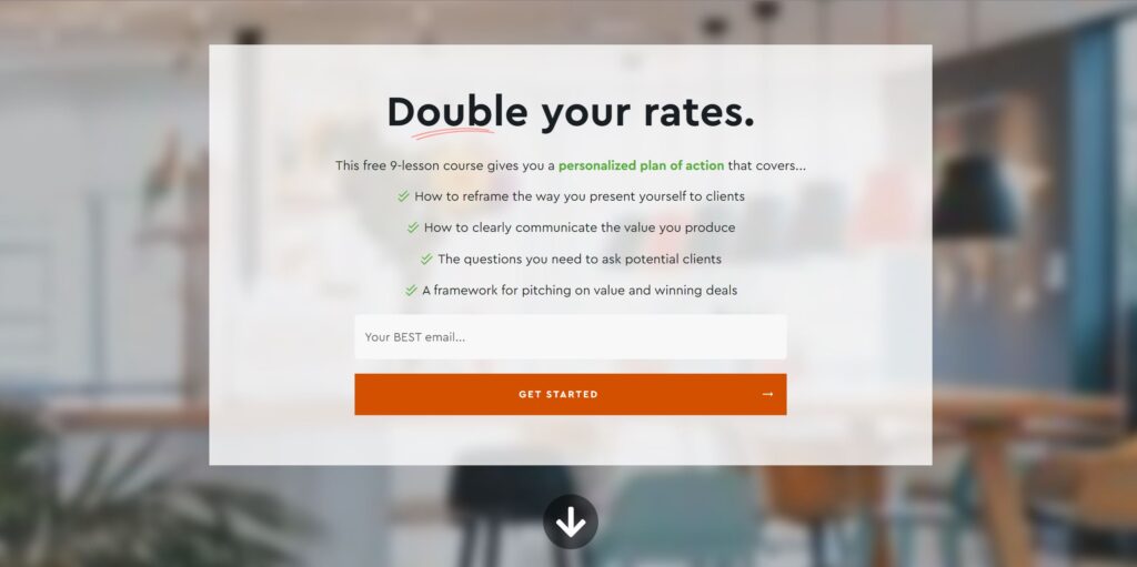
Image via Double Your Freelancing
11. A/B Test Your Email Popup Calls to Action and Headlines to Find Out What Converts Best
You’ve created a fantastic email popup. You’re in love with it; but will it convert your visitors?
There’s only one way to find out. Implement the popup, but also develop a variation and conduct an A/B test.
For instance, your popups might be identical except for the image you use or the headline wording. After the A/B test is complete, test the “winner” against another variation. Test a new element every time.
Hello Bar allows you to automatically start and stop your A/B tests. No stress or complicated coding involved.
12. Use Limited Input Fields on Your Newsletter Popups
For email popups, less is often more. One of the best practices to grow your conversions is using limited input fields on your newsletter sign-up forms.
The idea is to keep the process quick and painless for your target visitors. Asking for too much information upfront can be a turnoff and discourage people from signing up.
Stick to the essentials, like an email address and maybe a first name.
The fewer fields, the better. This streamlined approach makes it easy for new visitors to convert without feeling overwhelmed or frustrated by a lengthy newsletter popup.
13. Incorporate Automation for a Smooth Onboarding Process
Once a new visitor signs up through your popup, don’t leave them to their own devices. Instead, set up a series of automated emails to guide them through the onboarding journey.
These messages can welcome them to your list, provide valuable content, and gradually introduce them to your products or services.
Automation takes the guesswork out of onboarding, ensuring new subscribers receive a consistent, personalized experience.
This approach allows you to easily manage and streamline your processes while ensuring your new leads stay engaged and eager to learn more.
You May Also Like:
- Email List Cleaning: Clean Your List Without Losing Conversions
- Lead Capture Form: 19 Best Practices to Create an Ideal One
Hello Bar Email Popup Case Study: How Nutrition Secrets Increased Our Sales 56% by Implementing Awesome Email Popups
Our old website, Nutrition Secrets, allowed us to experiment with lots of email popups and other email marketing hacks. Once we started collecting email addresses, we boosted sales by 56 percent.
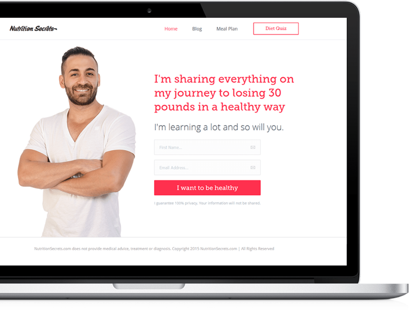
Those are pretty good results. We used leading questions to gamify the process a little and spark interest. It was an amazing learning experience that shows the power of email popups.
Set Up Email Popups Using Hello Bar in Under 5 Minutes and Start Growing Your Email List: Sign Up For free Now
Now that you have all the information you need to create fantastic email popups, it’s time to get started. You can create your own at HelloBar.com by signing up for a free account. That’s right. It’s free.
In fewer than five minutes, you can have your own email popups live on your site. Who knows? You might get a subscriber within another five minutes. Since the tool goes to work immediately, you don’t have to worry about the hustle.
You May Also Like:
- 12 Lead Generation Strategies That Will Greatly Increase Conversions
- How To Drive Lead Nurturing Campaigns After Email Acquisitions
FAQs
Q1. How do I stop popup ads on my email?
You can use built-in popup blockers provided by most email providers or install third-party ad-blocking extensions to stop popup ads in your email. Regularly updating your email software and being cautious when clicking links can also help reduce unwanted popups.
Q2. How do I eliminate the popup screen in my email?
To eliminate popup screens in your email, you can adjust your email settings to disable HTML or rich content, which is often used to display popups. Some email providers also offer options to block specific types of content or senders known to send popup emails.
Q3. Are email popups effective?
Email popups can effectively capture email addresses, promote offers, and engage visitors. When used strategically, popups can increase email list growth and conversions.
Q4. How to make a popup email?
To create a popup email, you need an email marketing platform or software that offers popup creation tools. These tools allow you to design the popup, set targeting rules, and integrate with your email list.
Q5. What is the best practice for using website popups in a user-friendly way?
The best practices for using website popups in a user-friendly way include: offering value to the user, timing the popup to appear at relevant moments, making the content clear and concise, providing an easy way to close the popup, and testing different approaches to optimize for user experience and conversions.
Conclusion
Do you want to grow your email list? Of course, you do.
However, you can’t achieve that goal without the right tools. That’s where Hello Bar comes in.
Create your own email popups so you don’t have to rely on boring signup methods on your site. You’ll grab more attention and increase your conversions.


