Website Conversion Optimization: How to Get Results With A/B Testing (& Actual Examples To Get You Started)

I hope you enjoy this blog post. If you want Hello Bar to grow your leads, click here.
Author:
Ryan Bettencourt
Published
November 30, 2018

Have you ever been cruisin’ around the web and stumbled upon a site where you used to have a subscription, or, another scenario, perhaps visited your fave SaaS site to check out their latest product news and thought, ‘Hey, this website sure looks different than the last time I was here, what gives…?’
What you probably were noticing was a growth-driven marketers attempt to improve the conversion rate of the website he or she manages, which includes making changes to CTAs, the navigation, layout (UI and UX) and design—to name a few.
But if you didn’t notice a site’s changes… that might be a good thing.
Because there’s a subtle art to crafting and implementing website conversion optimization tests. It might be a bold statement, but the best changes for site optimization are more subtle, and don’t disrupt the user’s experience and instead: enhance it.
So, how do you get results?
Throughout this post, we’ll offer a few examples on how you can optimize different pages, such as your Homepage, Pricing and Blog, etcetera.
Also, what’s a test without a metric? It’s like a car without a steering wheel!
So, have no fear, we’ll shine a light on which metrics should guide your strategies. And lastly, we’ll tackle the research and prep that drives any well-planned A/B test so you can turn your site into a conversion machine.
Here are five tips to help you plan and execute A/B tests—like a boss.
Step One: What are we even talking about?
First things first, let’s define website optimization… before our deep-dive, let’s all get on the same page. According to the web-wise Neil Patel, “Your website has two kinds of conversions:
1. On-page actions (a type of micro-conversion) 2. Revenue-driving conversions (the ones that support your business goals).”
For instance, at Leadfeeder, we create Test Plans for both kinds of conversions Patel noted. But, we don’t just run a test for a test’s sake. We try to decipher our potential customers’ roadblocks with hypothesis-based testing. It’s iterative. We test, learn, decipher, counter-test, analyze results.
“Conversion optimization is a team effort,” explains Leadfeeder’s Head of Growth, Brian O’Sullivan. “Even before testing our trial signup process at Leadfeeder, we made sure to chat with our customer-facing teams and ran user surveys to better understand the drivers and motivations behind every sign up. In conjunction with getting team and user feedback, we also watched user behavior on our website through Hotjar because what people say and actually do can be entirely different. There’s a lot of prep work before testing can even begin,” O’Sullivan denotes.
Let’s show you how we do it….
Optimization By Page Type: Pro Tips for Dirty-n-Quick A/B Tests
1. CUSTOMER PAGES
Customer Testimonial pages, when trafficked heavily, are a good indicator of potential customer interest. This is an integral facet for these pages being prime for A/B optimization testing.
“According to surveys, approximately 74 percent of online shoppers state that reviews from people who have used a product before play a major role in their purchasing decision. If you can link from a positive review to a product’s main page, that testimonial could potentially be the most crucial factor in the customer journey,” explains NeverBounce.
So, yes. These Customer pages, along with Pricing pages, show funnel-based behavior. They show whether that prospect is moving closer to the Decision phase, or not.
Tips for A/B Testing Your Customer Page:
- Video Video Video! Yes, it’s true, as you probably already know, video marketing is hot-to-trot and many popular platforms have even ‘altered their algorithm’ to rank higher for video, such as Google, Facebook and LinkedIn. With all this hullabaloo about video, invest in capturing a video testimonial from one of your seasoned customers.
- Pair video with a gated or ungated Case Study. Let these two mediums battle it out in an A/B Test using Google Optimize and see what happens.
- Track your CTA buttons with Google Analytics. On our Customer Page here at Leadfeeder, we tested the Free Trial button with our Demo button and decided that for those heading down the funnel, pushing to a Free Trial from the Customer Page was too aggressive. Book a Demo was the clear winner, and it makes sense. Prospects cruising your site when they’re in the Discovery Phase, check out your Blog, Case Studies, Customer Testimonials, and Product Pages, and as they move on, they head to the Pricing Page, which is where the CTA is more aggressive.
- Use Hotjar, UserTesting.com or Crazy Egg to “see” what prospects are doing once they’re on your site. At Leadfeeder, we “eat our own dogfood” meaning we use our product just like our customers do: to see who’s visiting our website and what they’re interested in. But, to dig deeper, using heat mapping is an excellent complement to understanding intent and where you can make the most wins based on data-driven insights.
2. PRICING PAGES
Pricing pages are oh-so-important. And for a B2B SaaS, you need your pricing page to showcase the value, and urge them along the buyer journey, but also be highly understandable.
Here’s an example from our Growth Team…
Pricing Page Test Plan: Adding the price-per-lead-slider.
Background: We’ve had some feedback from users that including the price-per-lead in the pricing table was confusing. We want to test taking it out of the table and instead using a price-per-lead calculator along with an ROI calculator.
Hypothesis: Adding a price-per-lead calculator and removing the price-per-lead from the pricing box will make our pricing easier to understand while still demonstrating that the ROI from Leadfeeder is great.
Business Case: A 20% uplift roughly translates to 30 additional sign-ups per month
Metrics:
- Sign-up starts
- Sign-ups
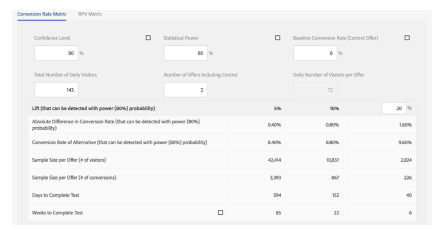
Estimated Sample Size Required:
- 3K p/variant, 5-6 week run time
- 8% CVR, 20% lift, 80% power, 80% confidence
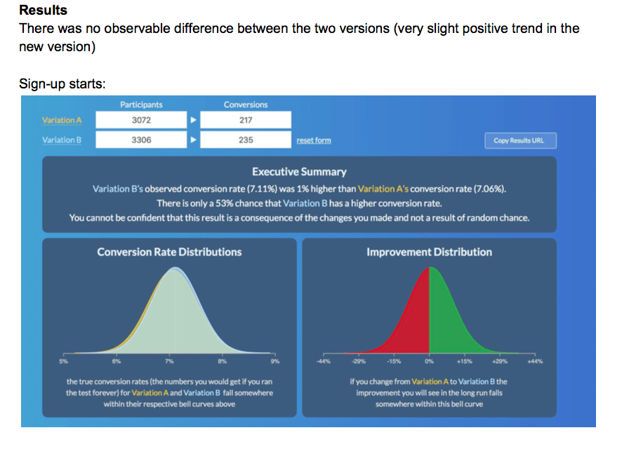
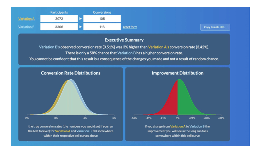
So, what did we learn from this A/B test experiment?
Well, for one, we couldn’t see any difference in performance between the two different versions. It’s possible there would have been a smaller lift from the new version if the experiment had run for longer. We decided to implement the new version as we feel it’s a better user experience.
This is sometimes the best you can do when testing—but it also left us with insights about the importance of longevity timing and the value of UX.
To build upon the importance of design, I reached out to my old friend, Andy Vitale, a UX Design Director who’s worked for the likes of 3M, Polaris, Belk and now SunTrust Bank. I asked him his thoughts on our process and he has this to say…
“Design plays a major part in conversion and optimization performance of a site. The design process is all about understanding the people who come to your site, what they are trying to accomplish and identifying ways to help them complete tasks,” he explains.
“Aside from feedback and validation, beyond just aesthetic, design focuses on functionality. Leveraging design principles and best practices will lead to enhanced conversion and performance. Providing ways for people to easily find what they are looking for and navigate the site is key. While you may have a sales funnel you want people to enter, depending on their purpose for visiting the site, they need ways to explore naturally, without feeling stuck.”
Overwhelming site visitors with too many options or too much content can add unnecessary confusion, which Vitale also cautions against. In terms of our Pricing Page UX test, we knew it’s also important to make sure things behave as expected, another tip that Vitale often shares with the UX community. Check out the slider for yourself, it’s pretty rad.
3. BLOG PAGES
The most difficult page, in my opinion, to get “right,” are the Blog Site Pages. Most B2B SaaS blogs are meant to perform as though they’re conversion monsters. Blog posts are carefully crafted, written, launched, promoted—then we wait. When a blog post fails to deliver traffic, signups or even a decent CTR, as marketers, we head-scratch and head back to the drawing board.
For optimizing a blog, the best place to start with A/B Testing are those pesky CTAs. The color, the size, the content, the messaging—all this can be tested.
For instance, here at Leadfeeder, we had a problem that I’ve faced managing many blogs in my past lives: lots of good traffic but no conversions on the CTAs.
Basically, our problem was one that many SaaS marketer’s face: We currently don’t derive much value from our blog subscribers. We push users to sign-up to our newsletter in posts—but only a wimpy 0.2% of our sign-ups come from users who had been a blog subscriber.
So, what did we do about it?
We wanted to A/B test focusing on having visitors to the blog sign-up directly.
Blog Page Test Plan: Calls-to-Action
Hypothesis
Focusing blog CTAs on sign-ups will result in more sign-ups overall.
Business Case
A 35% uplift roughly translates to ~15 additional sign-ups per month.
Metrics:
- Blog CTA clicks
- Sign-up starts
- Sign-ups
Estimated Sample Size Required: 3.7K p/variant, 3-week run time
(Note: We assumed 20 people click the subscribe CTA p/week. It’s a complete guess but we know 35 to 50 people click the other blog CTAs per week.)
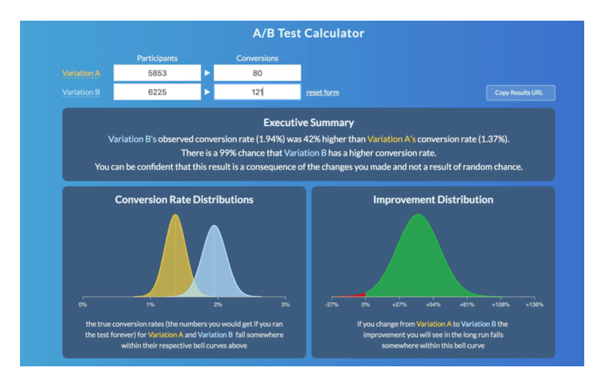
Actual Sample Size: 6K per variant, actual CVR was 1.4%.
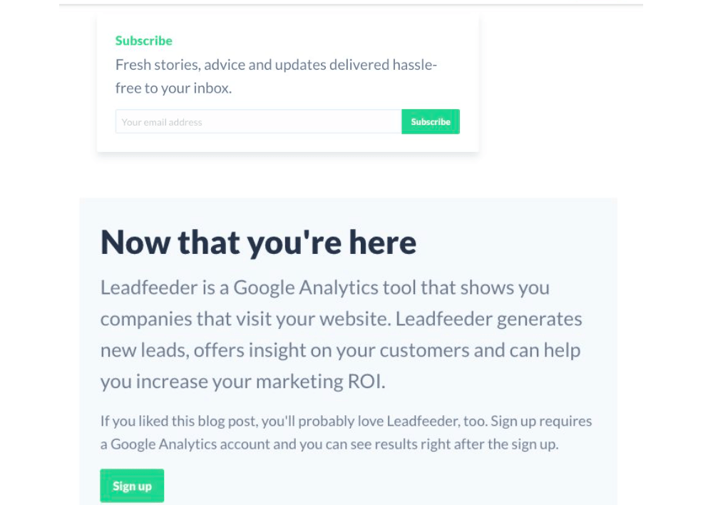
Here are the two original CTAs we decided to test against:
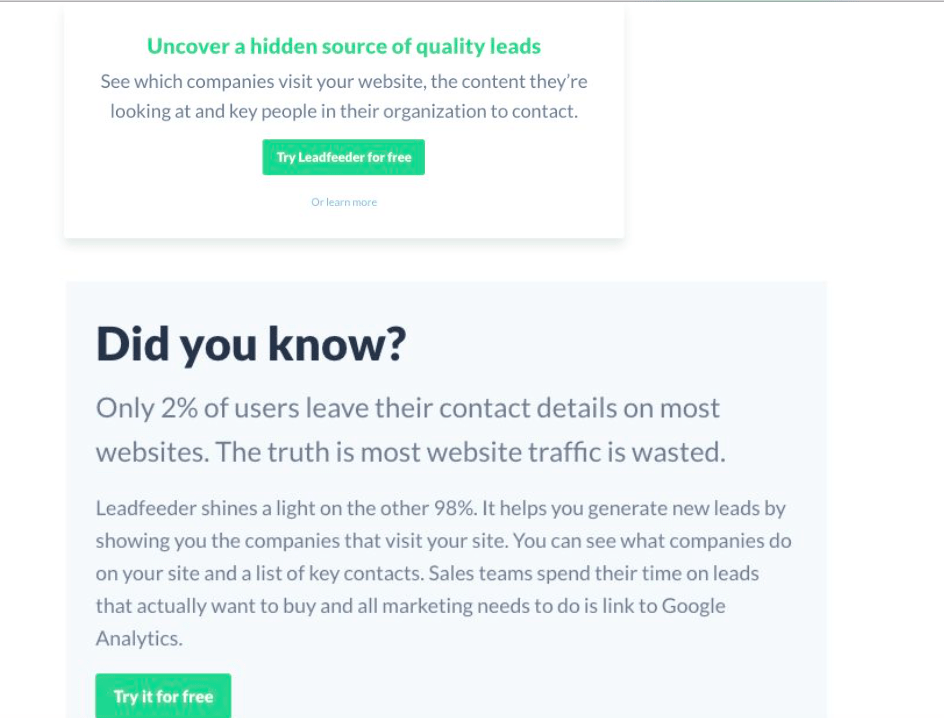
And here are the two new CTAs we created to A/B test against:
Blog Test Results:
Impressively, those who began the sign-up process, or as we call it, sign-up starts, increased by 42%, and as you can probably imaging: this stat was significant for us. Our ah-ha! moment: Changing all the CTAs to focus on sign-ups definitely got more people to start the sign-up process, but it’s still unclear if we actually receive any more sign-ups as a result. This will be tested next time around.
In either sense, the significance of the sign-up starts made us realize that it probably makes the most sense to include a mix of CTAs in the inline content in the future. So, we did that!
CLOSING THOUGHTS…
Running A/B Tests is challenging, yet fun, enlightening and oftentimes maddening—all at the same time. But, alas, as a marketer in the B2B space, it’s an integral facet to not only show your team you can ‘walk the walk,’ but it’s integral to customers and future customers that you let their decisions shape yours.
At the end of the day, what we’re all doing in the SaaS and PaaS world is solving problems for other people.
It’s that empathy for the user’s experience via surveying, Net Promoter Score analysis, design and especially A/B testing, that create better outcomes for website optimization because the most important thing is listening to your customers’ wants and pain points. Optimizing your website to be a conversion monster doesn’t have to be hard. Hopefully, these examples of how to run tests by page type will inspire you and your team to roll up your sleeves and play Mad Scientist—experiment! But use your customer’s intent as your secret sauce and you’ll go from zero to hero in no time. And your customer’s will be better for it.


