35 Best Abandoned Cart Email Examples: Increase Sales Today

I hope you enjoy this blog post. If you want Hello Bar to grow your leads, click here.
Author:
Ryan Bettencourt
Published
August 6, 2024
People who visit your website aren’t necessarily looking for something to buy. However, when they put things in their digital shopping carts, you want them to buy. That’s why it’s so important to study abandoned cart email examples and learn to create them yourself.
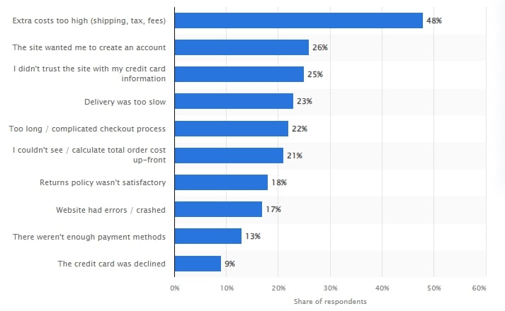
Abandoned shopping carts can significantly reduce your revenue. People get distracted, frustrated by the checkout process, or nervous about the price. In fact, almost 50% of consumers abandoned their carts in 2024 due to high shipping costs.
Some get disconnected from their internet connections or decide to do some comparison shopping first. The chart below illustrates the percentage of customers who abandon their carts for various reasons.
What Is an Abandoned Cart Email?
An abandoned cart email is an email you send to people who have exited your site without buying the item(s) in their shopping carts.
Offering an incentive is an effective strategy to remind them of items they wanted to buy and to nudge them back to your site. You can offer a discount or special offer to encourage them to complete the checkout process.
Abandoned Cart Email Statistics
The global cart abandonment rate reached an alarming 70% high in 2023. The chart below shows the worldwide cart abandonment rate over the years:
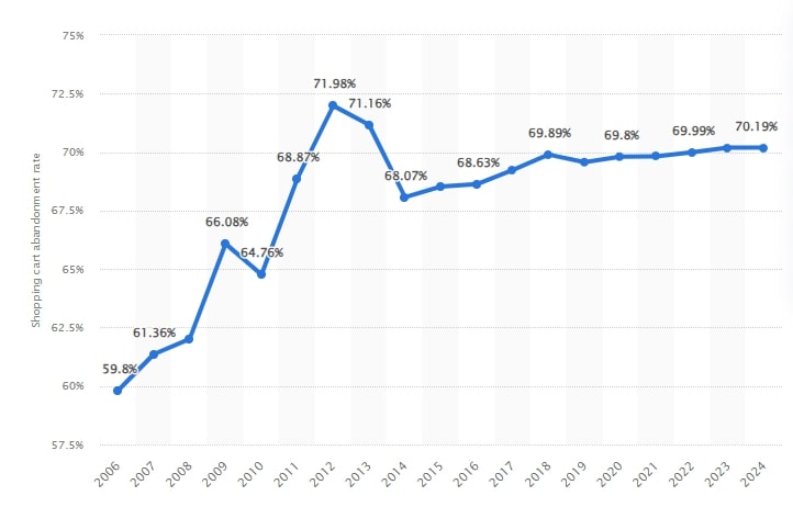
Image via Statista
The cart abandonment rate also varies by device.
A recent study shows that mobile devices have a higher cart abandonment rate compared to desktops. In 2022, the cart abandonment rate for mobile devices and desktops was 84% and 72% respectively, as shown in the chart below.
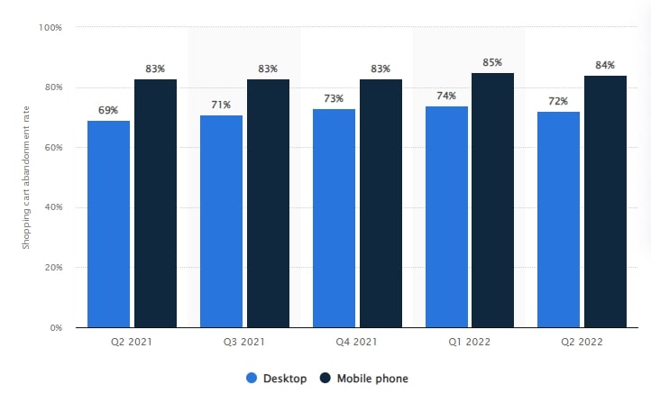
Image via Statista
The Cruise and ferry industry had a 98% cart abandonment rate, making it the highest among various industries as you can see below.
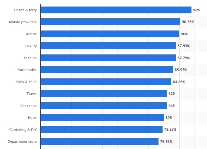
Image via Statista
You May Also Like:
- 23 Email Marketing Statistics To Highly Increase Your Conversions
- 19 Abandoned Cart Email Best Practices to Boost Conversions
What is a Good Abandoned Cart Email Conversion Rate?
Cart abandonment emails convert 1 in every 2 people. And it gets even better.
Automating your cart abandonment emails can boost your conversions. In 2023, automated cart abandonment emails had a 46.6% open rate and a 5.7% click rate as you can see below.
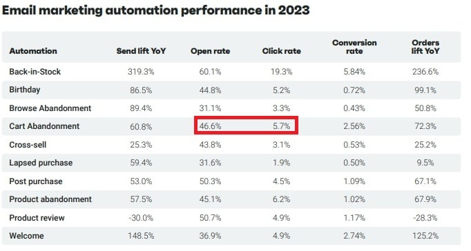
Image via Omnisend
Cart abandonment emails were among the top 5 types of automated emails with a 2.39% conversion rate as shown in the chart below.
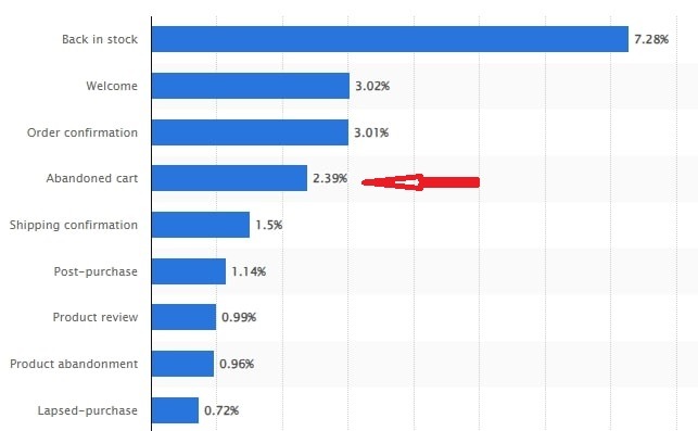
Image via Statista
That’s a great place to start, but your results can vary by industry. Test different email layouts, design, and copy to get the best abandoned cart email conversion rate possible.
Abandoned Cart Email Timing: How Many Emails Should We Send to Recover the Most Sales?
Some brands only send one abandoned cart email, but adding three or four to your arsenal can help you recover more sales. Consumers who receive your first email might be too busy or distracted to act. Reminding the consumer multiple times might get a conversion.
Ensure that each email in your abandoned cart email drip campaign contains different imagery and copy. Be creative with your message to surprise and delight your audience.
Here’s our suggested abandoned cart email sequence:
- Reminder: Gently remind your customers of the items they left in their cart.
- Urgency: Create a sense of urgency by highlighting that the cart expires soon or the items are in high demand.
- Incentive: Add a stronger incentive, such as a higher discount or a free gift with purchase.
- Final Reminder: Emphasize that this is the last opportunity to take advantage of the discount or special deal before the deal expires.
You May Also Like:
- Email Copywriting: 19 Proven Formulas to Use on Your Next Campaign
- Ecommerce Email Marketing – 25 Tips to Increase Sales
How to Reduce Ecommerce Cart Abandonment
We’ll discuss some excellent abandoned cart email examples below, but first, we want to clarify that you can reduce abandoned carts from the get-go. You don’t have to send emails if people don’t leave items in their carts.
Here are some strategies to reduce your cart abandonment rate:
Offer Transparent Pricing
When customers proceed to checkout and encounter unexpected shipping costs, taxes, or handling charges, they may feel misled and decide not to complete the purchase.
Display all costs (shipping, taxes) upfront on the product page. This transparency sets accurate expectations for customers. Go the extra mile and assure customers that the price they see is what they will pay, without any hidden fees.
Simplify Checkout
A complicated or lengthy checkout process can frustrate customers and prevent them from completing their purchases. Simplifying this process makes it easier for customers to complete their purchases without feeling overwhelmed or discouraged.
Here are a few tips:
- Use guest checkout to allow customers to purchase without creating an account
- Combine all checkout steps into a single page
- Minimize form fields and only ask for essential information
- Enable auto-fill options for address and payment information to save customers time
Provide a Clear Cancellation, Return, and Refund Policy
Customers need reassurance that they can easily return or exchange products if they are unsatisfied. A clear and customer-friendly cancellation, return, and refund policy can boost their confidence in completing a purchase.
Make the policy easily accessible from the product page and checkout page. Avoid using legal jargon that can confuse your customers. Instead, use simple and clear language to explain the policy.
Eliminate Distractions
Distractions during checkout can cause customers to lose focus and abandon their carts. Fortunately, you can get rid of these distractions with the following tips:
- Use a clean, minimalistic design for the checkout page
- Remove any unnecessary links that lead customers away from the checkout process
- Use prominent and persuasive CTA buttons like “Complete Purchase” or “Submit Order” to guide customers
Build Trust and Security
Customers can be skeptical, especially when providing sensitive information to an online store. You need to assure them of the safety and protection of their personal and financial information. Here’s how you can achieve that:
- Display trust badges like SSL certificates, secure payment icons, and third-party endorsements like BBB accreditations.
- Showcase customer reviews and testimonials from satisfied customers to enhance your credibility.
- Clearly state how you will use, store, and protect customer data.
Use Exit Popups
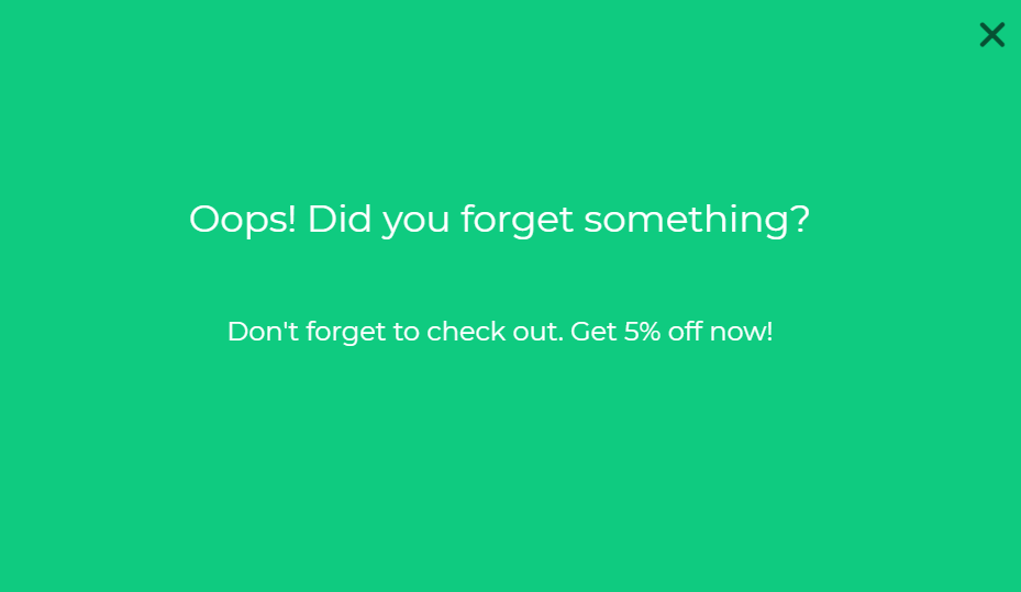
Exit popups are an effective strategy for reducing cart abandonment rates. You can retain customers’ interest and secure a sale by capturing customers’ attention before leaving. However, the exit popups must be convincing enough to nudge customers to complete the checkout process.
Try using Hello Bar to create an exit intent popup. It will appear on your checkout page when users attempt to click away without completing the purchase.
Feel free to get creative. You can offer customers a discount code, free shipping, or other incentives. Alternatively, remind customers of the items left in their cart and the benefits of completing the purchase.
Here’s a perfect example:
Improve Website Performance
Slow-loading pages can frustrate customers and result in cart abandonment. Optimizing your website’s performance can help you create a smooth shopping experience and boost conversions.
Here are several tips to optimize your website
- Compress images without sacrificing quality to reduce load times.
- Minimize CSS, JavaScript, and HTML to reduce file sizes and improve page load times.
- Ensure your website is responsive on mobile devices.
- Use tools like Google PageSpeed Insights to regularly check your website’s performance.
You May Also Like:
- Email Popups – 13 Best Practices to Insanely Grow Your Conversions
- 51 Catchy Email Subject Lines Proven To Boost Conversions
35 Best Abandoned Cart Email Examples to Inspire Your Next Campaigns
Now that we’ve set the stage, let’s get to those abandoned cart email examples. You don’t want to copy other brands, but a little inspiration never hurt anyone.
1. Amazon
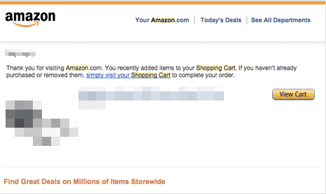
We can always expect Amazon to deliver amazing customer service and marketing. If you leave an item in your cart with your Amazon account, you might receive an email like this one. It’s personalized with your full name and includes a picture of the item(s) in your cart as well as the name.
We like the simple CTA: “View Cart.” It’s not too aggressive, but it makes the point.
2. Nike
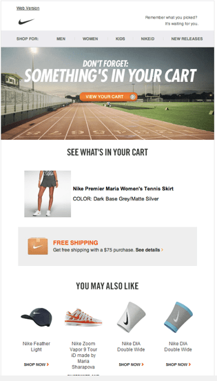
Nike knocks it out of the park, too. Instead of going for clean, simple, and minimalist, Nike uses a hero image with a primary headline. You’ll see a picture of what’s in your cart as well as a reminder about the company’s free shipping policy.
What we love most is the “YOU MAY ALSO LIKE” section. That’s a great strategy for luring people back to your site.
3. Revolve
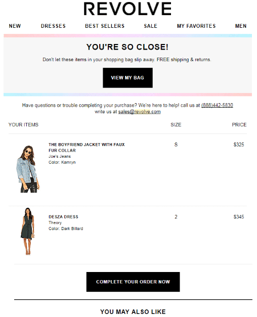
Revolve does a nice job of representing its brand in this abandoned cart email example. The CTAs have different text, but they’re rendered in the same way — white on black rectangles — and you can see what you forgot in your cart.
4. J.Crew
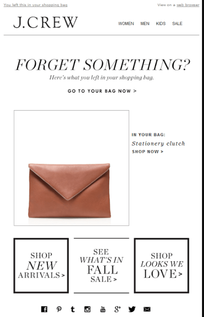
We like J.Crew’s classy approach. In addition to letting the customer know there are items in his or her shopping cart, there are also CTAs for other pages on the site in case the consumer might want to look at new arrivals, fall finds, or looks J.Crew loves.
5. Reebok
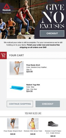
Reebok takes the tough-love approach with a “Give No Excuses” headline. It works here because of the brand and its audience. There’s an immediate CTA to check out, but if you scroll down, you see items in the abandoned cart, plus a subtle CTA to continue shopping and a bolder one to check out.
6. Nordstrom
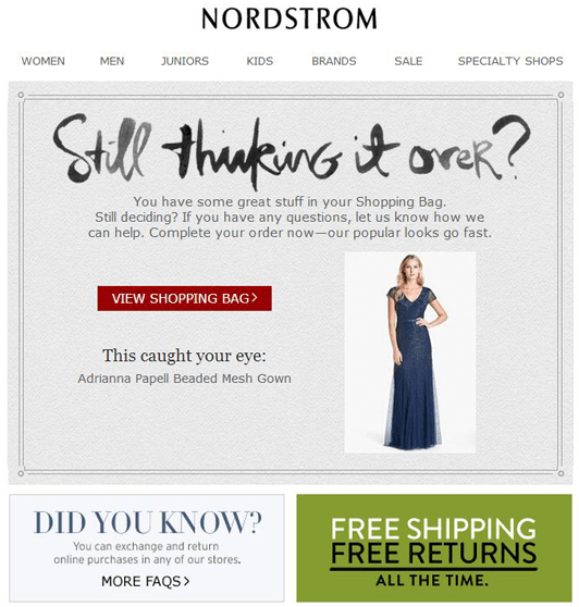
A question is a great headline among abandoned cart email examples. It works here for Nordstrom in a funky script. We also like the “Did You Know” and “Free Shipping/Free Returns” notices at the bottom. You’ll notice the line that conveys urgency: “our popular looks go fast.” This is a great hint to the consumer that they better check out quickly.
7. Bonobos
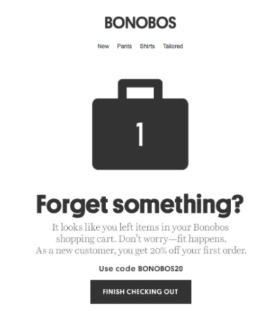
Here’s one of our minimalist abandoned cart email examples. We might add a photograph of the image left in the cart, but the number tells the consumer how many items there are. However, Bonobos makes up for leaving out the product image by offering a special coupon code directed at the new customer.
8. Bespoke Post
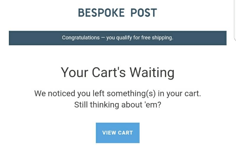
This email from Bespoke Post caught our attention because of the copy at the top: “Congratulations! You qualify for free shipping!” That’s a great way to hook the reader. It’s a pretty simple email otherwise with a “View Cart” CTA. It’s always best to include product images, but simplicity can help with conversions.
9. Mango
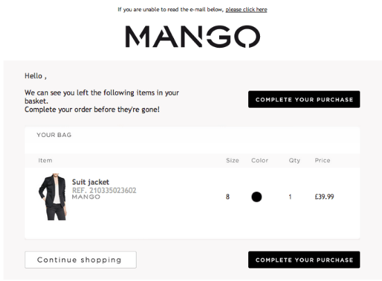
This is one of several abandoned cart email examples we’ve seen that leads with urgency. The message is crystal clear here: “Complete your order before they’re gone!” Mango includes not only the product image, but also the size the consumer chose, the color, the quantity, and the price. Their high-contrast, repeating CTAs work in Mango’s favor.
10. Chubbies
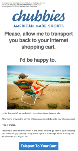
You have to love humor, right? Chubbies doesn’t go over the top, but inspires a giggle that aligns with the brand. You’re not just going to your cart — Chubbies offers to “teleport” you there. Plus, the wording is consistent throughout, which places an emphasis on branding.
11. Jessops
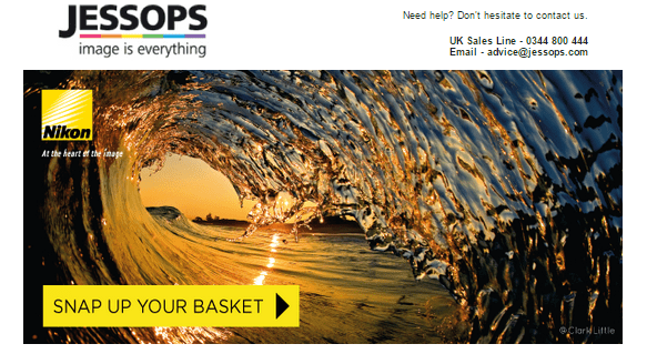
This Jessops email also includes a list of product images and descriptions below the cut, but we wanted to emphasize the email copywriting here. The store is dedicated to photography and videography, so the CTA pops off the screen with unusual wording: “Snap up your basket.” This reflects the definition of the word “snap” in the photography world. Well done.
12. AllBeauty.com
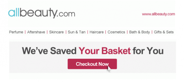
Personalization can work on a lot of levels, as we’ve shared in other blog posts. In this abandoned cart email example from AllBeauty.com, there’s no specific allusion to the individual receiving the email, yet it still feels personal.
For one thing, the words “for you” imply intimacy. It’s something done just for you. Second, the company makes “Your Basket” the same color as the “Checkout Now” CTA. Awesome emphasis on “you.”
13. Dot & Bo
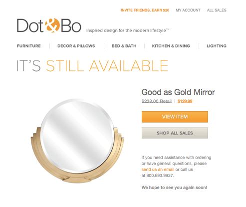
Here, we have a perfectly witten headline that’s sure to resonate with readers. Dot & Bo very subtly implies urgency and scarcity: “It’s Still Available.” That suggests it might not be if the customer waits too long to check out. There’s also a second, subtler CTA below the “View Item” button that invites the recipient to check out all current sales.
14. Huckberry
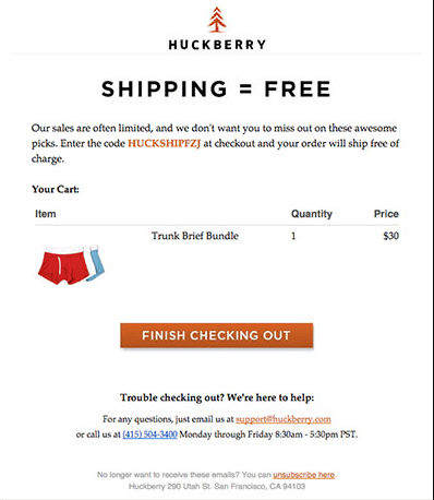
In copywriting, they say to lead with the most important thing. That’s what Huckberry does here with the headline “Shipping = Free.” It’s a creative way to state the incentive for checking out. Plus, you see the product image, description, quantity, and price, and there are multiple options for contacting the company if customers have trouble with the checkout process.
15. Levis
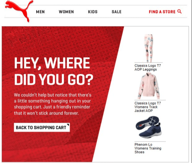
Levi’s turns up the urgency button pretty heavily here, and it works. The contrasting CTA stands out, and the geometric design draws the eye. We really like the thought that went into the design of this email. It’s one of the most creative abandoned cart email examples we’ve seen.
16. Forever 21
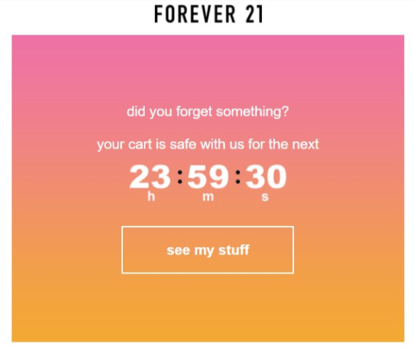
Countdown timers can work in lots of places, including abandoned shopping cart emails. Forever 21 wants you to know that it will save your items, but only for the next 24 hours. After that, the cart goes away.
17. Kate Spade New York
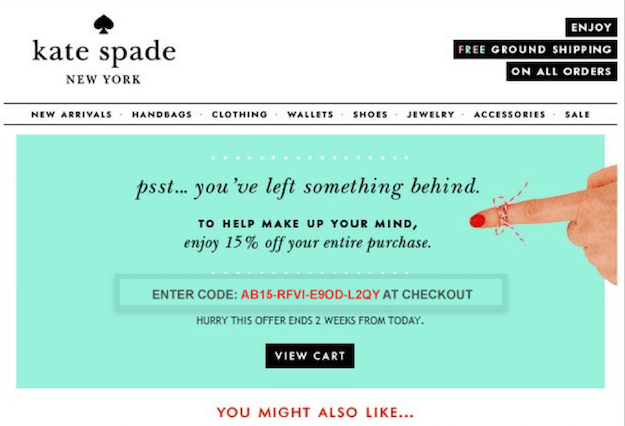
We like abandoned cart email examples that include multiple incentives. As long as you have a great email subject line to get people to open your messages, adding extra benefits to checking out can only increase conversions. In this example from Kate Spade New York, we have a discount code for 15 percent off as well as free shipping. Plus, there’s urgency: You only have two weeks to use the code.
18. Doggyloot
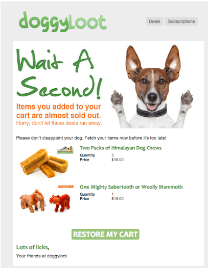
You have to love a picture of a cute dog, right? This email is precious, but not overly so. I like the line, “Hurry, don’t let these deals run away.” It’s reflective of the brand and its audience. Then, you have the closer: Lots of licks,” and the CTA: “Fetch your items now.” This email has a ton going for it.
19. Shutterfly
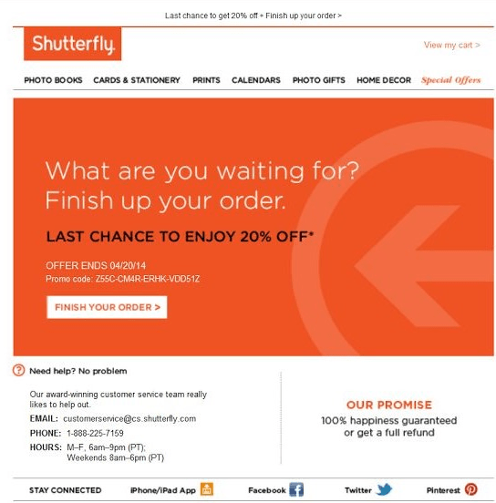
We have a few abandoned cart email examples like this one from Shutterfly. There are no product images, but the CTA is pretty compelling. You get 20 percent off with your promo code, but you only have a short time to take advantage. The trust signal — 100 percent guarantee — also goes a long way toward getting people to convert.
20. Ugmonk
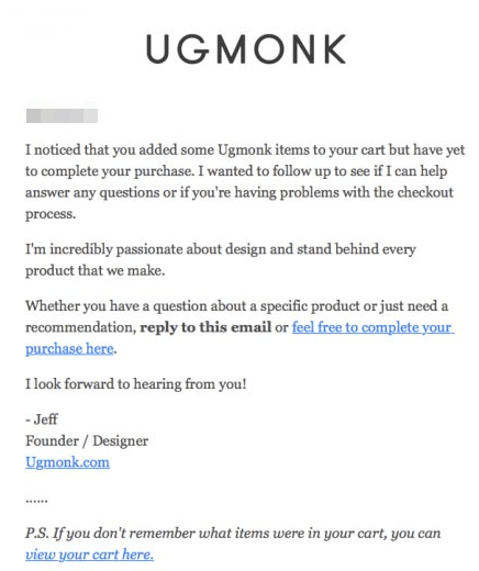
Here’s the thing, a great design can make an email more likely to convert your leads. However, lots of images weigh down the email, and many people only enable plain text.
This email from Ugmonk caters to the entire audience. It’s clean, text-only, and straight to the point. Plus, the copy does a great job of engaging leads.
21. Madewell
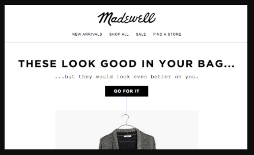
We love a good play on words. The headline on this abandoned cart email from Madewell — These Look Good In Your Bag — really hits home. Then, you have the subheadline kicker: …but they would look even better on you.
Below the cut, Madewell shows you the items in your cart to help remind you of items you wanted. It’s a clean, sleek email that works on multiple levels.
22. Venus
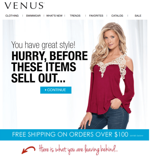
There’s never a wrong time to compliment your audience, as we saw above in the Madewell example. This copy from Venus uses the same psychology in its headline: “You have great taste!” Who doesn’t like to hear that?
You also have an incentive in the form of free shipping and a list of items you left behind.
23. Bloomingdale’s
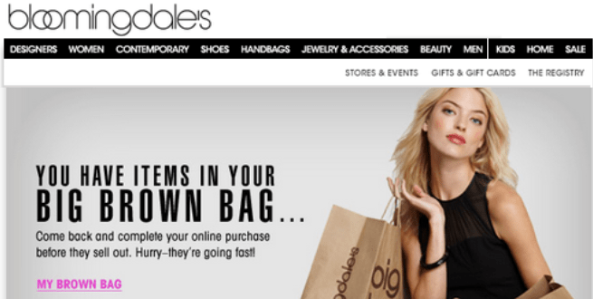
We’re not Bloomingdale’s shoppers, but are aware of the big brown bags for which they’re known. This example does a great job of reinforcing the brand, then uses the phrase “My Brown Bag” to speak to the customer in his or her language.
24. Mack Weldon
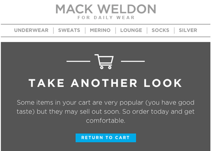
We have another complimentary example here. Mark Weldon lays it on a little thick; It combines urgency and scarcity to get the job done. We love that the CTA sticks out from the otherwise neutral palette.
25. Toys “R” Us and Babies “R” Us
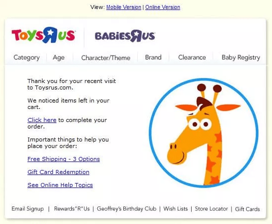
Frankly, we expected more from Toys “R” Us. While the giraffe image is cute, it’s a little too clipart-y; and the multiple CTAs can cause confusion. We like that the company thanks its visitors, but this email could be spiced up by adding product images and some engaging copy.
26. Thrive Market
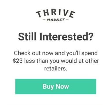
Here’s an interesting take from a large pool of abandoned cart email examples. Thrive Market tells you how much you’ll save by purchasing your items from them versus other retailers. Again, we have the blue CTA button with otherwise neutral colors.
27. BlackMilk
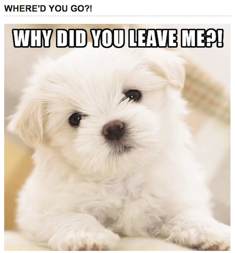
We are surprised more brands don’t use meme-style designs for their abandoned cart email strategy. This one of an adorable puppy captures our attention immediately. The “Why Did You Leave Me?” headline makes you want to click on the CTA below this screenshot and buy something. It’s a great example from clothing brand BlackMilk.
28. Pacsun
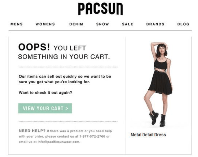
Many abandoned cart email examples use the idea that the consumer just forgot to check out. It’s assumed. Instead of suggesting that the customer didn’t want the item, you take the position that the product is extremely desirable. Pacsun does a great job with copy and imagery to create urgency.
29. Peak Design
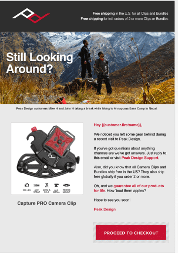
Here, we have a friendly abandoned cart email reminder from Better Brand. The email mentions the reader’s name, making it feel like a personal conversation. There’s also an image of the product and an emphasis on its benefits. The free shipping incentive nudges the reader to complete the purchase.
30. Hulu
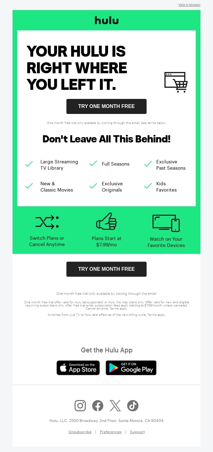
Image via Really Good Emails
Hulu sets the bar high for abandoned cart email examples. The simple and friendly headline reminds the customers of the product they left behind.
This abandoned cart email example also reinforces what the customer is missing out on by listing the benefits of subscribing to Hulu. The prominent call to action doubling as an incentive nudges readers to the right direction.
31. Fabletics

Image vis Really Good Emails
Fabletics takes personalization to the next level by sending a friendly reminder to the reader. The email features a clear image and a detailed description of the specific item left in the cart, helping the recipient recall their interest in the product. Additionally, the personalized call-to-action (CTA) stands out, effectively encouraging the reader to continue shopping.
32. Chatters Salon

Image via Really Good Emails
Of all abandoned cart email examples we’ve seen, none combines personalization, urgency, and incentive quite like this one. Chatters Salon communicates urgency right from the subject line.
The personal touch shows that Chatters Salons pay attention to individual customer needs. The email includes a clear call to action, telling Sheeza to “Complete Checkout” with an incentive for further persuasion.
33. Homes Alive

Image via Really Good Emails
You don’t want your pets to know you forgot their treats. Luckily, Homes Alive won’t breathe a word if you complete your checkout.
The email uses humor and empathy to connect with the reader. The cute dog image pulls the reader’s heart strings some more. And before they know it, they are clicking on the CTA before their items expire.
34. Explore Cuisine
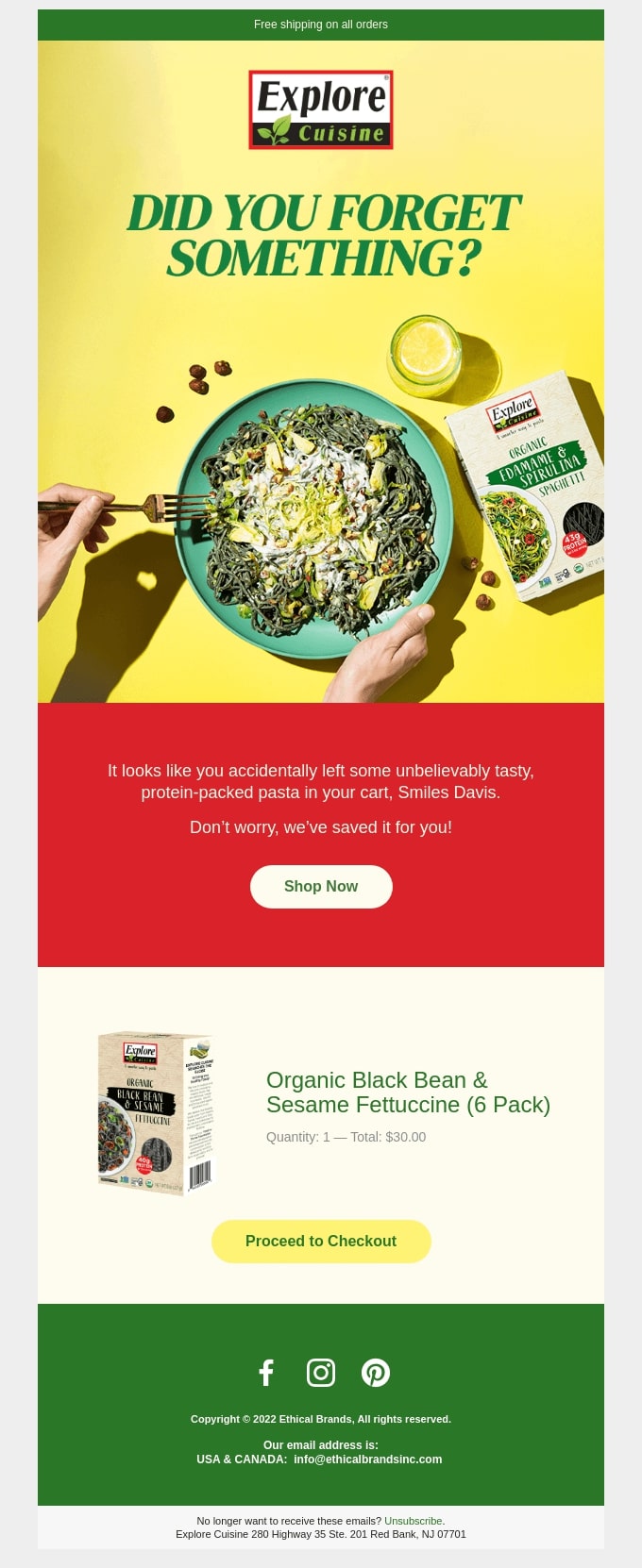
Image via Really Good Emails
You’ve got to love a minimalistic abandoned cart email example like this one from Explore Cuisine. It gets right to the point without any unnecessary frills.
This email doesn’t just nudge readers, it woos them back with a mouthwatering image of the protein-packed pasta they left behind. The promise of free shipping makes it irresistible for the reader to finalize purchase.
35. Rael

Image via Really Good Emails
Many abandoned cart emails have great email subject lines, but this one from Rael makes you want a second glance.
The subject line is a cheeky icebreaker. It’s friendly, relatable, and instantly grabs attention. This email includes an image of the abandoned product and a clear CTA that subtly encourages the customer to reconsider their purchase without sounding pushy.
You May Also Like:
- Email Marketing For Beginners: A Complete Guide
- How To Create And Maintain Brand Loyalty Like a Pro in 2024
Abandoned Cart Email Strategy Tips
Now that you’ve seen some abandoned cart email examples, what can you learn from them? Let’s examine some of the best email marketing strategies to help you increase your conversion rates and recover lost sales.
Use the Right Copywriting Techniques
We’ve seen an elegant, humorous, and straightforward copy. The right approach depends on your brand and audience.
Don’t be afraid to be goofy in your copy if you sell goofy clothing. This will reinforce your brand and make your potential customers feel comfortable.
Add Creative Subject Lines
We didn’t look at the subject lines for these emails, but they need to be even catchier than the emails themselves. Otherwise, your open rates will suffer.
Focus on snagging your audience’s attention. Add clever adjectives and powerful verbs to get your message across.
Be Personal and Specific
You can personalize your abandoned cart emails with the recipient’s name or simply use a casual, friendly approach. If the email sounds like a close friend could have sent it, you’ve done your job.
Offer an Incentive to the Buyer as well as a Sense of Scarcity
We saw incentives and scarcity in abundance in the abandoned cart email examples above. Tell your audience you’ll close out their shopping carts after a specific period, or remind them that your inventory goes fast. Adding a discount code won’t hurt, either.
Offer Related Products to Get Upsells
Maybe your prospective customer decided the initial product wasn’t quite what they wanted. Showing them related products might return them to your website and sales funnel.
6 Best Practices for Creating Cart Abandonment Emails
You must implement a strategy that resonates with your customers to get accurate results from your abandoned cart emails. Here are a few best practices to help you craft effective cart abandonment emails:
1. Get the Timing Right
As mentioned earlier, timing is critical when sending cart abandonment emails. It can mean the difference between conversions and lost revenue.
Ideally, you can send the first email within an hour or two after cart abandonment when the purchase intent remains fresh in the customer’s mind. If they are still reluctant, send follow-up emails in the sequence mentioned earlier.
Continuously A/B test different intervals to see what works best for your audience.
2. Always Feature Abandoned Product Images
If you don’t include an image, it can be difficult for customers to remember the product they abandoned. They may have viewed several more products after leaving your site.
Visual reminders of the products can rekindle the customer’s interest and increase the likelihood of completing the purchase.
Provide details such as the product name, price, and brief description. Remember to add clear and prominent CTA buttons that direct customers to the checkout page.
3. Offer Customer Support
Some customers abandon their carts due to technical issues or unanswered questions and concerns. Providing excellent customer support options in your abandoned cart emails can help you win these customers back.
Incorporate customer support options such as links to FAQs, live chat, customer service email, or phone numbers. If possible, offer personalized assistance. Phrases like “Need help with your purchase?” can make customers feel valued and supported.
4. Use a Clean and Simple Email Design
A cluttered email design can distract from conversion. Opt for a clean, simple layout that guides customers toward completing their purchase. Align the design with your brand’s colors, fonts, and logo to build trust and reinforce brand identity assets. Ensure you optimize the design for mobile devices for a seamless customer experience.
5. Incorporate Social Proof
Boost cart recovery by adding social proof to your emails. Include positive testimonials, reviews, and ratings to build trust. Highlight customer feedback and mention stats like “Join 1,000+ happy customers.” This approach fosters credibility and a sense of community, encouraging recipients to complete their purchases.
6. Align Email Copy with Your Brand’s Voice
Your abandoned cart email copy should reflect your brand’s personality. If your brand is playful or friendly, your customers shouldn’t be reading an overly serious or stern email.
So, whether your brand is professional or friendly, ensure your email copywriting reflects the appropriate tone consistently.
Use Hello Bar Exit Intent Popups on Your Website to Keep People From Leaving Their Carts
Remember, you don’t want people to abandon their shopping carts. Adding exit intent popups to your site—specifically, the checkout pages—can work wonders.
As we saw earlier, an exit popup takes over the entire screen, which is why it’s also called a page takeover.
Using Hello Bar, you can set up an exit intent popup in five minutes or less. Start by writing a compelling headline and offering an incentive to bring your visitors back and encourage them to finish the checkout process.
You May Also Like:
- Opt-In Email Marketing: 13 Best Practices To Better Results
- Email Collection: 16 Best Practices to Exponentially Grow Your Email List
FAQs
Q1. What can you write in an abandoned cart email?
Here’s what you should include In an abandoned cart email:
- Address the customer by name and gently remind them they left items in their cart
- List the products they left behind with images and descriptions
- Offer an incentive to encourage completion
- Mention a time-sensitive offer
- Include a clear, prominent button or link to return to their cart
Q2. What is an abandoned cart checkout email?
An abandoned cart checkout email is the follow-up message you send to customers who added items to their shopping cart but did not complete the purchase. The email reminds them of the items they left behind and encourages them to complete their purchase.
Q3. How successful are abandoned cart emails?
Abandoned cart emails can be highly effective in recovering lost sales. However, success rates vary depending on your industry, email content, timing, and the nature of your products.
Q4. Do you need consent for abandoned cart emails?
Yes, you need consent to send abandoned cart emails. You can obtain consent when customers provide their email addresses during checkout or when they create an account on your website.
Q5. How do you write a browse abandonment email?
Here’s how to write a browse abandonment email:
- Include a friendly greeting
- Suggest relevant products based on their browsing history
- Include images and descriptions of the products
- Offer a discount or free shipping
- Encourage them to revisit the product pages
Conclusion
These abandoned cart email examples can inspire you to create your own. Don’t copy what you’ve seen here; combine suitable elements to create the perfect solution for your specific audience.
Create an effective abandoned cart email strategy that aligns with your brand and follows best practices to get maximum conversions. You can boost your chances of recovering lost customers by timing your emails right, offering incentives, and personalizing your copy.
However, reducing abandoned cart emails in the first place is the ultimate solution.
Do you use abandoned cart emails? Why or why not?


